
Full-width sections can significantly enhance the overall design and functionality of a Shopify store, creating a seamless browsing experience for customers while highlighting key content, promotions, or products. This design technique is used by many top eCommerce sites, and now, thanks to Shopify’s flexible design options, you can easily incorporate full-width sections into your own store.
In this article, we will cover everything you need to know about full-width sections in Shopify. We will explain what they are, the benefits they offer, and provide a step-by-step guide on how to create full-width sections using custom liquid coding and Shopify themes.
Let’s get started!
Table of Contents
What is a Full-Width Section?
A full-width section is a design element that spans the entire width of a webpage, extending from one edge of the screen to the other without any padding or margins. This type of layout gives content, such as images, videos, text, and other design elements, more room to breathe and creates an immersive experience for visitors.
Full-width sections are commonly used in modern web design for various purposes:
- Hero sections at the top of a homepage, showcasing large images or videos that make an immediate impact.
- Product displays that highlight key items in an elegant and visually pleasing way.
- Promotional banners that span the entire screen to capture attention and drive engagement.
- Background images or textures that set the tone or atmosphere of a website, making it feel more integrated and cohesive.
In Shopify, full-width sections allow store owners to break free from rigid grid layouts. While Shopify’s built-in themes provide a certain level of flexibility, they often come with container width limitations, meaning content is typically boxed into a central portion of the page. Full-width sections break these limitations, allowing content to occupy the full viewport, which can lead to a more dynamic, modern aesthetic.
Benefits of Using Full-Width Sections in Shopify?
The use of full-width sections in a Shopify store can provide several advantages, both in terms of design and functionality. Below are some of the key benefits:
Enhanced Visual Appeal
One of the most immediate benefits of full-width sections is their visual impact. By eliminating borders, margins, and padding, full-width sections create a clean, modern, and professional look that catches the eye. They also allow for the use of large, high-quality images or videos that can fully engage visitors. Full-width layouts work especially well for hero images, product showcases, and promotional banners that demand attention.
Better Focus on Content
Full-width sections reduce distractions by utilizing the full screen, making it easier for users to focus on the content. This can be particularly effective when you want to highlight a product, promotion, or call to action. Instead of being confined to a small section of the page, important content can take center stage, improving user engagement and conversion rates.
Improved User Experience (UX)
When visitors land on well-designed Shopify stores that uses full-width sections, the browsing experience feels more immersive and seamless. Full-width sections contribute to a fluid, continuous layout, which can make a website feel less cluttered and easier to navigate. This can be particularly helpful for mobile users, as full-width sections scale naturally to fit different screen sizes, providing a more consistent experience across devices.
Mobile Responsiveness
Full-width sections are inherently responsive. Shopify themes and custom Liquid code that incorporate full-width layouts will automatically adjust the content to fit different screen sizes, including desktops, tablets, and mobile devices. With the growing number of users shopping from mobile devices, creating a mobile-friendly design is crucial to the success of your Shopify store.
Better Storytelling
Full-width sections allow store owners to craft a compelling narrative by showcasing different elements of their brand, products, or promotions in a flowing, visually cohesive manner. These sections can act as chapters in the story you are telling your customers, guiding them through various points of interest without the visual disruption caused by boxed content. This storytelling capability can improve brand identity and customer loyalty.
Customizable and Flexible
Full-width sections can be customized to meet specific design needs. By using custom Liquid code or a theme like Neat, store owners can fine-tune their full-width sections to suit their brand’s aesthetic and functionality. Whether it’s adjusting padding, margins, colors, fonts, or animations, the flexibility of full-width sections allows for complete creative control.
How to Create Full-Width Sections in Shopify Using Custom Liquid?
Shopify Liquid is the templating language used to create dynamic content in Shopify themes. While Shopify provides a variety of themes with built-in customization options, creating full-width sections using Liquid allows for a more tailored, precise approach.
Below is a step-by-step guide to creating full-width Shopify sections using custom Liquid code:
Step 1: Access Your Theme Files
To start, you’ll need to access the theme files in Shopify.
- From your Shopify admin dashboard, click on Online Store.
- Under the Themes section, find the theme you are currently using and click the “…” button.
- In the drop-down menu, select Edit Code. This will open the theme’s code editor.
Step 2: Add Custom Liquid for Full-Width Layout
- Next, you need to locate the section file in your theme’s code. Sections in Shopify are stored in the
sectionsfolder. Depending on your theme, you may have various section files for different parts of your website. In this guide, I am using Dawn theme. - Look for files theme.liquid file. In the code editing area, adding the following code before the </body> tag:
<style>
.ff-6571bd4ca74ac87bc4717f8f__container {
    margin: 0 !important;
    max-width: 100% !important;
}
</style>- After that, hit the Save button to update your changes.
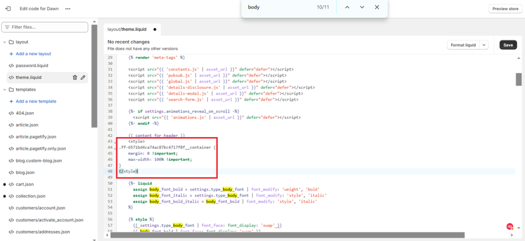
This code ensures that your section and its container span the entire width of the screen.
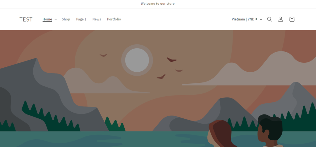
Step 3: Save and Preview
Once you’ve made these changes, save the file and preview your Shopify store. You should now see the modified section spanning the entire width of the browser window. You can further tweak the styling to adjust the layout as needed.
Here is the result:
How to Create a Shopify Full Width Section Within a Theme
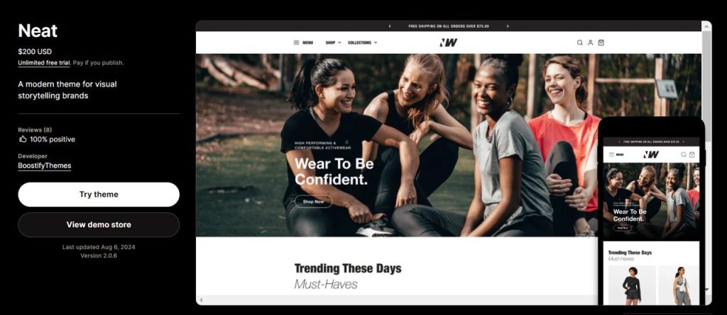
If coding isn’t your strong suit, many free and premium Shopify themes in the marketplace allow you to create full-width sections without needing to modify the code. One such theme is Neat.
Neat is a premium Shopify theme designed with flexibility and customization in mind. It comes with built-in options for creating full-width sections, along with a range of other layout options that can help you build a unique online store.
Step 1: Purchase and Install the Neat Theme
To start using Neat, you’ll first need to purchase and install the theme from the Shopify Theme Store.
- Go to the Shopify Theme Store and search for “Neat.”
- Purchase the theme and add it to your Shopify store.
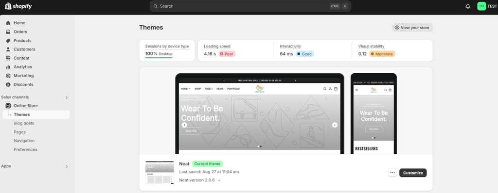
- Once the theme is installed and published as your current theme, navigate to Online Store > Themes and click Customize next to the Neat theme.
Step 2: Customize Sections in the Neat Theme
Once the Neat theme is installed, follow these steps to create full-width sections:
- In the theme editor, navigate to the section you want to modify. Neat offers multiple options for homepage sections, such as video banners, products, or image galleries.
- Select the section you want to make full-width.
- In the section settings, you’ll see an option to enable full-width layout. You can simply enable to make it full-width setting on. Or disable it if you don’t want it full-width setting.
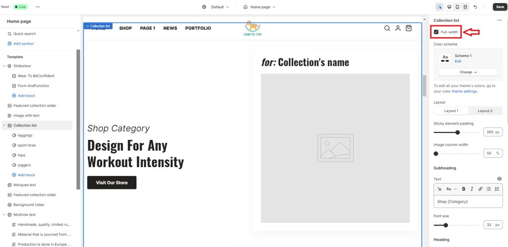
- Customize the section as needed. Neat allows you to adjust various settings, such as padding, margins, background colors, and images.
Step 3: Save and Preview Your Changes
Once you’ve configured the section to be full-width, don’t forget to save your changes and preview your store. Neat makes it easy to create polished, professional-looking full-width sections without touching any code.
Let’s see how to make the section full width in this video:
In Conclusion,
Full-width sections are an excellent way to improve the visual appeal and user experience of your Shopify store. Whether you choose to create full-width sections using custom Liquid code or opt for a pre-built theme like Neat, the benefits are clear: better focus on content, improved user engagement, mobile responsiveness, and greater design flexibility.
By following the steps outlined in this guide, you can transform your Shopify store into a more dynamic, professional, and engaging platform that captures the attention of your customers and keeps them coming back. Whether you’re showcasing products, promoting a sale, or telling your brand’s story, full-width sections can help you create the impactful, modern design that your business deserves.