
A great coffee shop logo is more than just a visual mark—it’s the face of your brand. From cozy neighborhood cafés to modern specialty coffee shops, the right logo can instantly communicate your atmosphere, personality, and the kind of experience customers can expect.
Looking for coffee shop logo ideas to create or refresh your café brand? In 2026, coffee shop branding is moving beyond simple coffee icons, with designers embracing bold typography, handcrafted details, minimalist concepts, organic shapes, and distinctive color palettes to create logos that feel memorable and authentic.
In this guide, we’ve rounded up 100+ coffee shop logo ideas, along with the latest trends and design tips to help you find a style that fits your brand. Whether you’re starting a new café or giving an existing coffee shop a fresh identity, these ideas will help you create a logo that stands out and leaves a lasting impression.
Table of Contents
4 Coffee Shop Logo Design Trends in 2026
As the F&B landscape evolves, coffee shop branding is moving beyond generic coffee cups and predictable bean icons toward more purposeful and expressive visual identities. Whether you’re opening a neighborhood espresso bar, launching a specialty coffee brand, or building an e-commerce coffee business, understanding the latest design movements can help you create a logo that feels relevant and memorable.
Here are four coffee shop logo design trends shaping café branding in 2026:
1. Modern Minimalist & Line Art
- The Look: Clean, continuous single-line illustrations, generous negative space, and sleek sans-serif typography.
- Why it works: This trend screams sophistication and clarity. It is heavily adopted by third-wave specialty coffee roasters who want their packaging and merchandise to look modern, uncluttered, and high-end. An aesthetic coffee logo built on minimalism ensures your brand looks sharp whether scaled down to a tiny website favicon or stamped on a minimalist white takeaway cup.
2. Retro & Vintage Aesthetics
- The Look: Heavily inspired by 1970s groovy typography, distressed textures, badge frames, and old-world European cafe signage. Think warm sepia tones, bold rounded lettering, and sunburst motifs.
- Why it works: Nostalgia sells. Vintage cafe logo ideas evoke a sense of comfort, heritage, and community.() They perform exceptionally well for community-centric coffee houses and acoustic cafes aiming for a timeless, cozy neighborhood vibe.
3. Eco-Friendly & Earthy Tone Branding
- The Look: Grounded in sustainability, this trend utilizes organic color palettes—such as muted sage greens, warm terracotta, oat milk creams, and deep coffee browns. Icons often incorporate botanical elements like coffee cherry branches, leaves, or flowing natural lines.
- Why it works: Modern consumers heavily value sustainability and ethical sourcing. An organic cafe branding approach visually signals that your beans are fair-trade, organic, or sustainably harvested, immediately building trust with conscious buyers.
4. Bold Typography-Centric & Take-Away Vibe
- The Look: Shifting away from traditional graphic icons entirely, these cool coffee shop logos use custom-crafted, chunky, or playful lettering as the absolute hero element. Combined with vibrant accent colors, they lean heavily into sticker-style or urban street aesthetics.
- Why it works: Ideal for fast-paced urban take-away kiosks and Gen-Z-focused cafes. These logos are built to pop instantly on Instagram feeds, TikTok reels, and bright, colorful merch like tote bags and insulated tumblers.
Explore 20 Coffee Shop Logo Ideas by Branding Style
Minimalist Specialty Coffee Logo Idea
Minimalist specialty coffee logos combine clean aesthetics with thoughtful design to communicate craftsmanship, quality, and sophistication. Rather than relying on elaborate illustrations, they use simple shapes, refined typography, and restrained colors to create a distinctive identity that reflects the precision and authenticity of specialty coffee.
Idea 1: Geometric Coffee Bean Logo

This style transforms the coffee bean into a clean, geometric symbol, balancing simplicity with a strong connection to the product. Its structured appearance reflects the precision and attention to detail associated with specialty coffee.
- Geometric Simplicity: Uses basic shapes and clean lines to create a recognizable, uncluttered symbol.
- Artisanal Identity: Connects visual design to coffee beans, careful sourcing, and brewing craftsmanship.
- Versatile Application: Works well on coffee bags, labels, cups, and other branded materials.
Idea 2: Single-Line Coffee Logo
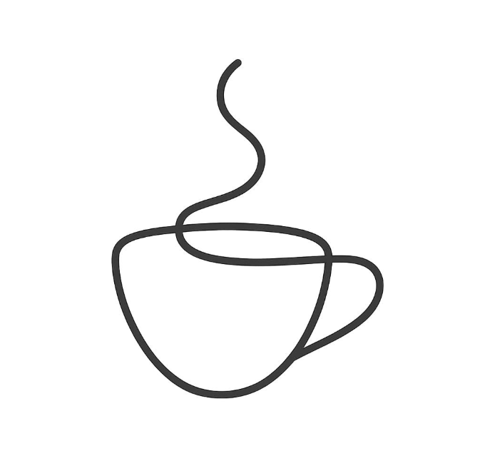
Single-line coffee logos use a continuous, flowing line to form recognizable coffee-related elements, such as a cup, rising steam, or brewing equipment. This minimalist approach creates an elegant, artistic identity while keeping the design simple and uncluttered.
- Continuous Line Art: Uses a single flowing stroke to form a coffee-inspired illustration.
- Elegant Simplicity: Combines artistic expression with a clean, minimalist aesthetic.
- Distinctive Branding: Creates a recognizable logo that works well on coffee cups, packaging, labels, and digital platforms.
Idea 3: Negative-Space Monogram

Negative-space monograms combine a letterform with a subtle coffee-related element, creating a logo that is simple at first glance but reveals an additional detail on closer inspection. This approach adds personality without compromising the minimalist aesthetic.
- Clever Symbolism: Integrates coffee beans or brewing-inspired shapes into the spaces between letters.
- Distinctive Identity: Creates a memorable visual mark through subtle details rather than complex illustrations.
- Compact Design: Remains recognizable on small labels, cup stamps, social media icons, and other compact applications.
2. Vintage & Retro Cafe Logo Ideas
Vintage and retro café logos draw inspiration from traditional coffeehouse branding, nostalgic typography, and classic print design. With elements such as decorative badges, bold vintage lettering, and engraved illustrations, these logos create a sense of heritage and character. They are ideal for cafés that want to feel established, authentic, and full of personality.
Idea 4: Vintage Badge & Emblem Logos
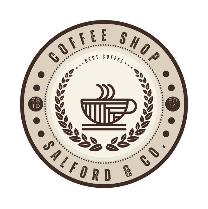
Vintage badge logos use a structured emblem, often featuring a circular or shield-shaped frame, classic lettering, and coffee-related symbols. Details such as founding dates, ribbons, and decorative borders give the design a timeless, established feel.
- Classic Emblem Shapes: Uses circular badges, shields, or seal-like layouts to create a recognizable brand mark.
- Nostalgic Details: Incorporates coffee cups, beans, laurel branches, or “Est.” dates to evoke traditional coffeehouse culture.
- Strong Brand Presence: Works especially well on coffee bags, takeaway cups, storefront signs, and merchandise.
Idea 5: 70s Retro Typography Logos
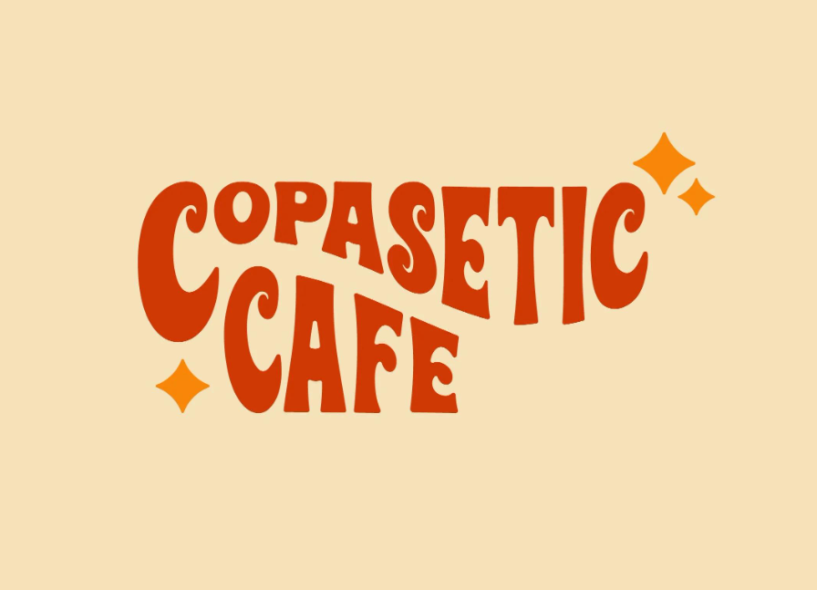
Inspired by 1970s graphic design and nostalgic American café culture, this style combines bold, groovy lettering with warm retro colors to create a distinctive, artistic identity. Using the word “Copasetic,” an American slang term dating back to the early 20th century and associated with Jazz-era culture, captures the relaxed, old-school spirit behind this aesthetic. This logo pairs especially well with cafés featuring exposed brick walls, weathered wooden furniture, and cozy, vintage-inspired interiors.
- Groovy Typography: Uses bold, rounded, wavy, or playful lettering inspired by 1970s graphic design.
- American Vintage Character: Evokes the nostalgia of classic American cafés, Jazz-era culture, and old-school creative spaces.
- Warm Retro Colors: Combines burnt orange, mustard yellow, cream, and earthy brown to create a welcoming, nostalgic feel.
Idea 6: Heritage & Engraved Logos
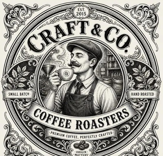
Heritage and engraved logos draw inspiration from traditional printmaking, antique illustrations, and historical brand marks. Fine linework, detailed botanical elements, and elegant serif lettering create a handcrafted appearance that communicates tradition, authenticity, and attention to detail.
- Intricate Linework: Uses engraved-style illustrations of coffee plants, beans, roasting equipment, or traditional brewing tools using detailed etching techniques.
- Traditional Typography: Pairs rich, hand-crafted artwork with classic serif fonts, established dates (ESTD), and carefully arranged badge lettering.
- Artisanal Appeal & Packaging Versatility: Works particularly well for independent roasters and heritage cafés, creating a striking visual impact when debossed on craft paper bags, stamped on packaging, or printed with foil accents.
3. Cozy & Artisan Coffee House Logo Inspiration
Cozy and artisan coffee house logos capture the warmth and personal touch of independent cafés. Through hand-drawn illustrations, organic lettering, and warm, understated typography, these designs create a welcoming identity that feels authentic rather than overly polished. They are ideal for neighborhood coffee shops, artisan roasters, and cafés built around craftsmanship and a relaxed atmosphere.
Idea 7: Hand-Lettered Coffee Logos
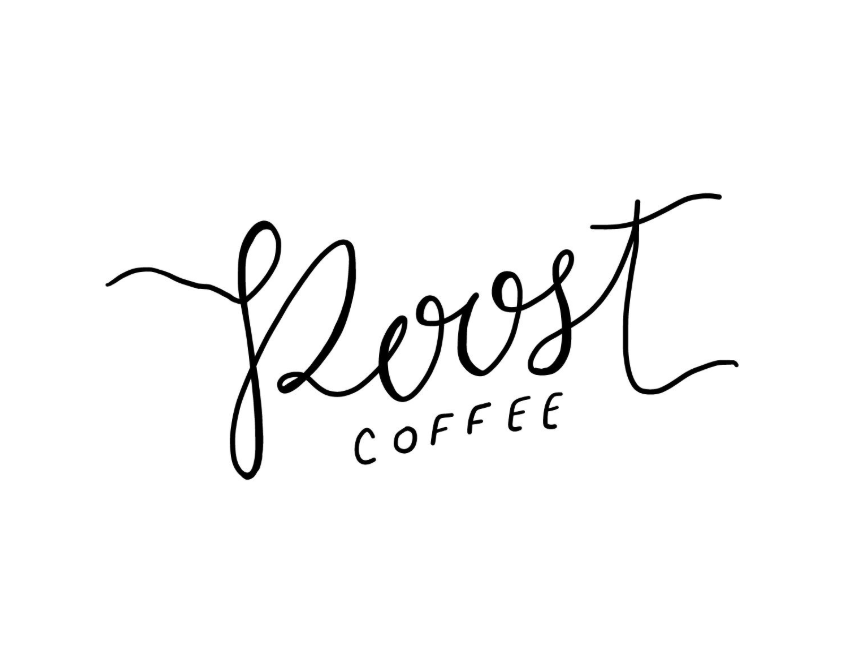
Hand-lettered coffee logos use custom lettering that resembles writing by hand, giving the brand a personal and approachable character. Slightly irregular strokes and natural letterforms make the logo feel crafted specifically for the café rather than taken from a standard font library.
- Personal Touch: Uses handwritten scripts or custom lettering to create a friendly, human-centered identity.
- Artisanal Character: Subtle variations in the strokes convey creativity and the care behind independently crafted coffee.
- Warm Brand Personality: Works well for neighborhood cafés, small-batch roasters, and cozy coffee houses that want to feel welcoming.
Idea 8: Hand-Drawn Coffee Illustrations
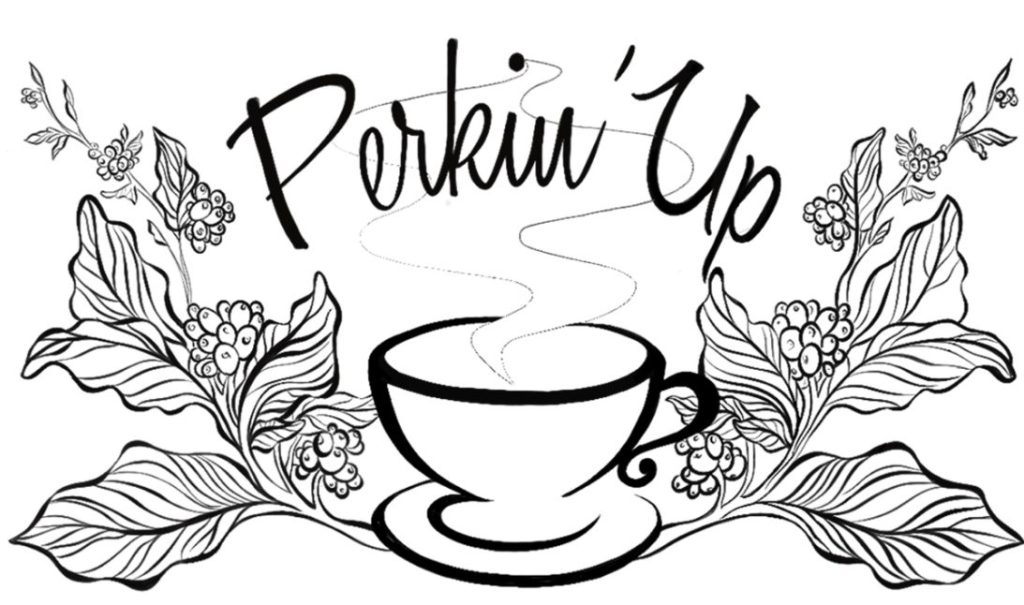
This style combines simple, hand-drawn illustrations with a relaxed café identity. Sketches of steaming mugs, coffee branches, ceramic cups, or brewing tools add a handmade quality, helping the brand communicate its love of coffee and attention to detail.
- Sketch-Like Artwork: Features imperfect lines and organic illustrations instead of rigid geometric shapes.
- Craftsmanship and Authenticity: Communicates the care involved in preparing coffee and selecting ingredients.
- Storytelling Potential: Uses coffee-related imagery to express the café’s personality, brewing philosophy, or artisanal approach.
Idea 9: Warm Serif Wordmarks
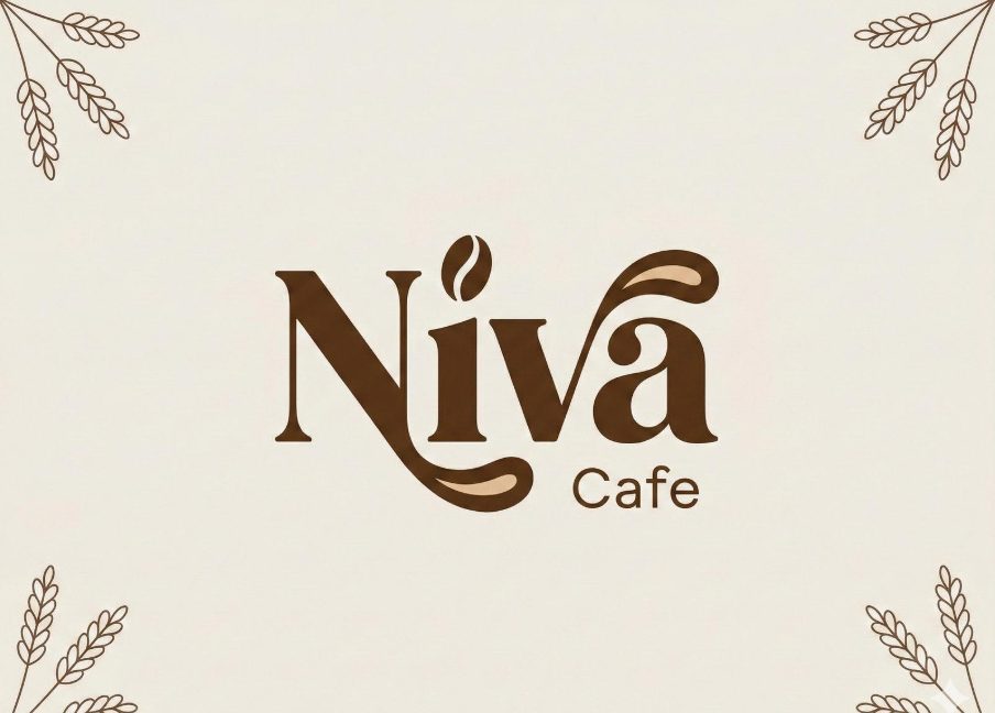
Warm serif wordmarks use softly styled serif fonts, balanced letter spacing, and earthy colors to create an inviting yet refined identity. Unlike formal luxury branding, this approach favors gentle curves, understated elegance, and an organic visual rhythm that feels comfortable and timeless.
- Soft Serif Typography: Uses expressive serifs and gentle curves to create a more approachable look than rigid corporate lettering.
- Earthy Color Palette: Combines warm brown, muted terracotta, cream, or olive green to reinforce a cozy atmosphere.
- Quiet Sophistication: Balances craftsmanship with understated elegance, making it suitable for intimate cafés and artisan coffee houses.
4. Trendy Gen-Z & Takeaway Coffee Branding Ideas
Trendy Gen-Z and takeaway coffee logos embrace bold visuals, playful details, and contemporary design to appeal to younger audiences. From oversized typography to expressive symbols and high-contrast color combinations, these styles help brands stand out in busy streets and on social media. They are particularly suitable for grab-and-go coffee shops, youth-oriented cafés, and modern coffee brands looking for a distinctive, instantly recognizable identity.
Idea 10: Bold Oversized Typography Logos
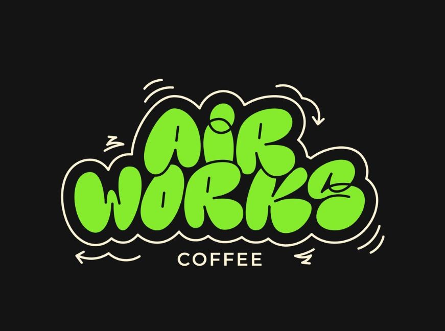
Bold oversized typography logos use large, expressive lettering to make the brand name the main visual attraction. Rounded fonts, exaggerated proportions, and unconventional letterforms create an energetic identity that feels contemporary and youth-oriented. This style is especially effective for takeaway coffee brands that want their names to remain recognizable on cups, packaging, storefronts, and social media.
- Statement Typography: Uses oversized, chunky, or exaggerated letterforms to capture attention quickly.
- Youthful Personality: Communicates confidence, creativity, and a playful attitude that resonates with younger audiences.
- Instant Recognition: Makes the brand name easy to spot on takeaway cups, stickers, and compact packaging.
Idea 11: Playful Icon & Symbol Logos
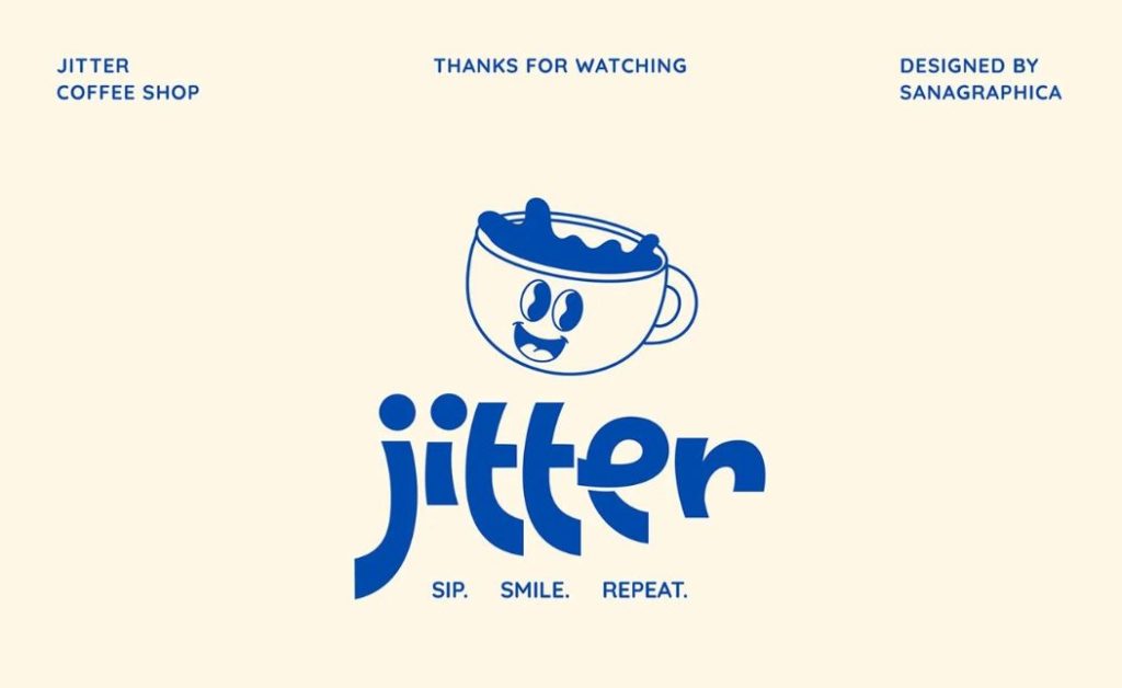
Playful icon and symbol logos combine a distinctive graphic element with a friendly brand name to create an approachable, memorable identity. Smiling coffee cups, expressive characters, abstract coffee beans, and quirky symbols add personality while giving customers a visual element they can easily associate with the brand. This approach suits Gen-Z-focused cafés that want their branding to feel fun, social, and recognizable beyond the logo itself.
- Expressive Graphics: Uses playful characters, unusual symbols, or coffee-inspired illustrations to create visual interest.
- Friendly Brand Identity: Builds an approachable personality through expressive shapes, facial features, or unexpected details.
- Social Media Appeal: Creates recognizable visual assets that can be reused on cup stickers, merchandise, and social content.
Idea 12: High-Contrast Takeaway Coffee Logos
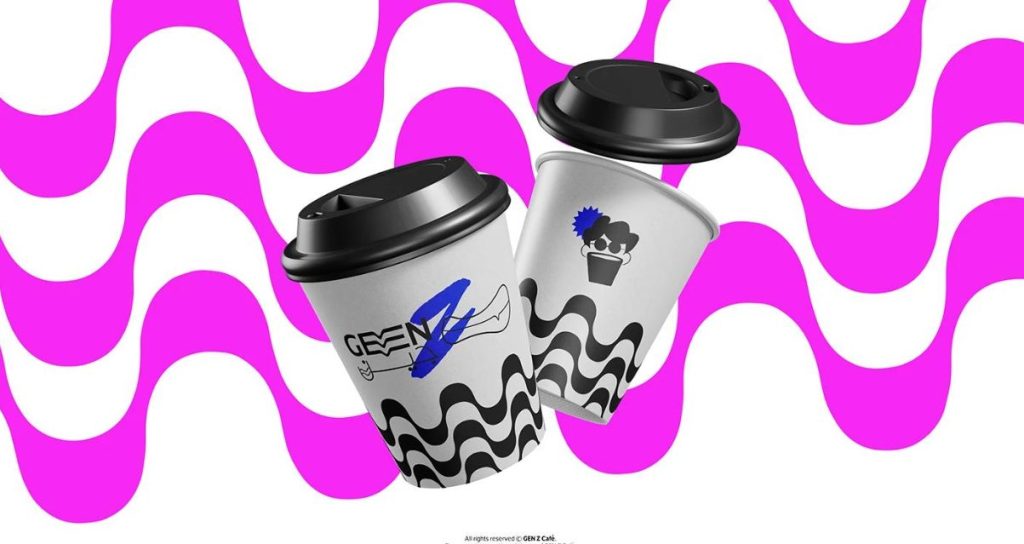
High-contrast takeaway coffee logos rely on striking color combinations, bold graphic shapes, and clear visual hierarchy to stand out in fast-paced retail environments. Pairings such as black and white, electric blue and cream, or vivid pink and dark brown make the branding highly visible, even on small cups and packaging. The result is a punchy, contemporary identity designed to catch attention at a glance.
- Striking Color Contrast: Combines contrasting hues or light and dark tones to make the logo stand out.
- Graphic Impact: Uses bold patterns, strong outlines, or oversized visual elements to create an energetic appearance.
- Packaging Visibility: Maintains a clear, recognizable identity across takeaway cups, sleeves, paper bags, and promotional materials.
5. Industrial & Urban Roastery Logo Ideas
Industrial and urban roastery logos draw inspiration from warehouse architecture, industrial machinery, and the raw character of city life. With bold typography, utilitarian layouts, and mechanical details, these designs communicate strength, precision, and authenticity. They are ideal for specialty roasters, warehouse-style cafés, and urban coffee brands that want a rugged identity with a contemporary edge.
Idea 13: Industrial Typography Logos
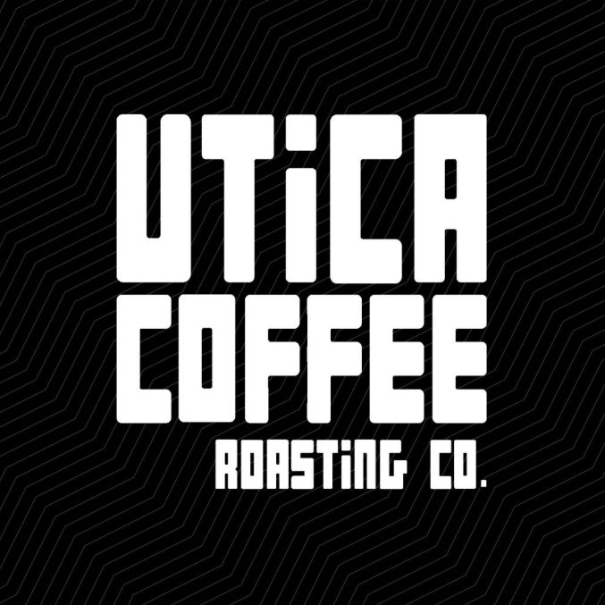
Industrial typography logos use bold, condensed, or heavy sans-serif lettering to create a strong, utilitarian identity. Inspired by factory signage, warehouse graphics, and urban street culture, this style favors straightforward typography over decorative elements. Its defining feature is the raw, functional appearance of the lettering, making it suitable for modern roasteries that want to communicate confidence, precision, and a no-nonsense approach to coffee.
- Heavy Typography: Uses bold, condensed, or uppercase lettering to establish a strong visual presence.
- Utilitarian Aesthetic: Keeps decorative elements to a minimum, drawing inspiration from industrial signage and urban environments.
- Strong Brand Recognition: Makes the roastery name easy to identify on coffee bags, equipment, storefronts, and merchandise.
Idea 14: Industrial Stamp & Label Logos
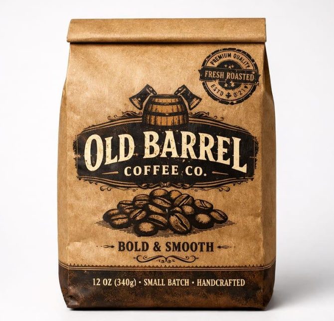
Industrial stamp and label logos resemble the markings found on shipping crates, factory labels, and product packaging. They often combine framed layouts, batch numbers, technical details, and compact typography to create a practical, workshop-inspired identity. Unlike industrial typography logos, which emphasize the letterforms themselves, this concept relies on structured layouts and labeling details to evoke the authenticity of small-batch roasting and hands-on production.
- Stamp-Inspired Layouts: Uses rectangular frames, circular seals, or compact label compositions.
- Technical Details: Incorporates roast dates, batch numbers, origin information, or establishment dates when relevant to the brand.
- Packaging-Friendly Design: Fits naturally on kraft coffee bags, product labels, shipping boxes, and roast identification tags.
Idea 15: Machine-Inspired & Mechanical Logos
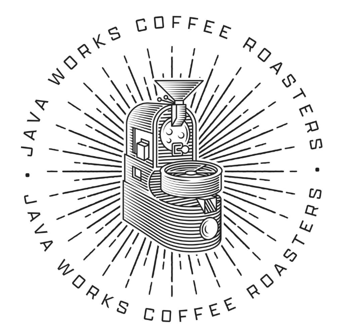
Machine-inspired logos incorporate mechanical shapes and roasting-related elements, such as gears, rotating drums, pressure gauges, or simplified machine components. These graphics connect the visual identity directly to the roasting process, giving the brand a technical and production-focused character. The key distinction is the use of machinery-inspired symbolism, which makes this style especially suitable for roasters that want to highlight roasting expertise, equipment, and process control.
- Mechanical Symbolism: Uses simplified gears, roasting drums, gauges, or machine-inspired geometric forms.
- Technical Character: Communicates precision, consistency, and a process-driven approach to coffee roasting.
- Distinctive Visual Identity: Creates a recognizable symbol that can complement the brand name across packaging, signage, and digital platforms.
6. Botanical & Organic Cafe Logo Concepts
Idea 16: Coffee Plant & Leaf Logos
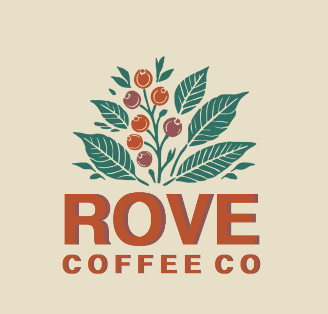
These logos feature coffee branches, leaves, cherries, or beans as the main visual elements. Fine botanical linework and natural colors create an organic identity that communicates freshness, sustainability, and a close connection to nature.
- Botanical Illustrations: Uses coffee leaves, branches, and cherries to establish a clear connection to coffee.
- Natural Color Palette: Combines olive green, earthy brown, and warm cream for an organic appearance.
- Fresh Brand Identity: Works well for eco-conscious cafés, specialty coffee shops, and plant-inspired interiors.
Idea 17: Organic Shape Logos
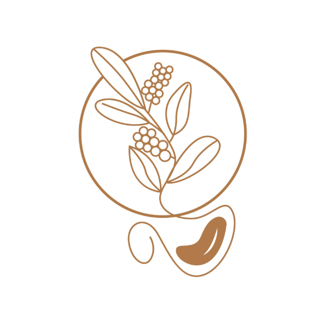
Organic shape logos use flowing curves, irregular circles, and soft, nature-inspired forms instead of rigid geometric structures. This approach creates a relaxed, contemporary identity that feels approachable and visually connected to natural materials.
- Fluid Shapes: Incorporates soft curves and imperfect forms inspired by nature.
- Minimalist Aesthetic: Keeps the design simple while adding warmth and individuality.
- Flexible Branding: Adapts easily to storefronts, coffee cups, menus, and social media.
Idea 18: Farm-to-Cup & Origin-Inspired Logos
These logos draw inspiration from coffee-growing regions, mountain landscapes, farms, and the journey from harvested beans to the finished cup. Their visual storytelling helps communicate traceability, responsible sourcing, and a genuine appreciation for coffee origins.
- Origin-Inspired Imagery: Features mountains, farms, landscapes, or coffee-growing plants.
- Sustainable Storytelling: Highlights the connection between coffee sourcing, agriculture, and nature.
- Authentic Positioning: Suits independent roasters and cafés that emphasize ethically sourced or single-origin coffee.
7. Dark & Moody Noir Coffee Bar Logos
Idea 19: Monochrome Noir Wordmarks
Monochrome noir wordmarks rely on typography and the contrast between black, white, and muted gray to create a sleek, understated identity. With clean lettering and minimal decoration, this style gives a coffee bar a modern, sophisticated, and slightly mysterious atmosphere.
- Black-and-White Contrast: Uses a restrained monochrome palette for a dramatic visual effect.
- Typography-Driven Design: Makes the brand name the primary visual element.
- Modern Sophistication: Works well for minimalist espresso bars and contemporary urban cafés.
Idea 20: Gothic & Dramatic Serif Logos
These logos use expressive serif fonts, sharp letterforms, and dramatic proportions to create a moody, editorial look. Deep burgundy, charcoal, and antique ivory can add a sense of mystery and vintage elegance without making the branding feel overly ornate.
- Expressive Serif Fonts: Features sharp serifs, elongated letters, or distinctive curves.
- Dark Color Palette: Combines charcoal, burgundy, and muted ivory for a rich visual identity.
- Distinctive Character: Suits atmospheric coffee bars, late-night cafés, and vintage-inspired interiors.
Idea 21: Night-Inspired Symbol Logos

Night-inspired symbol logos incorporate elements such as crescent moons, stars, shadows, or abstract steam to evoke the quiet atmosphere of coffee after dark. A simple emblem paired with restrained typography creates a memorable identity that feels atmospheric rather than overly decorative.
- Celestial Symbolism: Uses moons, stars, or abstract night-inspired imagery.
- Atmospheric Design: Creates a calm, mysterious mood through simplified shapes and dark tones.
- Memorable Emblem: Works well for late-night coffee bars, espresso lounges, and cafés with a distinctive nocturnal identity.
8. Playful & Whimsical Neighborhood Cafe Logo Ideas
Idea 22: Coffee Mascot Logos

Coffee mascot logos feature friendly characters, such as smiling coffee cups, cheerful coffee beans, or cartoon baristas. Their expressive faces and approachable illustrations give a café a fun personality that customers can easily recognize and remember.
- Friendly Characters: Uses expressive coffee-inspired mascots to create an inviting identity.
- Playful Personality: Adds humor, warmth, and a sense of friendliness to the brand.
- Memorable Branding: Works well for takeaway cups, stickers, merchandise, and social media.
Idea 23: Whimsical Doodle Logos
Whimsical doodle logos combine loose hand-drawn lines with playful details such as tiny stars, flowers, swirls, and quirky coffee illustrations. Their intentionally imperfect appearance creates a creative, relaxed identity that feels personal rather than overly polished.
- Hand-Drawn Details: Uses doodles and sketch-like lines to create an artistic look.
- Quirky Visual Elements: Incorporates unexpected decorative touches for added personality.
- Creative Appeal: Suits independent cafés that want a casual, expressive, and youthful brand identity.
Idea 24: Neighborhood-Inspired Logos
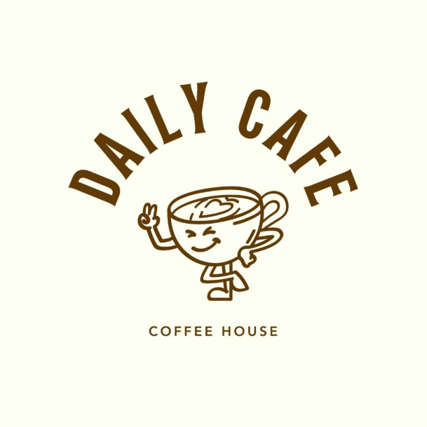
Neighborhood-inspired logos reflect the familiar charm of local coffee shops through illustrations of small storefronts, neighborhood streets, houses, or community landmarks. This approach gives the brand a personal, welcoming identity that feels rooted in its surroundings.
- Local Visual Elements: Features storefronts, street corners, or recognizable neighborhood details.
- Community Connection: Communicates familiarity, warmth, and a sense of belonging.
- Authentic Identity: Works especially well for independent cafés serving as everyday gathering spots for local residents.
Deep-Dive Design Tips: How to Design a Coffee Shop Logo
Creating a great coffee logo isn’t just about making it look pretty. It needs to work in the real world—from a tiny smartphone screen to a large storefront sign. Here are a few practical tips to keep in mind when designing your coffee shop logo:
1. Keep It Scalable
Your logo has to look sharp no matter where people see it. Think about how small it will be on a tiny sugar packet, a website favicon, or a loyalty stamp card, and how big it will look on a 12oz kraft coffee bag or a shop banner. Avoid tiny, complicated details that turn into a blurry dot when shrunk down.
2. Choose Colors That Feel Right
Colors send a message before a customer even reads your name. Warm browns and creamy tones make people think of cozy spaces and roasted beans. Muted greens and earthy colors tell customers your coffee is organic and sustainably sourced. Stick to a simple color palette (two or three colors max) so your logo is easy to remember and cheaper to print.
3. Pick Clear and Readable Fonts
It’s fun to use fancy, curly handwriting fonts, but make sure people can actually read your shop’s name from a distance. The golden rule is to pair a bold display font (for your main shop name) with a clean, simple font for your tagline or location (like “Artisan Roasters Since 2024”).
4. Balance the Physical and the Digital
Your logo needs to live comfortably in two worlds. It has to look great physically—whether it’s rubber-stamped on a paper cup, debossed on a coffee bag, or glowing as a neon sign on your shop wall. At the same time, it needs to look crisp and clean on your social media avatars and your online store headers.
DIY Tools & Next Steps for Your Coffee Business
Best Free and Pro Tools to Create Your Coffee Logo
You don’t need to be a professional designer to create a memorable coffee shop logo. Whether you’re working with a limited budget or looking for more advanced design capabilities, these tools can help you turn your branding ideas into reality.
- AI Logo Makers: Tools like Looka can help you explore different logo concepts based on your coffee shop name, industry, and design preferences. They’re useful for generating initial ideas, but you should review each design carefully to ensure it reflects your brand identity and can be used for your intended business needs.
- Easy Template Editors (Canva): Canva offers customizable logo templates, fonts, colors, and graphic elements that make it easy to experiment with different café branding styles. It’s a practical choice for beginners who want to create a simple logo without learning professional design software.
- Professional Vector Software (Adobe Illustrator): For greater creative control, Adobe Illustrator lets you create and refine vector logos that remain sharp at different sizes. This makes it suitable for branding applications ranging from small social media icons to large storefront signs and printed materials.
Ready to Launch Your Coffee Brand Online?
Once you’ve established your coffee shop’s visual identity, it’s time to bring that brand to your online storefront. Whether you’re selling whole-bean coffee, subscription boxes, or branded merchandise, a well-designed website can help you present your products consistently and create a better shopping experience.
- Looking for the perfect name? Explore our guide to coffee business name ideas for inspiration when choosing a memorable name that fits your brand.
- Need website inspiration? Browse these coffee shop websites to discover how successful coffee brands present their products, communicate their identity, and organize their online stores.
- Ready to build your store? Explore our recommended Shopify themes for coffee shops to find a design that complements your branding and supports your online sales.
Final Thoughts
A great coffee shop logo is more than an attractive design—it’s a visual expression of your brand’s story, values, and the experience you want to create for your customers. From minimalist wordmarks to playful illustrations and vintage-inspired emblems, the right design can help your café stand out in a competitive market and build a lasting connection with its audience.
As you explore these 25+ coffee shop logo ideas for 2026, look beyond current trends and consider what makes your business unique. Think about your target customers, coffee philosophy, shop atmosphere, and long-term vision. Choose colors, typography, and visual elements that reflect your identity, and prioritize simplicity, versatility, and recognizability over unnecessary decoration.
Most importantly, remember that a logo is only one part of a successful brand. Consistent visual identity across your storefront, menus, packaging, social media, and customer experience helps turn a recognizable design into a brand people trust, remember, and return to. When your logo tells the right story, every interaction becomes an opportunity to strengthen that connection.