
The success of a store often hinges on more than just great products—it’s about creating an experience that engages, attracts, and converts visitors. One of the most crucial yet often overlooked aspects of crafting that experience is color. The right color scheme can have a profound impact on how customers perceive your Shopify store, influencing everything from brand recognition to conversion rates.
As Shopify store owners, choosing the right color scheme is essential to establishing an emotional connection with your audience, reinforcing your brand identity, and guiding customer behavior in subtle yet powerful ways. In this guide, we’ll take a deep dive into Shopify color schemes, palettes, specific examples and tips to enhance your store’s look and feel.
Table of Contents
What is Shopify Color Scheme?
A Shopify color scheme refers to the combination of colors used throughout your Shopify store to create a cohesive visual identity. This includes colors on your homepage, product pages, call-to-action buttons, banners, and even fonts. These colors play a key role in setting the tone of your store and determining how visitors interact with your website. Please dive deeper into custom button colors to see how refined button styling can improve your click-through rates
There are lots of free premium Shopify themes that come with preset color schemes, but customization options allow you to tweak and modify those schemes to better align with your brand. When selecting or creating a color scheme for your Shopify store, it’s essential to choose colors that reflect your brand’s personality, appeal to your target audience, and work well together.
Why is Color Scheme Important in eCommerce?
Brand Identity
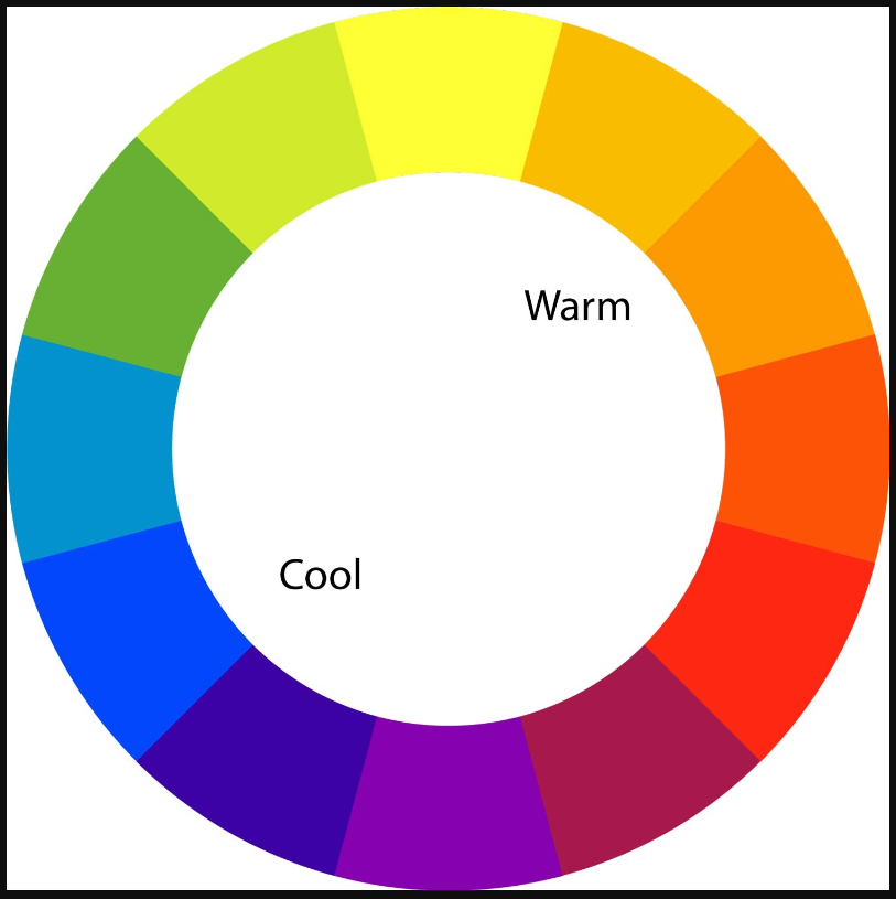
Your color scheme is a critical component of your overall brand identity. Just like a logo or a tagline, colors evoke certain emotions and associations in consumers. For instance, blue is often associated with trust and professionalism, while red evokes excitement and urgency. Consistent use of color can help build recognition and loyalty, enabling customers to instantly identify your brand amidst the competition.
Influence on Buyer Behavior
Colors can subtly influence buyer decisions. Research shows that people make a subconscious judgment about a product within 90 seconds of initial viewing, and 62%-90% of that judgment is based on color alone. For example, using red for your “Buy Now” buttons can instill urgency, encouraging visitors to complete their purchase.
Enhanced User Experience
A well-thought-out color scheme enhances the user experience by making your website more visually appealing and easier to navigate. When colors are harmoniously balanced, it creates a pleasing environment that can keep users on your site longer, reducing bounce rates and increasing conversion opportunities.
Highlighting Key Elements
Strategic use of color can guide the user’s attention to key elements on your site. For instance, a contrasting color for call-to-action buttons can make them stand out, encouraging clicks and boosting conversions. Similarly, neutral backgrounds with bold accent colors can help highlight special promotions or new arrivals.
15 Best Color Schemes + Palettes for Shopify Stores (With Examples)
Choosing the perfect color palette for your Shopify store is more than just a design decision; it’s a way to define your brand and influence how customers interact with your products. Here, we dive into 15 different color schemes that are tailored to various business types, each with specific emotional impacts and practical design tips. Let these examples inspire you to find the best color palette for your store.
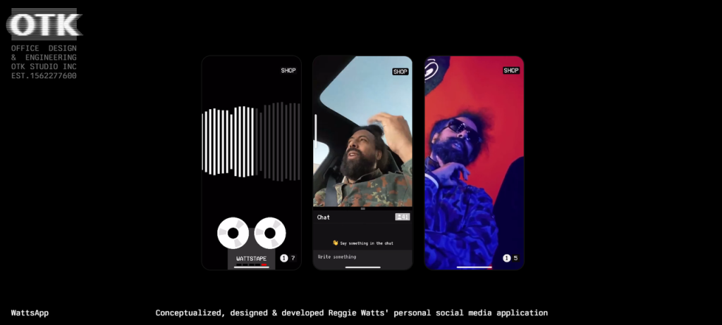
1. Classic Monochrome
- Palette: Black, White, Gray
- Effect: Monochrome color schemes are clean, timeless, and sophisticated. Black symbolizes luxury, authority, and power, while white creates a sense of purity and simplicity. Gray serves as a neutral color, balancing the intensity of black and the lightness of white. This combination works especially well for brands that want to evoke professionalism and elegance without overwhelming the customer with too many colors.
- Design Tips: When using a monochrome scheme, rely on texture and typography to add depth and variety to your design. Use black for prominent elements like headers and calls to action, while white can serve as the background to maintain clarity and simplicity. A well-placed pop of gray in product descriptions or borders can add subtle contrast.
- Example: A luxury fashion brand could use this palette to emphasize elegance, such as a Shopify store selling high-end, minimalist clothing or accessories. You can refer to OTK.
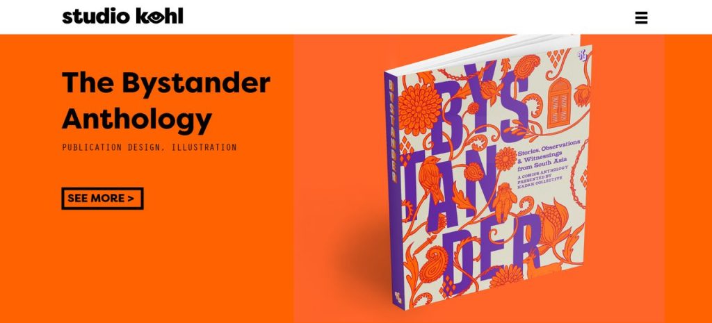
2. Bold and Bright
- Palette: Red, Yellow, Orange
- Effect: Bright and bold colors like red, yellow, and orange are attention-grabbing and energetic, making them perfect for brands targeting younger audiences or selling fun, casual products. Red is often associated with passion and excitement, while yellow is linked to happiness and optimism. Orange strikes a balance between the two, combining energy and enthusiasm.
- Design Tips: To avoid overwhelming your visitors, use these bold colors strategically. For instance, red and orange can highlight special offers or sales banners, while yellow could be used to draw attention to product features or new arrivals. Pair these bright hues with neutral backgrounds, like white or light gray, to maintain a balanced and enjoyable visual experience.
- Example: A Shopify store selling children’s toys or party supplies or studio like Studiokohl benefit from this vibrant, playful color scheme to convey energy, excitement, and fun.
3. Earthy Tones
- Palette: Brown, Green, Beige
- Effect: Earth tones like brown and green are calming and grounding, evoking a sense of nature, health, and sustainability. Green is universally associated with growth, health, and tranquility, while brown conveys warmth, reliability, and stability. Beige acts as a neutral buffer, providing a soft, understated background that enhances the natural aesthetic.
- Design Tips: Use green as your primary color for buttons, links, or other clickable elements, as it encourages action while maintaining a sense of calm. Brown can serve as a grounding color for headers or borders, creating a warm, inviting feel. Beige works well for backgrounds, ensuring that the focus remains on the products themselves. Incorporate natural textures or imagery, such as leaves or wood, to enhance the earthy vibe.
- Example: A Shopify store selling organic skincare, natural products, or eco-friendly home goods can use earthy tones to communicate sustainability and a connection to nature. Take Villafeltrinelli as an example.

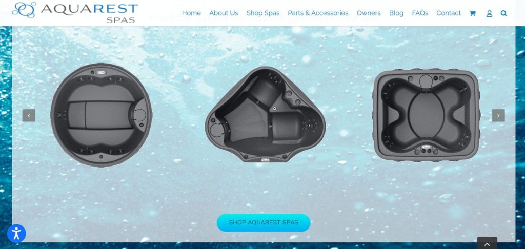
4. Oceanic Blues
- Palette: Teal, Navy, Sky Blue
- Effect: Shades of blue, particularly oceanic tones, are calming, trustworthy, and universally appealing. Teal adds a vibrant, youthful touch, while navy conveys authority and professionalism. Sky blue is fresh and light, offering a sense of freedom and tranquility. Together, these colors evoke feelings of trust, peace, and exploration, making them ideal for travel, lifestyle, or water-related brands.
- Design Tips: Use navy for your logo or primary text to establish trust and professionalism. Teal and sky blue can be employed as accent colors, drawing attention to calls to action or highlighting key features of your products. Combine these shades with crisp whites to create a fresh, open feel that invites customers to explore your store.
- Example: A Shopify store selling beachwear, water sports equipment like Aquarestpas could use this palette to evoke the calming and refreshing qualities of the ocean.
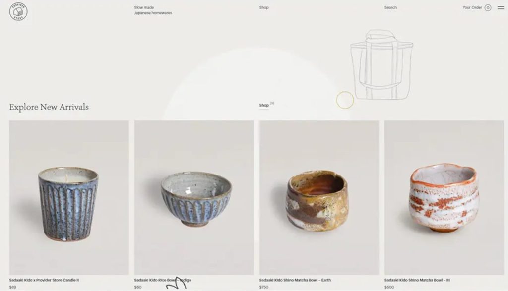
5. Elegant Neutrals
- Palette: Beige, Cream, Dusty Rose
- Effect: Neutral colors like beige, cream, and dusty rose evoke a sense of elegance, calm, and understated luxury. Beige and cream are versatile and soothing, while dusty rose adds a soft, romantic touch without overpowering the rest of the palette. This scheme is ideal for brands that want to focus on product quality and craftsmanship, allowing their items to take center stage without distraction.
- Design Tips: Use beige and cream as background colors to create a light, airy atmosphere. Dusty rose works beautifully as an accent color for buttons or promotional banners, adding a touch of softness and femininity. Pair these tones with simple, elegant fonts and spacious layouts to enhance the luxurious feel of your Shopify store.
- Example: A Shopify store selling fine jewelry, luxury home decor, or boutique clothing can use elegant neutrals to create a high-end, sophisticated atmosphere. Take Provider Store as an example.
6. Pastel Playfulness
- Palette: Lavender, Mint Green, Pale Pink
- Effect: Pastels are soft, approachable, and inherently calming, making them ideal for products aimed at children, families, or wellness. Lavender brings a sense of tranquility and creativity, mint green is fresh and rejuvenating, and pale pink adds warmth and sweetness. These colors together create a lighthearted, welcoming environment that appeals to customers seeking comfort and relaxation.
- Design Tips: Use pastel colors as background elements to create a soft, inviting atmosphere. Mint green can be used for product tags or buttons to add a pop of freshness, while lavender and pale pink can serve as accent colors in headers or promotional banners. Make sure to balance the pastels with plenty of white space to keep the design from feeling too busy
- Example: A Shopify store selling jewelry, baby clothing, nursery decor, or whimsical stationery would benefit from this soft, playful palette. Grainne Morton is an example.

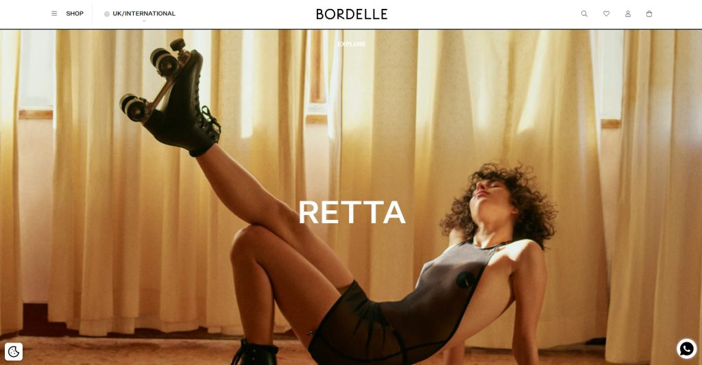
7. Dark and Dramatic
- Palette: Black, Burgundy, Dark Gray
- Effect: Dark colors like black, burgundy, and dark gray create a bold, dramatic look that speaks to exclusivity and luxury. Black is the epitome of sophistication, while burgundy adds warmth and depth. Dark gray serves as a sleek, modern neutral. Together, these colors exude confidence and opulence, perfect for high-end brands that want to make a strong, memorable impression.
- Design Tips: Use black as the dominant color in your layout, with burgundy serving as an accent color for key elements like calls to action or product highlights. Dark gray can be used for text or borders, adding subtle contrast without overpowering the design. Pair with high-quality, full-screen product imagery to emphasize luxury and exclusivity.
- Example: A Shopify store selling premium leather goods, high-end electronics, items for men, or luxury accessories or a site with little content can use dark, dramatic tones to evoke exclusivity and sophistication. Bordelle is an example.
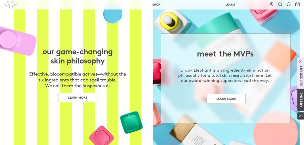
8. Citrus Punch
- Palette: Orange, Lime, Lemon Yellow
- Effect: Bright citrus colors like orange, lime, and lemon yellow are energetic and refreshing, instantly evoking feelings of health, vitality, and fun. Orange is warm and inviting, lime adds a tangy freshness, and lemon yellow creates a sense of optimism and cheerfulness. Together, they create a lively, invigorating palette that’s perfect for health food stores, fitness brands, or wellness products.
- Design Tips: Use orange for your primary calls to action, as it creates a sense of urgency without feeling overwhelming. Lime and lemon yellow can serve as accents for product highlights, banners, or special promotions. Pair these bold colors with neutral backgrounds, such as white or light gray, to maintain balance and keep the focus on your products.
- Example: A Shopify store selling fresh produce, juices, or health-focused products like Drunk Elephant can use these zesty colors to convey freshness, vitality, and energy.
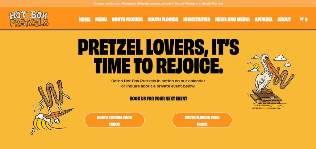
9. Selective Yellow
- Palette: Tangerine, Selective Yellow, Sandstorm, Minion Yellow, Flavescent
- Effect: This yellow monochromatic color scheme exudes energy, warmth, and positivity, much like the sun itself. Each shade of yellow—from the bright, bold Tangerine to the softer Flavescent—works together to create a dynamic yet harmonious design. Yellow is associated with joy, optimism, and vitality, making this palette ideal for stores that want to evoke a playful, fun, and inviting atmosphere. The gradient of yellow shades provides depth and variety, while still maintaining a cohesive look.
- Design Tips: Use the brightest tones, like Selective Yellow and Minion Yellow, for calls-to-action, banners, or product highlights to draw attention and create a sense of urgency. Softer shades, such as Flavescent and Sandstorm, can be applied to backgrounds or secondary elements, helping to maintain visual balance while ensuring the design remains lively. Tangerine can serve as an accent color, adding depth to key elements like headers or promotional sections. Be sure to pair these vibrant shades with plenty of white space to keep the design fresh and readable, allowing your products to stand out against the upbeat backdrop.
- Example: A Shopify store focused on summer apparel, beach accessories, food or lifestyle products aimed at an upbeat, youthful audience can use the Yellow color scheme to create an energetic and joyful atmosphere. This palette is perfect for brands that want to emphasize vibrancy, happiness, and optimism. Please refer to Hot Box Pretzels.
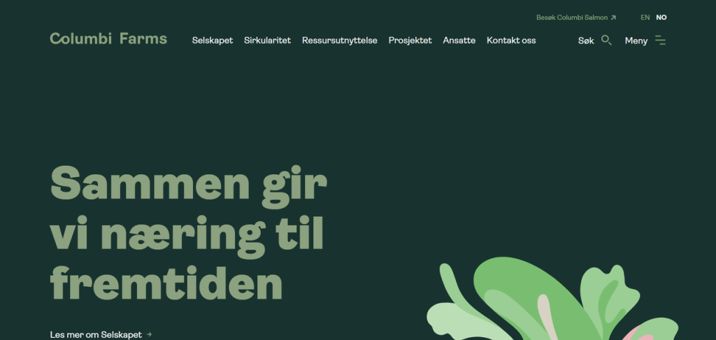
10. Cool Mint and Gray
- Palette: Mint Green, Light Gray, White
- Effect: Mint green is often associated with freshness, rejuvenation, and cleanliness, making it an excellent choice for brands that focus on health, wellness, or beauty. Paired with light gray and white, this palette creates a crisp, modern, and calming aesthetic. Mint green is vibrant without being overwhelming, while light gray provides a neutral, sophisticated balance. White ties the palette together, adding a sense of purity and openness.
- Design Tips: Use mint green as the primary accent color, highlighting important elements like call-to-action buttons, banners, or product features. Light gray works well as a background or secondary color for text, providing a modern and understated contrast. White should dominate large areas such as the background, giving the store a clean, airy look. This color scheme is particularly effective in promoting a sense of freshness, which is ideal for brands that focus on clean beauty, organic products, or modern wellness solutions.
- Example: A Shopify store selling modern skincare products, fresh beverages like Columbi Farms can use this cool and refreshing color scheme to evoke a sense of cleanliness and vitality.
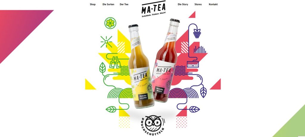
11. Tropical Vibes
- Palette: Bright Pink, Turquoise, Pineapple Yellow
- Effect: Tropical colors are bright, bold, and full of energy, creating a lively, playful atmosphere. Bright pink adds a touch of femininity and fun, turquoise evokes the refreshing feel of the ocean, and pineapple yellow brings in warmth and cheer. This palette is perfect for brands that want to create an energetic, vacation-like vibe.
- Design Tips: Use bright pink and turquoise for attention-grabbing elements like call-to-action buttons or promotional banners. Pineapple yellow can highlight product tags or sale offers, creating a sense of urgency and excitement. Pair these bright hues with plenty of white space to ensure that the design doesn’t feel too overwhelming.
- Example: A Shopify store selling summer apparel, swimwear, or beverages can use these vibrant tropical colors to evoke a sense of fresh, fun, and carefree relaxation. Ma-Tea is an eye-catching website using tropical vibes.
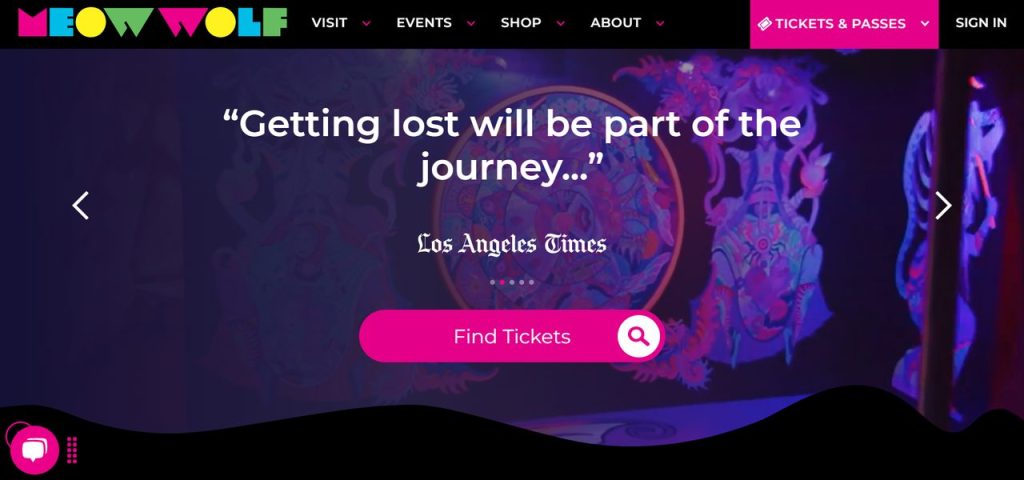
12. Regal Purples
- Palette: Royal Purple, Gold, Deep Burgundy
- Effect: Purple has long been associated with royalty, luxury, and sophistication. When combined with gold and deep burgundy, it creates a rich, opulent look that’s perfect for premium brands. Royal purple conveys creativity and elegance, while gold symbolizes wealth and success. Burgundy adds depth and warmth, rounding out the palette with a sense of richness.
- Design Tips: Use royal purple for headers, logos, or key calls to action to establish a sense of luxury. Gold can be employed sparingly as an accent color, highlighting special offers or premium products. Burgundy serves as a rich backdrop, creating warmth and balance. Pair these rich tones with clean, modern typography to maintain a sense of elegance and sophistication.
- Example: A Shopify store selling luxurious home decor, designer clothing, or high-end beauty products can use this rich, regal palette to convey a sense of opulence and sophistication. We take Meo Wolf as an example.
13. Minimalist Black and White
- Palette: White, Black, Light Gray
- Effect: White is the ultimate minimalist color, symbolizing simplicity, purity, and sophistication. Paired with light gray and soft beige, this palette creates a serene, spacious atmosphere that lets your products shine without distraction. Ideal for brands that want to emphasize clean design and modern aesthetics, a minimalist white palette feels open and uncluttered.
- Design Tips: Use white as the dominant background color to create a clean, open space for your products. Light gray and beige can serve as secondary colors, adding subtle contrast in text, borders, or buttons. This palette works best with high-quality product imagery and simple, elegant typography.
- Example: A Shopify store selling Scandinavian furniture, minimalist clothing, or modern home decor, or luxury food can use a minimalist white palette to create a clean, spacious look. The website of Duft and Co is an example.
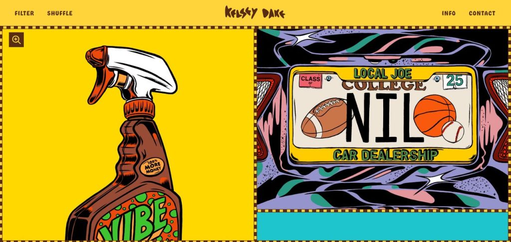
14. Retro Pop
- Palette: Bright Red, Cyan, Mustard Yellow
- Effect: Retro colors like bright red, cyan, and mustard yellow are bold and playful, evoking the charm and fun of past decades. Red brings energy and excitement, cyan adds a cool, fresh touch, and mustard yellow provides warmth and cheer. This palette is perfect for brands that want to stand out and appeal to customers seeking a unique, nostalgic experience.
- Design Tips: Use bright red for attention-grabbing elements like sale banners or call-to-action buttons. Cyan and mustard yellow can be used to highlight key features, product descriptions, or promotional sections. Pair these bold colors with neutral backgrounds, like white or beige, to keep the design balanced and enjoyable.
- Example: A Shopify store selling vintage clothing, retro-inspired accessories, toys, or nostalgic decor can use this playful, bold palette to evoke a sense of nostalgia and fun. You can look at Kelsey Dake.
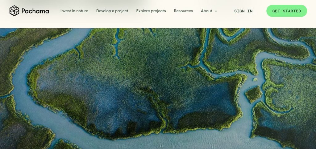
15. Forest Greens
- Palette: Forest Green, Moss, Sage
- Effect: Green is the color of nature, health, and growth, making it perfect for brands focused on sustainability or outdoor activities. Forest green is deep and calming, while moss and sage add softer, earthy tones. Together, they create a palette that feels grounded, peaceful, and harmonious, appealing to customers with a love for nature and eco-friendly values.
- Design Tips: Use forest green as your primary color for headers, buttons, or promotional banners to create a sense of strength and stability. Moss and sage work well as accent colors, adding softness and balance. Pair these greens with natural textures like wood or stone to reinforce the outdoor, eco-friendly theme.
- Example: A Shopify store selling outdoor gear, sustainable products, or nature-inspired brand like Pachama can use forest greens to evoke a sense of adventure and environmental consciousness.
These color palettes are designed to help Shopify store owners enhance their branding, improve user experience, and evoke the right emotions in their customers. Whether you’re aiming for luxury, fun, or sustainability, the right color palette can make all the difference in establishing your store’s unique identity and driving conversions.
5 Tips to Choose the Best Shopify Color Schemes for Your Store
Consider Your Brand Identity
Your brand’s core values and personality should dictate your color scheme. Are you a playful, casual brand, or a luxury, high-end brand? Bright colors may work for the former, while muted, rich tones will suit the latter.
Keep Your Target Audience in Mind
Different demographics react to colors in different ways. Younger audiences tend to prefer bold, vibrant colors, while older demographics may prefer subdued tones. Consider who your ideal customer is when selecting a color scheme.
Ensure Contrast and Readability
It’s essential to maintain high contrast between text and background colors for readability. You don’t want your customers straining to read product descriptions or call-to-action buttons. Here’s how to change the background color of Shopify sections to ensure clarity and visual comfort.
Align with Industry Trends
Some color palettes are more common in certain industries. For instance, eco-conscious brands tend to use greens and earthy tones, while tech companies often lean toward cool grays and blues.
Use Color Psychology
Take advantage of color psychology to evoke the right emotions in your customers. For example, use red to create urgency, blue to inspire trust, and green to communicate health and environmental consciousness.
Apply Color Schemes Effectively with the Right Theme
After selecting the ideal color palette for your Shopify store, the next step is to apply it consistently across your site. However, not every theme makes this easy. Many free themes provide limited control, allowing only a few preset options that don’t fully capture your brand’s visual identity. To truly bring your chosen color scheme to life, you need a theme that offers flexibility and precision in customization.
The Neat Shopify theme was built with enhanced color scheme support, giving you complete freedom to personalize your store’s look. You can choose from a wide range of pre-designed palettes or fine-tune colors for each section — from headers and buttons to product cards and footers. Its clean and minimalist layout ensures your selected colors remain the highlight, creating a cohesive, visually appealing storefront that reflects your brand’s personality.
Key advantages:
- Enhanced color scheme support: Apply cohesive palettes store-wide or adjust colors for individual sections without touching any code.
- Clean, performance-focused design: Highlights your colors beautifully while keeping your store fast and lightweight.
- Easy customization: Instantly test and preview different palettes to see how they transform your store’s overall feel.
Discover how Neat helps you bring your color scheme ideas to life in this demo video.
Final Thoughts
Choosing the right color scheme for your Shopify store is not just a matter of aesthetics; it’s a strategic decision that can impact customer perceptions, engagement, and conversion rates. By understanding the importance of color psychology, aligning your palette with your brand identity, and keeping user experience in mind, you can create a visually appealing store that draws customers in and keeps them coming back.
With the examples and tips provided in this guide, you’re now equipped to confidently choose or create a color scheme that will elevate your Shopify store and set it apart in the competitive world of e-commerce.