Every element of your Shopify store can impact how visitors interact with your products and, ultimately, how likely they are to convert into paying customers. One of these critical elements is the button color. Buttons are not just functional components but also powerful tools for guiding user behavior and encouraging specific actions, like adding items to a cart or completing a purchase.
In this comprehensive guide, we’ll explore everything you need to know about Shopify custom button colors, from understanding their importance to step-by-step instructions on how to change them. We’ll also delve into what you should consider when selecting the right color palette for your store.
Table of Contents
Importance of the Button Color on Shopify
The color of buttons on your Shopify store might seem like a small detail, but it plays a significant role in user experience and conversion rates. In web design, buttons often act as calls-to-action (CTAs), guiding users through the website and influencing their decisions to click, buy, subscribe, or engage further.
1. Visual Hierarchy and User Guidance
Buttons act as signposts, telling the visitor where to go next. A well-chosen color can make buttons stand out against the background, drawing attention and ensuring that users follow the path you’ve set for them.
For example, let’s say your store has a clean white background with light-colored product images. A bold red or orange button will stand out, clearly guiding users to take the next step. This is what’s called establishing a visual hierarchy. The right button color highlights important CTAs, making them more prominent than other elements on the page.
2. Psychological Influence of Colors
Color psychology plays a significant role in how users perceive and interact with your site. Different colors evoke different emotions and behaviors. When designing buttons for your Shopify store, you can use this knowledge to your advantage by selecting colors that evoke the feelings you want users to experience when interacting with your brand.
Here’s a quick rundown of how some common colors can impact user behavior:
- Red often creates a sense of urgency or excitement, ideal for sale buttons.
- Blue is calming and evokes trust, making it suitable for secure transaction buttons.
- Green is associated with positive action and growth, often used for “Proceed to Checkout” or “Buy Now” buttons.
Understanding the psychological triggers behind different colors can help you make more informed decisions about your Shopify store’s button colors. This knowledge is a powerful tool in shaping how users perceive your brand and how they interact with your CTAs.
3. Brand Consistency
In eCommerce, brand consistency is crucial. Every element on your website, from fonts and images to color schemes, should reflect your brand’s identity. Buttons are no exception. A website that uses consistent colors across all its elements, including buttons, reinforces brand recognition and professionalism.
For example, if your brand colors are blue and white, sticking to these colors for your buttons ensures a cohesive visual experience. However, if all your website elements use the same color scheme, your buttons might blend in too much. In such cases, consider using a complementary color from your brand palette for the buttons to help them stand out while maintaining brand consistency.
4. Conversion Rate Optimization
Small changes can have a huge impact on conversion rates. In fact, many businesses have seen a significant boost in conversions by merely tweaking their button colors. For example, one famous A/B test involving a green “Buy Now” button vs. a red one saw the red button perform better, increasing conversions by 21%.
Why does this happen? It’s all about visibility and contrast. The red button stood out more against the website’s design, catching the user’s eye faster and prompting immediate action. By experimenting with different button colors through A/B testing, you can determine which color performs best for your target audience.
How to Change Button Color on Shopify: A Step-by-step Guide
We’ll implement these steps using the BoostifyThemes Neat theme.
Step 1: Accessing the Shopify Theme Editor
To begin changing the button color on your Shopify store, the first step is accessing the Shopify Theme Editor. Here’s how to do it:
- Log in to your Shopify account by visiting Shopify.com and entering your credentials.
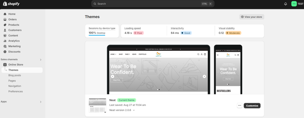
- In your Shopify admin dashboard, navigate to the Online Store section on the left-hand menu and click on Themes.
- Under the Themes section, you’ll see your current active theme. Locate the Customize button next to the theme you are currently using, and click on it. This will open the Shopify Theme Editor, where you can modify various elements of your store’s design.

Step 2: Navigating to the Button Color Settings
Now that you’re in the Shopify Theme Editor, your next step is to find the settings for button colors:
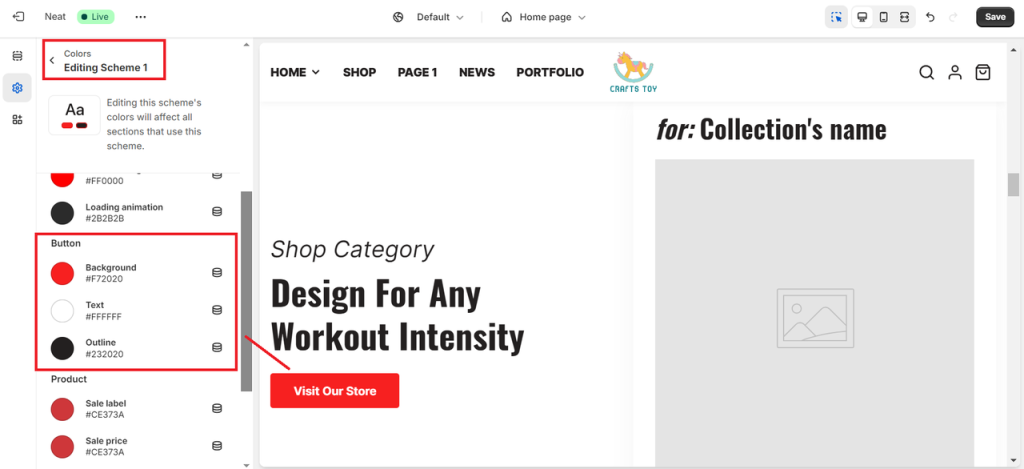
- In the sidebar, look for a section called Theme Settings, usually located at the bottom of the editor’s menu.
- Once inside Theme Settings, locate a section that deals with color customization. This section may be labeled as Colors, and find your color scheme.
- After that, scroll down to the Buttons section. This is where you can change the background color, text color, and outline for buttons across your store.

Step 3: Save or Publish
Once you are finished, be sure to test the changes across devices, check for accessibility, and finalize the design by clicking Save or Publish button to update them.
By following these steps, you can customize your Shopify store’s buttons to align with your brand, improve user interaction, and ultimately enhance the shopping experience.
What to Consider When Choosing the Right Color Palette for Your Shopify Store?
Selecting the ideal color palette for your Shopify store involves more than just picking colors that look good together. You need to consider several factors, such as brand identity, user experience, and the psychological impact of colors. Here are the most important things to consider when choosing button colors:
1. Align with Your Brand’s Color Scheme
Your buttons should harmonize with your overall brand identity. Consistency is key when it comes to branding, as it helps build recognition and trust with your customers. For example, if your brand’s primary color is blue, your buttons should either be a complementary shade of blue or a contrasting color that still fits within your brand’s aesthetic.
If you already have a predefined color palette for your business, make sure your buttons align with it. This will create a cohesive look across your website, packaging, marketing materials, and social media presence.
2. Prioritize Contrast for Maximum Visibility
One of the most critical factors when choosing button colors is ensuring they have enough contrast with the background of your site. Low-contrast buttons can easily get lost in the design, leading to poor click-through rates. High-contrast buttons, on the other hand, stand out and are easier for users to see and interact with.
For example, if your site has a light background (like white or pale gray), choose a dark or bold color for your buttons, such as red, blue, or black. Conversely, if your site has a dark background, light-colored buttons (like white, yellow, or light green) will be more visible.
3. Understand Color Psychology
As discussed earlier, different colors evoke different emotions and actions. When selecting button colors, think about what actions you want users to take and the feelings you want to invoke in them. For instance:
- Use red or orange to create urgency or excitement for a limited-time offer.
- Use green to encourage users to complete a purchase or proceed to checkout.
- Use blue to foster a sense of security and trust, particularly for CTAs related to account creation or newsletter signups.
4. Consider Cultural Perceptions of Color
Colors can have different meanings across various cultures. If your Shopify store serves an international audience, it’s important to take cultural differences into account when choosing button colors. For example:
- In Western cultures, red is often associated with danger or urgency, while in Eastern cultures (like China), red symbolizes luck, prosperity, and happiness.
- White is seen as pure and clean in Western societies, but in some Eastern cultures, it is associated with mourning.
By understanding these cultural nuances, you can make more informed decisions about how to design your CTAs for global customers.
5. Ensure Accessibility
In addition to considering aesthetics and psychological impact, it’s important to make sure your button colors are accessible to all users, including those with visual impairments or color blindness. The Web Content Accessibility Guidelines (WCAG) recommend a minimum contrast ratio between text and background for legibility. You can use online tools, such as Color Contrast Checker, to ensure your button colors meet accessibility standards.
Ensuring accessibility not only improves UX but also helps you reach a wider audience by making your site inclusive for everyone.
6. Test and Optimize for Best Results
After choosing your button colors, it’s essential to test them to see how they perform. Running A/B tests can help you determine which button colors generate the most clicks and conversions. For example, you could test a red button against a green one to see which leads to more completed checkouts.
The key to optimization is continuous testing and refinement. Monitor your button performance and don’t hesitate to make tweaks based on user behavior and feedback.
Final Words,
Button colors are an often overlooked yet highly impactful aspect of your Shopify store’s design. By carefully selecting and customizing your button colors, you can create a more engaging user experience, increase your store’s conversion rates, and reinforce your brand identity. Whether you’re looking to create urgency with bold colors like red or evoke trust with calming hues like blue, understanding the psychology behind colors will help you design buttons that guide users toward taking the actions you want.
In the end, the ideal Shopify custom button colors not only look good but also drive results. Use this guide as a starting point to craft visually appealing and highly functional buttons that enhance your Shopify store’s overall design and performance.
For more step-by-step guidance on customizing your Shopify store and improving overall design performance, explore our collection of Shopify tutorials and guides to continue optimizing every detail of your storefront.

