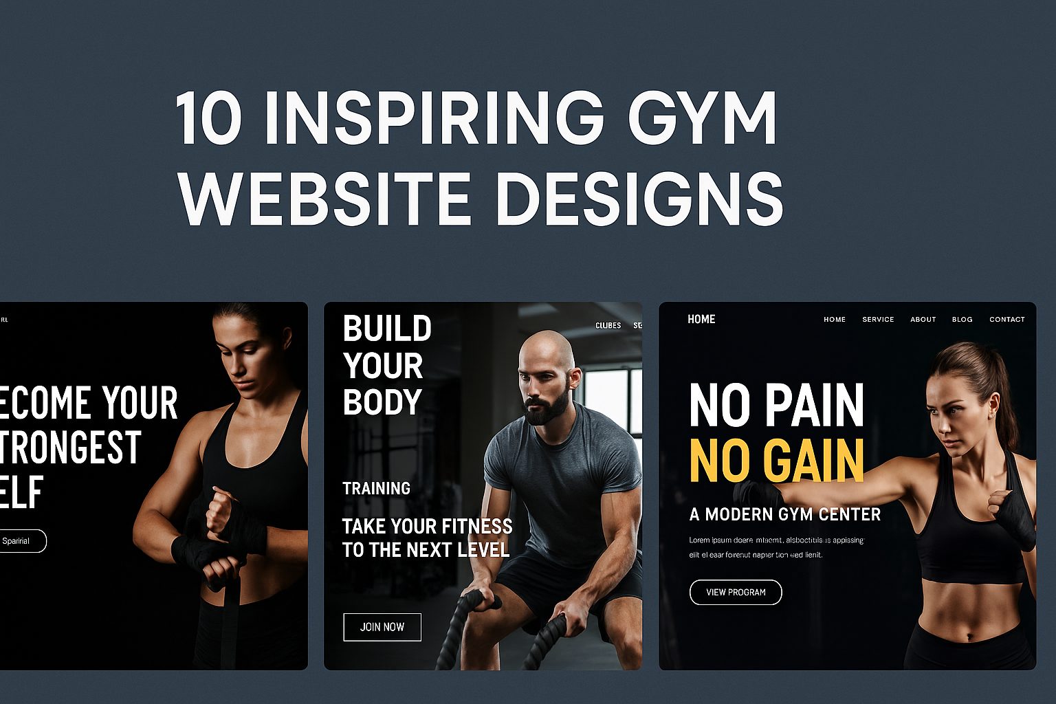
A well-designed gym website can be the difference between gaining a new member and losing them to a competitor. In today’s digital-first world, your website often serves as the first impression of your fitness brand — and it needs to motivate visitors the moment they arrive. A strong design not only reflects your brand’s energy and professionalism but also builds trust, encourages sign-ups, and showcases the unique experience your gym offers.
From bold imagery and smooth navigation to clear calls to action, every element should inspire users to take the next step — whether it’s booking a class, joining a program, or exploring your services. In this article, we’ll explore 10 inspiring gym website design examples that demonstrate how creativity, clarity, and user-focused design can elevate your fitness business and help you connect with your audience more effectively.
Table of Contents
Explore 10 Most Inspiring Gym Website Designs to Learn From
1. Gymshark
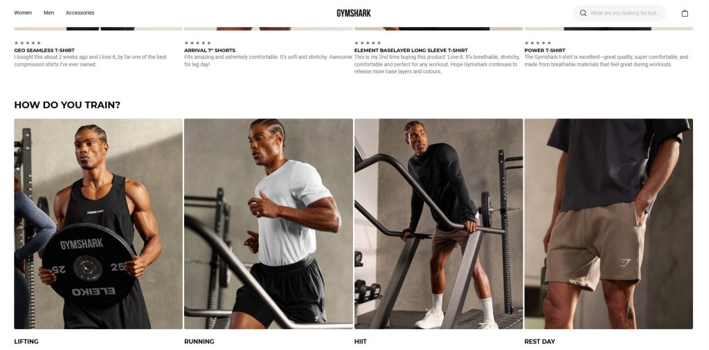
Gymshark is a UK-founded fitness apparel brand (launched in 2012) that has grown into a global phenomenon. Their online storefront is powered by Shopify and has become a benchmark in the fitness apparel e-commerce space.
What stands out:
- The hero section immediately communicates a strong brand identity: large imagery of athletes, minimal clutter, bold “Shop Now” or “New Drop” calls.
- Navigation and category structure are very tight and optimized for conversion: you know quickly where to go.
- They’ve scaled with Shopify to support growth and large traffic volumes, which underscores performance and UX.
What to learn:
- When you land on the site, you should instantly understand who the brand is and what they sell.
- Keep hero area clean + strong CTA above the fold.
- If you anticipate scaling, platform and performance considerations matter early.
2. NOBULL
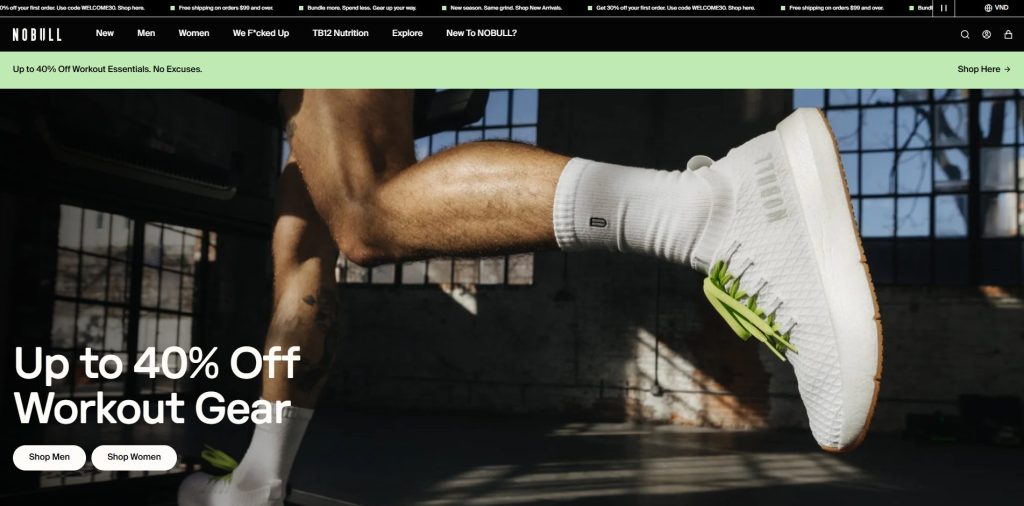
NOBULL is a brand focused on high-performance footwear and training apparel, targeted at committed athletes and those who train hard. Their e-commerce store uses Shopify Plus and emphasizes a no-nonsense aesthetic.
What stands out:
- Design is clean, almost austere: minimal distractions, strong product visuals, brand-tone (“for people who train”).
- Hero imagery and visuals communicate durability, performance, and serious training vibes.
What to learn:
- Align your web design with your brand tone. If your gym/product is “serious”, the visuals and layout should reflect that (dark backgrounds, bold imagery, minimal fluff).
- Feature product visuals in a way that emphasize real use + performance — not just generic lifestyle.
3. Alo Yoga
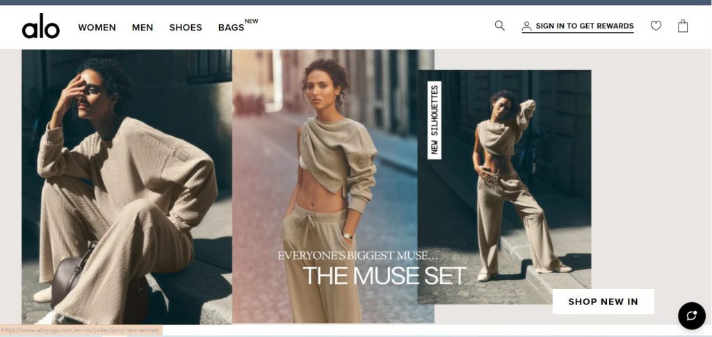
Alo Yoga is a premium athleisure and yoga-apparel brand whose online store is built on Shopify. While more “yoga/lifestyle” than hardcore gym gear, its website’s design is highly polished and offers inspiration for boutique fitness brands.
What stands out:
- High-quality lifestyle photography: the site conveys an aspirational “movement + mindfulness” brand rather than just product listing.
- Premium typography and spacious layout: breathing room, elegance, fewer distractions.
What to learn:
- If your gym or brand position is “premium experience” (studio classes, boutique fitness), then design accordingly: less chaos, more curated visuals.
- Use lifestyle imagery to sell the feeling, not just the gear.
4. Rogue Fitness
Rogue Fitness is a supplier of strength & conditioning equipment (barbells, rigs, etc.). While not purely apparel, their ecommerce site (listed among Shopify fitness stores) is a strong example of high-end fitness gear commerce.
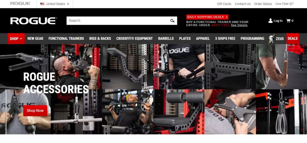
What stands out:
- Product pages include detailed specs, usage visuals, strong functional design rather than purely “style”.
- Navigation supports large catalog of heavy gear, clean categories, performance focus.
What to learn:
- If you sell equipment (not just apparel), your site needs to provide more detail: specs, usage context, trust signals.
- Even large catalogs can work if navigation is well structured and product presentation is strong.
5. REP Fitness
REP Fitness is a U.S.-based company specializing in high-quality strength and conditioning equipment for both home and commercial gyms. Their Shopify-powered store perfectly blends performance, credibility, and modern design.
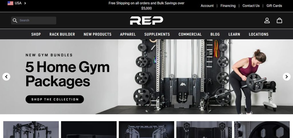
What stands out:
- Clean, neutral design with bold, high-resolution imagery that highlights real gym setups and products in action.
- Well-structured navigation for equipment categories like benches, racks, and bars—clear and intuitive.
- Product pages emphasize trust through specs, videos, and verified reviews.
What to learn:
- For equipment-focused brands, visuals and trust signals matter as much as style.
- Use whitespace and clear typography to emphasize strong product photography.
- Organize by use case (home, commercial, specialty) to improve UX and conversions.
6. York Fitness
York Fitness is a heritage brand with over 80 years in the gym equipment industry, bringing classic reliability to modern e-commerce. Their Shopify website combines familiarity and trust with a clean, accessible layout that makes online shopping effortless. It’s a good example of how long-established brands can modernize their image while maintaining brand recognition and authenticity.
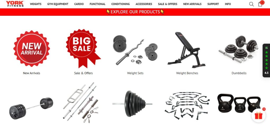
What stands out:
- Straightforward homepage layout with bold product images and promotion banners.
- Category pages and filters make it easy to find treadmills, weights, or benches quickly.
- The red-and-black brand palette reinforces the “gym heritage” feel.
What to learn:
- Simplicity sells: you don’t always need flashy effects to communicate reliability.
- Consistent brand colors and tone create recognition and trust.
- A clear homepage layout helps customers navigate large catalogs more easily.
7. A7 Europe
A7 Europe caters to serious strength athletes, focusing on performance-driven apparel and accessories. Their Shopify store perfectly reflects that ethos—every design choice feels intentional, no fluff. The dark, sleek aesthetic combined with athlete-focused photography creates a disciplined and high-performance brand experience from the moment you land on the page.
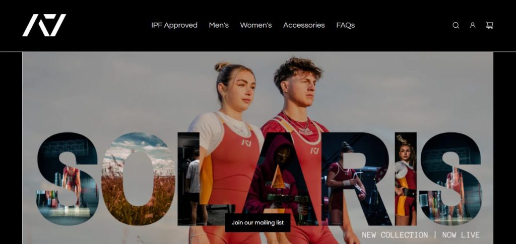
What stands out:
- Dark color palette and clean grid design create a focused, athletic mood.
- Product imagery emphasizes real athletes and community involvement.
- Strong product filtering and intuitive browsing experience.
What to learn:
- Match your visual tone with your audience — serious athletes expect a no-fluff, performance-driven feel.
- Showcase your community; authenticity builds loyalty.
- Keep your grid layout balanced and image-heavy for a professional finish.
8. Gorilla Sports
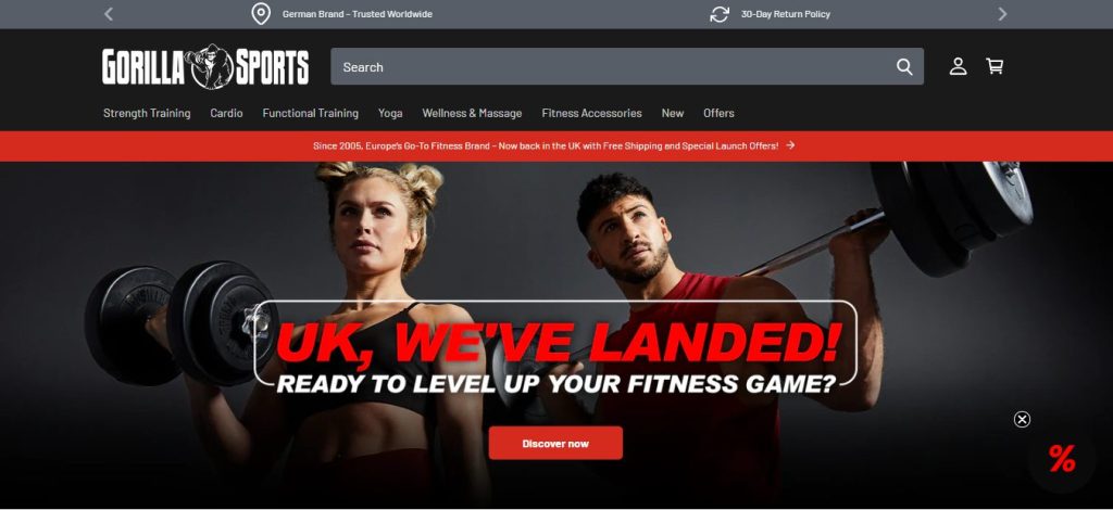
Gorilla Sports offers a massive range of fitness and strength training products designed for both home and commercial use. Their Shopify site radiates energy and motivation through bold visuals and a sense of movement. The brand blends lifestyle photography with a functional layout, ensuring that users stay inspired while being able to shop seamlessly.
What stands out:
- Hero banners use action-driven photography and motivational taglines.
- Strong call-to-actions guide visitors to product categories right away.
- Consistent imagery gives a feeling of movement and intensity.
What to learn:
- Dynamic visuals (people in action) make your brand feel alive and motivational.
- Make sure your CTAs are visible immediately — “Shop Strength Gear” or “Build Your Home Gym.”
- Keep energy high with cohesive, high-contrast imagery and layout rhythm.
9. Ascend Cardio Equipment
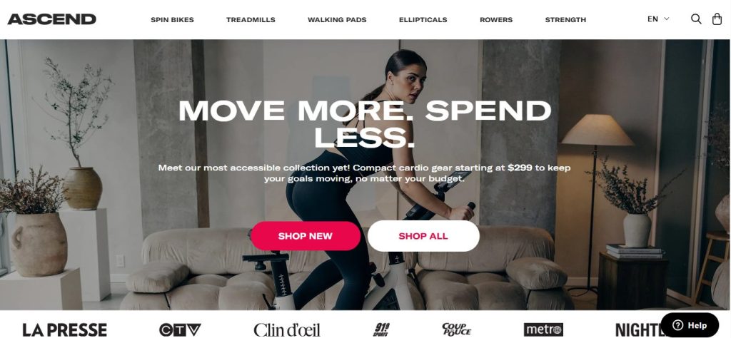
Ascend Cardio Equipment focuses on premium-quality machines that elevate the home training experience. Their Shopify design captures that same premium feel through crisp visuals, minimalist design, and smooth interactivity. Everything from the imagery to the typography feels purposeful—helping the brand position itself as a high-end yet accessible fitness solution.
What stands out:
- Minimalist color scheme and crisp visuals highlight each machine.
- Smooth scrolling and animation effects keep visitors engaged.
- Focus on clear CTAs and strong feature storytelling for each product.
What to learn:
- If you sell premium gear, communicate quality through design clarity and simplicity.
- Use large hero images to emphasize innovation and engineering.
- Don’t clutter your product pages — let visuals and short, impactful copy speak.
10. AKFIT Fitness Supply
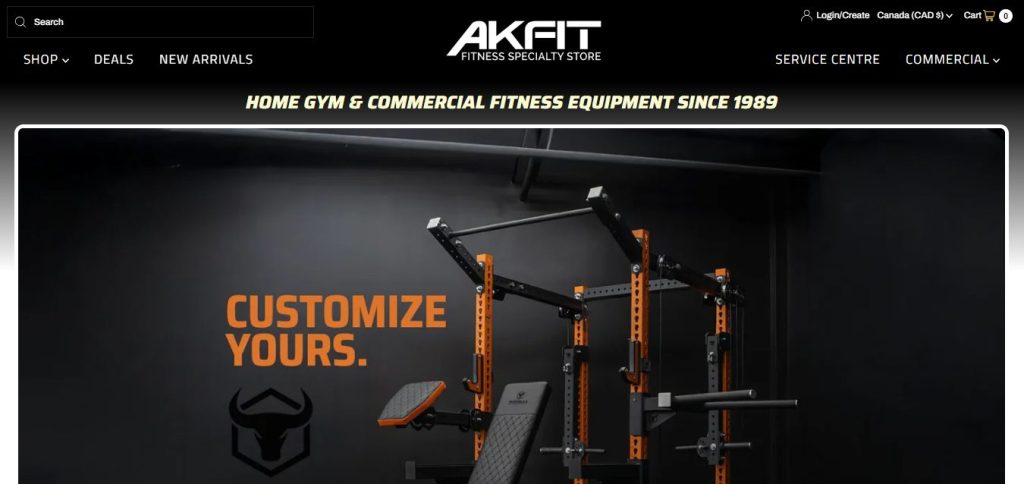
AKFIT is a Canadian retailer that bridges the gap between professional gym suppliers and everyday fitness enthusiasts. Their Shopify website delivers a well-organized, user-friendly experience, showcasing a wide range of strength and cardio equipment. The brand emphasizes trust through testimonials, installation photos, and expert advice—creating a reliable, community-driven shopping environment.
What stands out:
- Practical homepage with top banners for seasonal promotions.
- Good balance between product grids, educational content, and installation showcases.
- High-trust elements like financing options and customer reviews.
What to learn:
- Highlight installation photos to show real-world applications.
- Balance “shop now” elements with helpful information for larger purchases.
- Reinforce trust through guarantees, warranties, and customer support visibility.
Design a Stunning Gym Website That Converts — No Coding Needed
Designing a gym website that truly converts doesn’t have to be complicated. With the right Shopify theme, you can create a professional, high-performing site that motivates visitors to take action. A strong theme brings together eye-catching visuals, easy navigation, and fast performance, helping your brand look as powerful online as it is in real life.
One standout option is the Neat Shopify Theme. It’s designed for visual storytelling and built to help fitness-focused businesses make a strong first impression. With features like media-rich product pages, multi-level menus, and sleek typography, Neat lets you design a stunning gym or fitness gear website — no coding required.
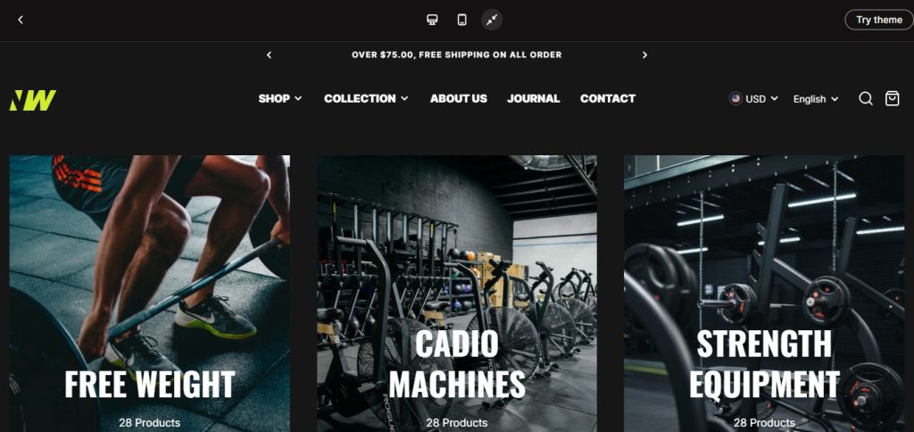
Here’s how you can use Neat to craft a high-impact gym or fitness store that looks great and converts effortlessly:
Hero Section with Action
Use a full-width hero image or video of your gear in use (weights, bands, athletes in motion). Place a headline like “Train Harder. Gear Up Now.” and a clear CTA: “Shop Now”. The Neat theme supports large media blocks and strong visuals to set the tone immediately.
Show Your Product Categories Early
Right below the hero, highlight your main categories: e.g., “Resistance Bands”, “Home Gym Kits”, “Barbells & Plates”. Use icon-style cards or clean visuals so visitors can quickly see your product range. With Neat, you can use sections like “Lookbook” or “Image Collage” to make this visually engaging.
Put Product Media in the Spotlight
For fitness gear, showing product use is key. Choose a theme that supports image stacking, carousels, video, and zooms—Neat includes these. On each product page: include use-case photos, specs (weight, materials, resistance levels), and maybe a short clip of the item being used.
Clean Navigation + Fast Checkout
Make sure customers can easily browse gear, then buy without friction. Use a clear menu (Shop • Gear • New Arrivals • Sale • About • Contact). Make CTA buttons prominent. The Neat theme includes features like “quick buy”, slide-out cart, and sticky header.
Reflect Your Brand Style
Whether your gear is high-performance (heavy weights, CrossFit) or lifestyle-oriented (home workouts, wellness), make your design match. Choose bold contrast and strong images for high-intensity gear, a lighter palette, and elegant imagery for wellness gear. With Neat, you can customize color schemes and layouts to fit your brand.
Optimize for Mobile & Speed
Many shoppers will browse on mobile looking for gear. Ensure your hero media, product galleries, and buttons scale well. Premium themes like Neat are built with responsive design and performance in mind.
Build Trust with Details and Reviews
Show customer reviews, highlight product features, and include videos of real people using your gear. A theme that supports customer testimonials, FAQs, and visual storytelling is helpful. Neat’s version 2.0 added new section types like “Testimonials with product” and “Image tab”.
In Conclusion,
A great gym website is more than just an online presence — it’s the digital extension of your brand’s energy, passion, and commitment to helping people live healthier lives. The best gym websites combine powerful visuals, seamless navigation, and clear calls to action to create an experience that motivates visitors to take the next step, whether that’s signing up, booking a class, or buying gear.
As you’ve seen from these inspiring examples, effective design doesn’t always mean complexity — it’s about clarity, consistency, and emotion. If you’re ready to create a high-impact gym website that looks professional and converts effortlessly, consider using premium Shopify themes. With its clean design, flexible layout options, and performance-focused structure, it gives you everything you need to turn your fitness vision into a sleek, conversion-driven website.

