Driving traffic to your Shopify store is easy, but turning visitors into customers is not. That’s why landing pages matter. A high-converting Shopify landing page delivers one clear message, removes distractions, and guides visitors toward a single action — whether that’s buying, signing up, or learning more.
The fastest way to build pages like that isn’t guessing — it’s learning from what already works.
In this guide, you’ll find 10+ Shopify landing page examples from real use cases, showing how successful stores structure their pages to convert. Use them as blueprints to create landing pages that turn clicks into sales.
Table of Contents
Shopify Landing Page Examples by Use Case (10+ Examples)
1. Single-Product Sales Landing Page – BlendJet
Landing page: https://blendjet.com/
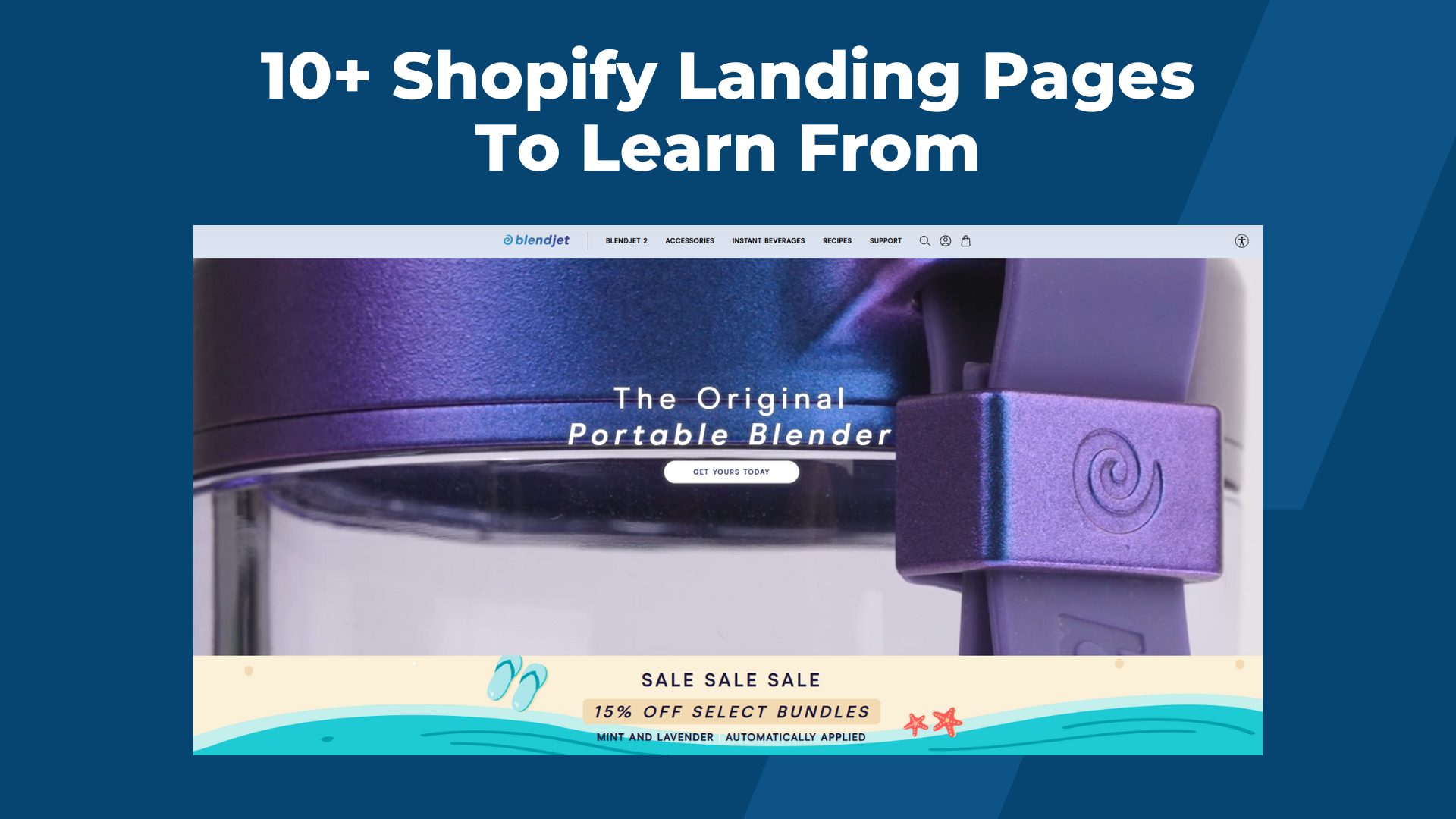
BlendJet is a direct-to-consumer brand best known for its portable, USB-rechargeable blender designed for people who want smoothies, protein shakes, and mixed drinks anywhere. Instead of selling a wide catalog, BlendJet built its business around a single hero product, which makes its landing page strategy extremely focused.
The BlendJet landing page is built entirely around the BlendJet 2 portable blender. From the moment visitors arrive, they see the product in use through bold lifestyle visuals and a clear value proposition that explains what the blender does and why it is different. The page removes all unnecessary distractions and guides visitors through features, benefits, and social proof, all leading toward the same goal – purchasing the product.
Why it converts
- One hero product keeps all attention on a single buying decision
- The value proposition is instantly clear above the fold
- Lifestyle visuals show how the product fits into everyday use
- A consistent “Shop Now” CTA guides visitors forward
- Reviews and press mentions reduce buyer hesitation
2. Paid Ads Landing Page – Ridge
Landing page: https://ridge.com/
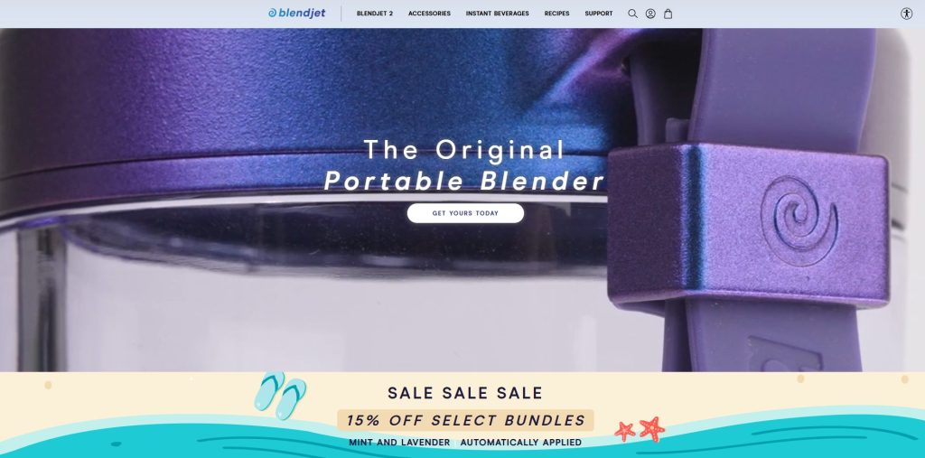
Ridge is a premium everyday-carry brand known for its minimalist metal wallets and durable accessories. The company runs aggressive paid advertising across Facebook, Instagram, and YouTube, which means its landing pages are optimized to convert cold traffic quickly and efficiently.
Ridge’s homepage and category landing pages are designed to receive visitors directly from paid ads. The hero section reinforces the same message used in ads — sleek, durable gear built to last — paired with a clear “Shop Now” call to action. From there, the page flows into product categories and featured items, giving paid visitors just enough choice without overwhelming them.
Why it converts
- Ad traffic lands on a page that matches the same promise and visuals
- The brand’s premium positioning is obvious within seconds
- A clear “Shop Now” CTA creates a simple path to purchase
- Product photography increases perceived quality
- Trust signals (warranty, reviews, shipping) remove friction
3. Product Launch Landing Page – Fishwife
Landing page: https://eatfishwife.com/
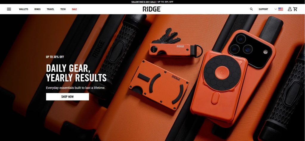
Fishwife is a modern seafood brand known for its playful packaging and limited-edition product drops. Instead of selling everything all the time, the brand regularly releases themed bundles and seasonal products, turning each launch into a small event.
This landing page is built specifically for the Valentine’s Day Gift Pack. The hero section leads with the phrase “Just Dropped”, instantly signaling that this is a new, limited release. The entire visual design — hearts, floating chocolate sardines, and the gift box — is focused on this one product. Rather than showing a full store catalog, the page acts as a campaign hub designed to drive attention and sales toward a single launch.
Why it converts
- Clear launch messaging (“Just Dropped”) creates urgency
- Campaign-specific visuals focus attention on one new product
- One primary “Shop Fishwife” CTA removes distraction
- Seasonal theme (Valentine’s Day) adds emotional relevance
- Limited-edition framing makes the product feel exclusive
4. Lead Generation Landing Page – Sur Coffee
Landing page: Brand Ambassador Signup Page
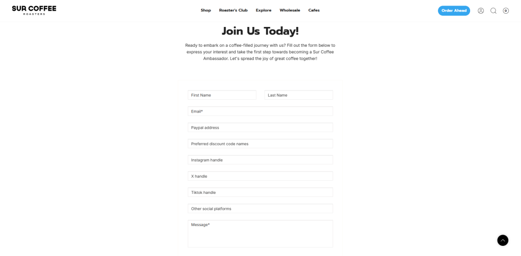
Sur Coffee is a specialty coffee brand that grows through community and advocacy rather than just direct sales. Instead of pushing visitors straight to checkout, the brand uses a dedicated brand ambassador landing page to recruit fans, creators, and repeat customers who can help spread the word.
This landing page is designed to capture high-quality leads, not just email addresses. Visitors are invited to apply to become part of the Sur Coffee ambassador program, with benefits like free products, commissions, and exclusive perks clearly highlighted. The page uses a longer, story-driven layout to explain the opportunity and then guides users to submit their information through an application form.
Why it converts
- The offer is compelling (free coffee, perks, and income opportunities)
- The page targets a specific audience (creators and superfans), not everyone
- A clear explanation of benefits makes the value obvious
- A focused application form creates commitment
- Community positioning builds emotional engagement
5. Limited-Time Promotion Landing Page – Gymshark

Gymshark is one of the most successful Shopify-powered apparel brands, and Black Friday is a critical revenue moment for them each year. During BFCM, Gymshark temporarily replaces its standard homepage experience with a dedicated Black Friday promotion landing page, designed to capture urgency-driven traffic and convert at scale.
The landing page leads with a bold, offer-driven headline centered entirely on Black Friday, immediately signaling a limited-time event. The visual design uses strong contrast, high-impact product imagery, and a simplified layout to direct attention toward the promotion. Instead of telling a brand story or showcasing a full catalog, the page focuses on one objective: push visitors toward discounted collections while the sale is live.
Why it converts
- The offer-first headline makes the value immediately clear
- Black Friday branding creates built-in scarcity and urgency
- Strong visual hierarchy guides attention from headline → product → CTA
- Seasonal takeover replaces normal browsing behavior with sale intent
- Minimal distractions keep users focused on shopping the promotion
6. Pre-Order Landing Page – Fashion Nova
Landing page: https://www.fashionnova.com/collections/coming-soon
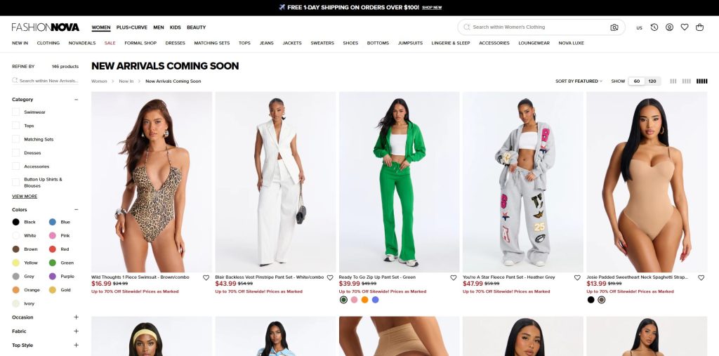
Fashion Nova uses its “New Arrivals Coming Soon” page as a forward-looking merchandising tool rather than a traditional checkout-focused landing page. Instead of hiding unreleased products, the brand openly showcases what’s coming next, giving shoppers early visibility into upcoming styles, trends, and price points.
By presenting unreleased items in a familiar product grid layout, this page lowers the barrier to future purchases. Visitors can explore styles, compare looks, and mentally shortlist favorites before anything is available to buy. This approach keeps demand warm and encourages repeat visits, ensuring shoppers return as soon as the collection officially drops.
Why it converts
- Early exposure to products builds anticipation before release
- “Coming Soon” labeling creates curiosity without pressure
- Full imagery and pricing help shoppers pre-decide
- Familiar shopping layout reduces friction
- Repeat visits increase launch-day conversion likelihood
7. Brand Storytelling Landing Page – Allbirds
Landing page: https://www.allbirds.com/pages/sustainability
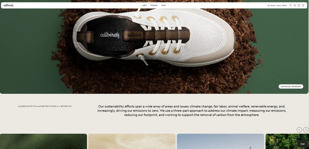
Allbirds uses its brand storytelling landing page to explain why the company exists before asking visitors to buy anything. Instead of leading with products or promotions, the page opens with the brand’s mission around sustainability, transparency, and responsible material sourcing. This immediately frames Allbirds as a purpose-driven brand, not just a footwear retailer.
As visitors scroll, the page unfolds like a narrative. Visuals, data points, and plain-language explanations work together to show how materials are sourced, how carbon footprint is measured, and what actions the brand is taking to reduce environmental impact. The CTAs are intentionally soft — guiding users to explore products or learn more — allowing trust and alignment to form naturally before conversion.
Why it converts
- Purpose-first storytelling builds emotional trust before selling
- Clear, simple language makes complex sustainability topics easy to understand
- Strong visual storytelling reinforces credibility and transparency
- Data and proof points support the brand’s claims
- Soft CTAs invite exploration without pressure
8. Bundle or Upsell Landing Page – Magic Spoon
Landing page: https://magicspoon.com/products/custom-mixed-bundle-6-box
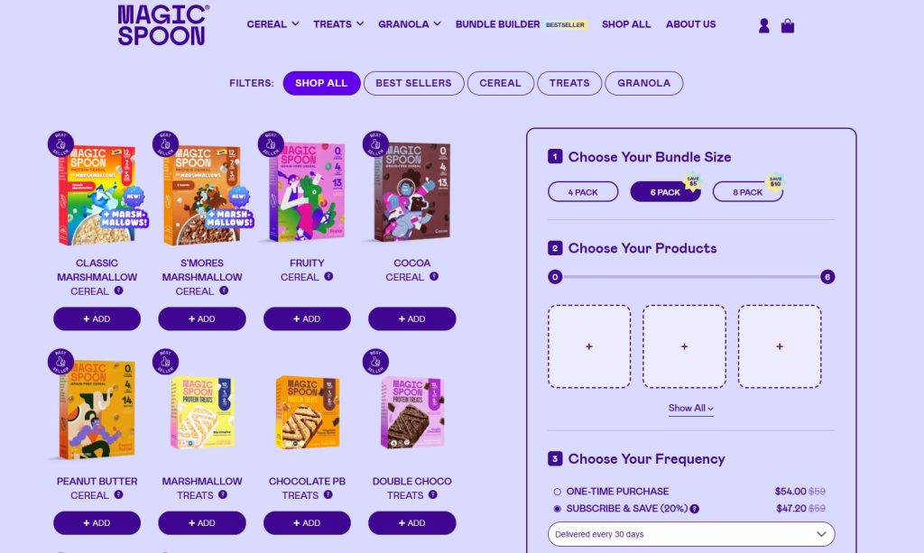
Magic Spoon’s bundle offering page lets visitors customize a 6-box cereal mix from the brand’s best flavors. Instead of buying single boxes one by one, shoppers are guided toward assembling a curated set with a clear value proposition: variety and savings in one purchase. The page opens with high-impact visuals, flavor options, and pricing that highlights the benefit of bundling.
Rather than presenting a full catalog or category grid, the layout stays focused on the bundle itself. Visitors can drag and drop or select flavors, see how the bundle changes in real time, and then add the entire set to cart. This streamlined experience positions the final purchase as the smartest and most convenient choice for first-time and returning customers alike.
Why it converts
- Bundles are positioned as a value play versus individual SKUs
- Visual grouping makes the choice easy and intuitive
- Customization keeps visitors engaged longer before purchase
- Clear pricing reinforces savings from bundling
- One primary CTA pushes the bundle conversion
9. Seasonal Campaign Landing Page – Pura Vida Bracelets
Landing page: https://www.puravidabracelets.com/collections/valentines-day-collection
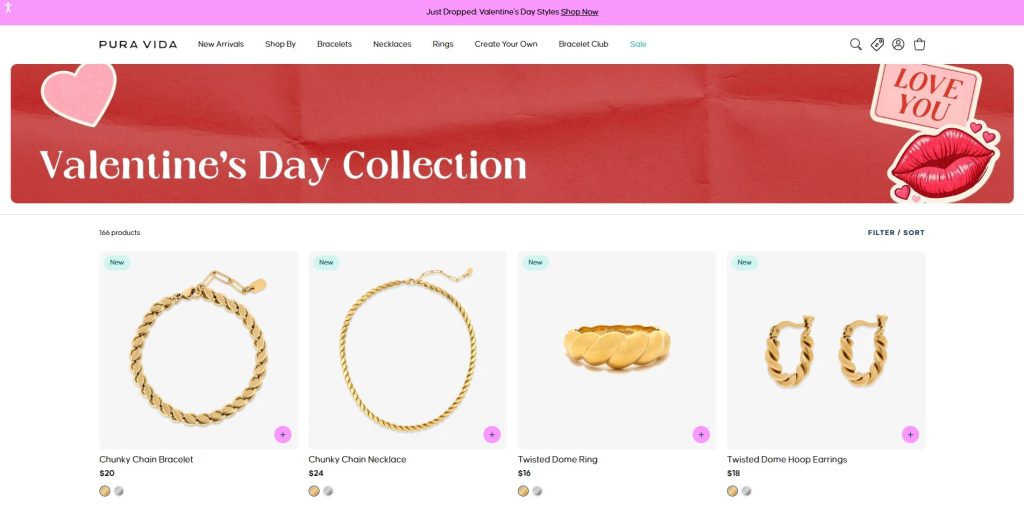
Pura Vida turns its Valentine’s Day Collection into a dedicated seasonal campaign landing page by framing products around a specific occasion rather than a generic category. The hero banner, color palette, and playful Valentine’s visuals immediately signal the moment and intent, helping shoppers understand that this page is curated for gifting and time-sensitive purchases.
Below the hero, the page presents a tightly curated grid of gift-ready items marked as New, allowing visitors to browse quickly without feeling overwhelmed. Filters and sorting remain available, but the emphasis stays on discovery and inspiration—guiding shoppers from seasonal mood to purchase with minimal friction.
Why it converts
- Clear seasonal framing aligns instantly with Valentine’s Day shopping intent
- Themed visuals create emotional relevance and urgency
- Curated selection reduces decision fatigue for gift buyers
- “New” badges reinforce freshness and timeliness
- Familiar collection layout keeps browsing intuitive while focused
10. Collection-Focused Landing Page
Landing page: https://kyliecosmetics.com/collections/kylie-cosmetics-lips-lip-kits
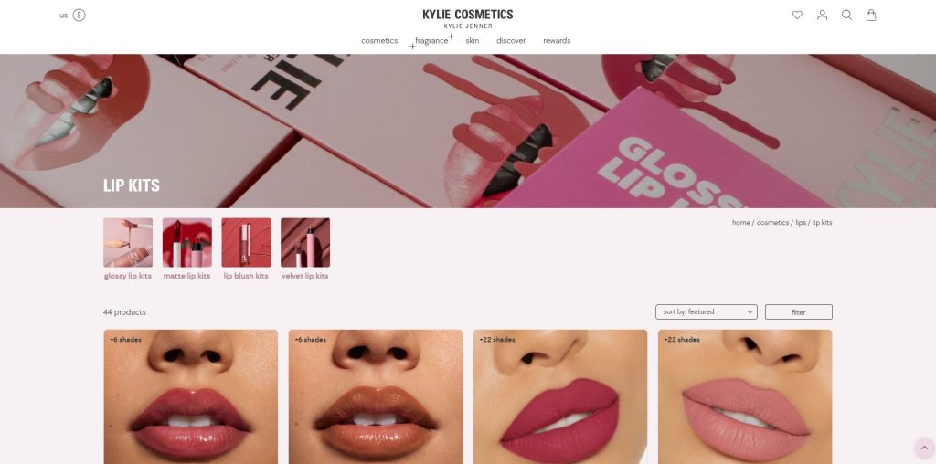
Kylie Cosmetics uses its Lip Kits page as a classic collection-focused landing page designed to help shoppers browse a signature product category efficiently. Instead of pushing a single hero product or promotion, the page clearly frames the category first, then lets users explore variations such as glossy, matte, blush, and velvet lip kits within one focused environment.
The layout prioritizes visual clarity and comparison. Large product images, shade counts, and consistent formatting make it easy for shoppers to scan options and narrow down choices quickly. Filters and sorting tools support deeper exploration, while the collection structure keeps attention on the product category rather than distracting users with unrelated items.
Why it converts
- Strong category focus aligns with high-intent shoppers
- Visual consistency makes shade and finish comparison easy
- Sub-collections reduce overwhelm within a large catalog
- Clear product counts and labels set expectations
- Familiar collection layout supports fast browsing and repeat purchases
Common Layout Patterns Used Across These Landing Page Examples
While the landing pages featured in this article serve different purposes, from product launches to seasonal campaigns, they consistently rely on a small number of proven layout patterns. Understanding these patterns helps you recognize why certain pages convert and how to reuse the same structures across different use cases.
Hero → Benefits → Proof → CTA
This is the most widely used and reliable landing page structure across Shopify stores. The page opens with a strong hero section that clearly communicates the value proposition or campaign message. Immediately after, key benefits explain why the product or offer matters, followed by social proof such as reviews, testimonials, press mentions, or usage stats. The page then reinforces the desired action with a clear, focused CTA.
This pattern works because it mirrors how shoppers make decisions—first understanding what’s being offered, then evaluating its value, and finally looking for reassurance before committing.
Product-First vs. Story-First Layouts
Not all landing pages start in the same place. Product-first layouts lead with visuals, pricing, and direct CTAs, making them ideal for paid traffic, limited-time promotions, and high-intent shoppers who already know what they want. Examples include single-product sales pages and bundle landing pages.
In contrast, story-first layouts prioritize narrative and brand context before introducing products. These layouts are commonly used for brand storytelling, mission-driven brands, or launches that require more education. They build emotional connections and trust first, then guide visitors toward softer conversion points.
Choosing between these two depends on traffic intent rather than design preference.
Minimal vs. Content-Rich Approaches
Some high-converting landing pages are intentionally minimal—removing navigation, reducing copy, and focusing on a single CTA. These pages work best for paid ads and time-sensitive campaigns where distraction hurts conversion.
Others are more content-rich, offering detailed explanations, imagery, FAQs, and multiple sections. These layouts perform well for higher-consideration purchases, pre-orders, or community-driven offers where visitors need more information before converting.
Both approaches can convert effectively when aligned with user intent. The key is not how much content you include, but whether each section moves the visitor closer to the desired action.
How to Create a High-Converting Shopify Landing Page
The fastest way to build a high-converting Shopify landing page is to stop designing from scratch and start turning proven examples into repeatable structures. As you’ve seen throughout the examples in this article, most successful landing pages follow familiar patterns—clear hero messaging, focused CTAs, social proof, and a logical content flow. When these patterns are reused consistently, merchants can launch new landing pages faster while maintaining conversion quality.
This is where section-based layouts become especially powerful. Instead of rebuilding layouts for every campaign, you can assemble landing pages using modular sections—hero banners, feature grids, testimonials, countdowns, bundles, or email capture blocks. Section-based design allows you to swap messaging, visuals, and CTAs without touching code, making it easy to adapt landing pages for product launches, seasonal promotions, paid ads, or collections.
Another key advantage of this approach is speed and consistency. Campaigns change often—Black Friday, Valentine’s Day, product drops, pre-orders—but the underlying structure that converts usually stays the same. With reusable sections, you can duplicate a proven landing page, update content for a new campaign, and publish quickly without sacrificing performance or design coherence.
Use Flexible Shopify Themes and Reusable Sections
To make this workflow practical, you need a Shopify theme that’s built for flexibility rather than rigid page templates. The best landing-page-ready themes support:
- Modular, drag-and-drop sections
- Clean typography and spacing for conversion
- Easy customization without custom code
- Performance-optimized layouts for mobile
On top of that, section apps can extend Shopify’s native editor by adding conversion-focused blocks you can reuse across multiple pages—ideal for merchants running frequent campaigns.
A Practical Solution: BoostifyThemes
BoostifyThemes focuses on building conversion-ready Shopify themes and reusable sections that help merchants create landing pages quickly inside Shopify’s native editor—without relying on heavy page builders or custom development.
Customizable Shopify Themes
BoostifyThemes currently offers several themes designed to suit different industries and landing page needs:
- Purely theme — Ideal for wine, coffee, watches, jewelry stores
Optimized for conversions, Purely works well for premium and detail-oriented products where clarity, trust, and visual polish are critical. It’s especially effective for product-focused landing pages and curated collections.
- Neat theme — Ideal for fashion, razors & barbershop products, outdoor gear, fitness equipment stores
Built for clean merchandising and physical products that benefit from strong visuals and straightforward layouts. It suits brands selling lifestyle gear or equipment where usability and structure matter.
- Noire theme — Ideal for stores selling pet products, home décor, tech gadgets, and baby products
Supports content-rich and visually expressive layouts, making it ideal for brands that need flexibility for storytelling, product education, and category-driven landing pages.
- Strong theme — Ideal for stores offering footwear and beauty products
Designed for bold product presentation and high-impact visuals. With presets like Bend, it supports both fashion-forward footwear stores and beauty brands that rely on visual appeal and campaign-based landing pages.
Besides, you can refer to these free premium Shopify themes to explore more options for building landing pages.
Boostify Sections App
In addition to themes, BoostifyThemes offers Boostify Sections, a 100% free Shopify section app that provides over 100 customizable sections and blocks that will be updated weekly.
With Boostify Sections, merchants can:
- Add landing-page-ready sections (hero, benefits, testimonials, bundles, CTAs, countdowns) to any page
- Reuse high-performing sections across multiple campaigns
- Build and update landing pages quickly without coding
This section-based approach makes it easy to recreate proven landing page structures—such as product launches, seasonal campaigns, or bundle pages—directly inside Shopify’s editor.
Final Checklist Before Launching Your Shopify Landing Page
High-converting Shopify landing pages are built by combining proven layouts with clear messaging, focused CTAs, and solid performance fundamentals. When these elements are aligned, landing pages become easier to launch, test, and scale across different campaigns.
Solutions like BoostifyThemes, with its section-based Shopify themes and Boostify Sections app, allow merchants to recreate high-converting landing page structures directly inside Shopify’s editor, without rebuilding pages from scratch.
By pairing the examples in this guide with the right tools, you can turn inspiration into execution and consistently launch landing pages that drive real results.