If you are starting a clothing brand, your logo is one of the first things customers will judge. It is not just a symbol; it communicates your style, price level, and identity in seconds. A clean minimalist wordmark can feel premium, while a bold streetwear logo can instantly signal energy and attitude.
In this article, we suggest 20 clothing brand logo ideas across different styles, from luxury and vintage to sporty and eco-friendly. More importantly, you will learn how to apply your chosen logo to your Shopify branding, including the right font pairing, color choices, and layout, so your store looks consistent and professional.
Table of Contents
Why Your Clothing Brand Logo Matters for Shopify Success
First impressions
logo = trust + positioning
When someone lands on your Shopify clothing store, they instantly decide whether your brand feels “legit” or not. Your logo plays a big role in that first impression because it signals professionalism and helps customers understand your brand positioning. For example, a clean wordmark with wide spacing often feels premium, while a bold graphic logo can feel youthful and streetwear-focused.
A strong logo also makes your brand easier to remember. In a competitive clothing market, being memorable helps customers come back and recognize you across platforms like Instagram, TikTok, and Google Shopping.
How logos influence conversion
Fashion shoppers buy with their eyes
Fashion is visual. Customers rarely buy clothing purely based on logic, they buy because the product looks good and the brand feels right. A well-designed logo supports this by making the entire store look more consistent and higher quality.
If your logo looks amateur, shoppers may assume the clothing quality is also low, even if your products are great. On Shopify, where customers cannot touch the fabric, your branding becomes a “replacement” for physical trust. A polished logo can increase perceived value, strengthen confidence, and improve conversion rate.
Quick Checklist Before Choosing a Clothing Brand Logo
Target audience (streetwear vs luxury vs casual)
Before you choose a logo style, define what type of customers you want to attract. Each audience expects a different visual language:
- Streetwear: bold typography, strong icons, high contrast, edgy vibe
- Luxury: minimalist wordmarks, serif fonts, clean spacing, premium simplicity. You may be interested in exploring the top luxury clothing brand name ideas.
- Casual/everyday wear: friendly fonts, soft icons, approachable style
If your logo style does not match audience expectations, your store will feel confusing. Even if the products are good, customers may feel that “something is off” and leave.
Logo readability (small icons, mobile header)
Most Shopify traffic is mobile, so your logo must stay clear at small sizes. Many logos look fine on a desktop banner but become unreadable in a mobile header.
Checklist to test readability:
- Can you still read the brand name when the logo is small?
- Does it stay clear in a sticky header?
- Is it easy to recognize the Instagram profile picture size?
A logo that is simple and readable will always perform better for e-commerce.
Logo versatility (favicon, labels, social profile)
Your logo needs to work across multiple brand touchpoints, not just your homepage. The best clothing logos are flexible and come in several versions:
- Primary logo (full brand name)
- Icon/monogram (for favicon and social profile)
- Black & white version (for printing and packaging)
- Transparent version (for Shopify overlays and banners)
This versatility ensures your branding stays consistent everywhere, helping customers trust the brand and recognize it faster.
20+ Clothing Brand Logo Ideas (By Style)
Below are 20 proven logo directions used by successful clothing brands. For each idea, I’ll explain what it looks like, who it’s best for, and how to apply it on Shopify.
Minimal wordmark logos (clean + modern)
1. Ultra-minimal lowercase wordmark

Look & feel: clean, calm, modern, premium basics
Best for: minimalist clothing, capsule wardrobe, neutral fashion
How to execute well:
- Use a geometric sans-serif font
- Keep the logo thin-medium weight
- Avoid extra design elements
- Pair with white-space-heavy layout + simple product grid.
2. Bold uppercase sans-serif wordmark
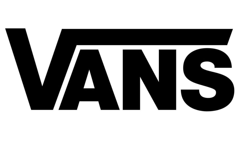
Look & feel: confident, strong, high visibility
Best for: unisex brands, streetwear-lite, everyday basics
How to execute well:
- Use uppercase letters
- Avoid fancy fonts, focus on weight
- keep clean edges (no outline effects)
- Work great for header + sticky nav because it stays readable on mobile.
3. Split-letter wordmark (creative cut typography)
Look & feel: designer, modern, memorable
Best for: fashion-forward brands, modern womenswear, trendy labels
How to execute well:
- add 1 unique detail only (e.g., a cut in the “A” or “E”)
- keep everything else simple
- Match with strong editorial photography and minimal UI.
Monogram logos (2–3 letters, premium vibe)
4. Interlocking initials monogram
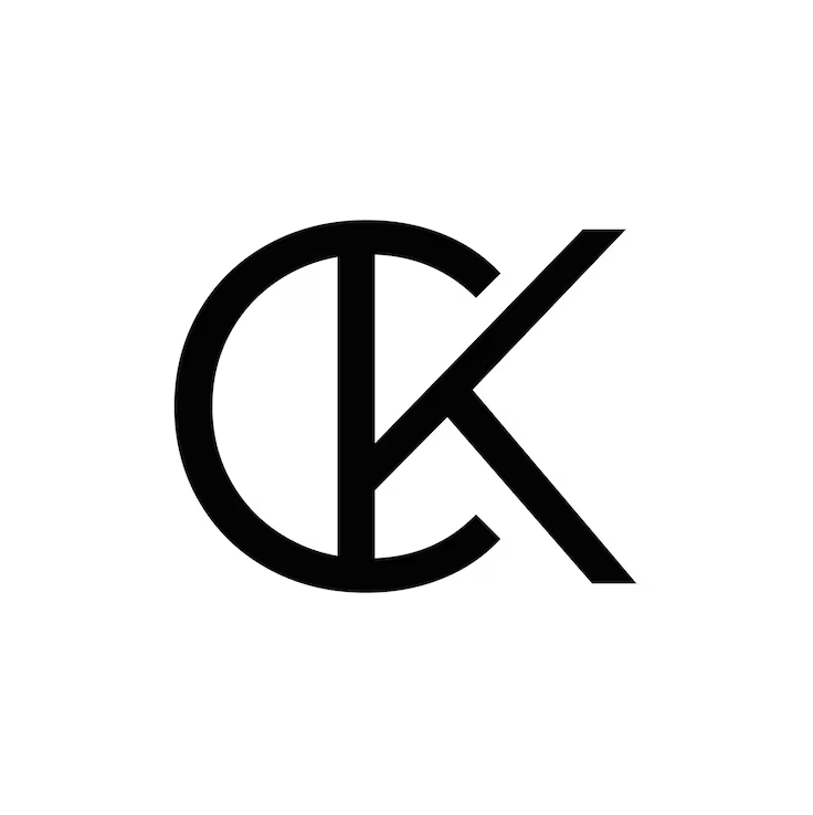
Look & feel: luxury boutique, premium identity
Best for: high-end fashion, tailored clothing, designer labels
How to execute well:
- Use 2 initials (AB, MT, etc.)
- Keep symmetry and balance
- Avoid complex curves
- Monogram is perfect for favicon + product image watermark.
5. Circular monogram badge
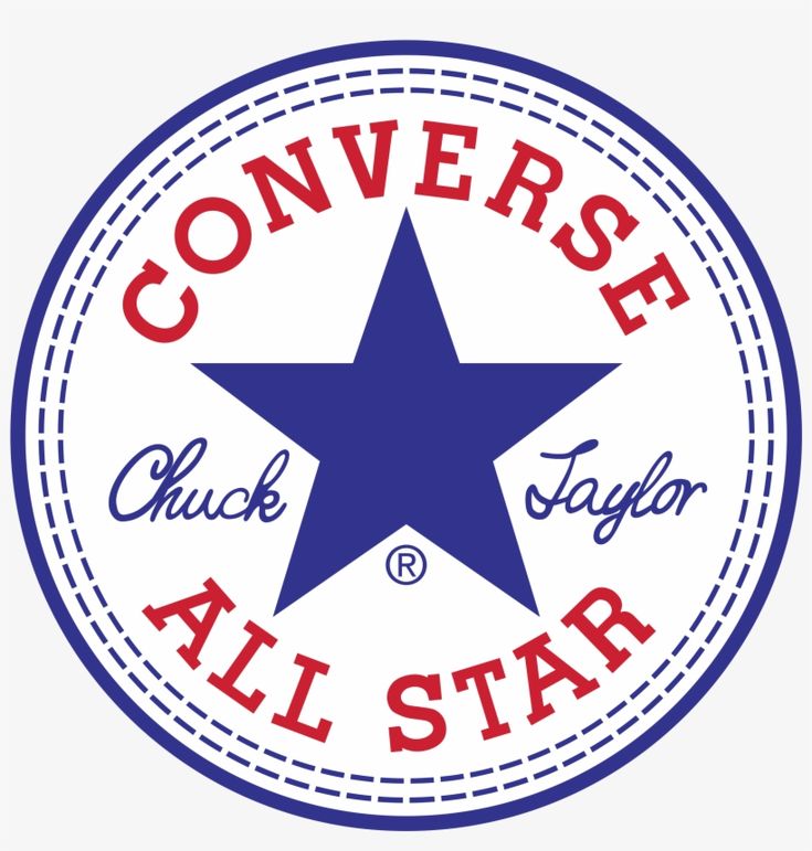
Look & feel: premium seal, classy and official
Best for: boutique brands, handmade premium, heritage style
How to execute well:
- Initials in center, brand name around circle
- Include small separators (dots or tiny lines)
- Use this badge for “About”, packaging, footer signature.
6. One-letter monogram icon

Look & feel: quiet luxury, modern minimal premium
Best for: minimal luxury, “clean girl” aesthetic fashion
How to execute well:
- Use 1 letter (usually the first letter of the brand name)
- Make it a custom shape (not default font)
- Ideal for a mobile header with limited space.
Symbol/icon logos (simple shapes)
7. Abstract geometric icon
Look & feel: modern brand identity, scalable
Best for: contemporary brands, tech-fashion, futuristic minimal
How to execute well:
- Use simple geometry (triangle, circle, lines)
- Aim for a “mark” that looks good, embroidered
- Geometric icons look great as section dividers & badges.
8. Minimal animal silhouette logo

Look & feel: bold, iconic, recognisable
Best for: menswear, outdoor clothing, sporty brands
How to execute well:
- Pick 1 animal only
- Simplify to 1-color silhouette
- Work well for product tags, social profile image.
Streetwear logo ideas (bold, sporty, edgy)
9. Street badge/stamp logo
Look & feel: bold, gritty, merch-ready
Best for: streetwear, skatewear, dropshipping street tees
How to execute well:
- Round badge with bold font
- Slightly “rough” texture optional
- Badge logos are perfect for big hero banners (impact).
10. Graffiti/brush typography logo

Look & feel: rebellious, expressive, youthful
Best for: edgy Gen Z fashion, street collections
How to execute well:
- Must be readable even in a messy style
- Avoid extreme thin strokes
- Use dark backgrounds + strong contrast buttons.
11. Sports-inspired emblem logo (shield style)
Look & feel: strong identity, competitive/athletic
Best for: active streetwear, gym/street hybrid brands
How to execute well:
- Shield + initials + small icon (bolt/star)
- Keep it symmetrical
- Emblem logos work great on hats, hoodies, and labels.
Luxury clothing logo ideas (thin serif, spacing)
12. Thin serif luxury wordmark
Look & feel: expensive, elegant, high-end
Best for: women’s fashion, boutique luxury, formalwear
How to execute well:
- Thin serif font
- Large letter spacing
- No extra icon needed
- Pair with clean product pages and minimal popups.
13. Serif wordmark with tiny icon accent
Look & feel: premium but unique
Best for: luxury boutique that wants a signature detail
How to execute well:
- Add one tiny icon (star/dot/diamond)
- Keep extremely subtle
- This tiny icon can become your “brand pattern” in sections.
Vintage/retro clothing brand logo ideas
14. Retro “Since XXXX” badge logo

Look & feel: classic heritage, authentic
Best for: denim, outdoor clothing, vintage tee brands
How to execute well:
- Curved text + “since”
- Simple border
- Place “since” badge on About section + footer.
15. Script + serif combo logo
Look & feel: boutique, handcrafted heritage
Best for: women’s boutique, handmade clothing brands
How to execute well:
- Serif for brand name
- Script for tagline OR “atelier”
- Work well with warm pastel colors.
Handmade/boutique logo ideas
16. Handwritten signature logo
Look & feel: personal, artistic, exclusive
Best for: handmade, custom tailoring, local studios
How to execute well:
- Look best in black/white
- Avoid messy handwriting, keep elegant
- Use it on product pages like “Designed by…” signature.
17. Botanical line icon logo

Look & feel: delicate, feminine, organic
Best for: eco boutique, linen brands, handmade womenswear
How to execute well:
- Single-line drawing
- Keep icon simple (leaf/flower)
- Pair with natural colors (beige, olive, cream).
Sport/activewear logo ideas
18. Dynamic icon (bolt/wave/mountain)
Look & feel: energy, movement, performance
Best for: gymwear, running, outdoor brands
How to execute well:
- Make icon sharp and bold
- Avoid too many lines
- Use bold product labels like “performance fabric”, “quick dry”.
Kids clothing logo ideas
19. Rounded playful typography
Look & feel: friendly, safe, warm
Best for: kidswear, babywear, family brands
How to execute well:
- Round corners font
- Small cute icon (sun, bear)
- Use large buttons + bright accent color in store UI.
Sustainable / eco clothing logo ideas
20. Eco mark (leaf icon + clean wordmark)

Look & feel: responsible, clean, modern natural
Best for: sustainable brands, organic cotton, ethical fashion
How to execute well:
- Simple leaf icon (1 shape, not detailed)
- Neutral/green palette
- Add badges like “Sustainable fabrics” and “Plastic-free packaging”.
What Makes Clothing Brand Logo Ideas Look Expensive
Luxury logos are rarely complicated. In fact, the most “expensive-looking” clothing brand logos usually follow a few strict visual rules: clean typography, controlled spacing, and minimal design choices that feel intentional. If your goal is to make your Shopify store look premium (even if you are not a luxury brand yet), these principles will instantly elevate your brand identity.
Typography rules (serif vs sans)
Typography is the foundation of luxury branding. Before adding icons or details, focus on choosing the right font style because it sets the tone immediately.
Serif logos (classic luxury) Serif fonts often feel elegant, high-end, and timeless, especially for women’s fashion or boutique brands. They also work well for “quiet luxury” branding when paired with minimal layouts and neutral palettes.
Best for:
- luxury fashion
- boutique clothing
- premium handmade brands
Sans-serif logos (modern luxury) Sans-serif fonts can also look luxurious, but the difference is in the execution: clean geometry, balanced proportions, and usually wider spacing. This is best for modern brands with a minimalist premium vibe.
Best for:
- modern premium streetwear
- minimalist basics
- unisex fashion labels
Pro tip: Avoid overly decorative fonts. Luxury logos usually look expensive because they are simple and confident, not because they are complex.
Spacing and minimalism
If typography is the “voice” of your logo, spacing is what makes it feel premium. Many luxury brand logos are just wordmarks, but they look expensive because:
- Letter spacing is carefully adjusted (not too tight)
- The logo has room to breathe
- There is no unnecessary outline, shadow, or gradient
- The design stays readable at small sizes (mobile header, favicon)
A luxury rule to remember: If your logo needs extra effects to look good, it probably is not premium enough yet.
For Shopify specifically, minimal logos also have a big advantage: they work perfectly with clean headers, sticky navigation, product grids, and white backgrounds, which are common in fashion ecommerce.
Choosing a “quiet luxury” icon
Most expensive-looking clothing brands use either no icon or a very subtle icon. The goal of a luxury icon is not to decorate, but to create a recognizable mark that feels exclusive.
Here are quiet luxury icon styles that work best:
- Monogram icon (initials in a clean shape)
- Simple geometric symbol (circle, square, triangle, lines)
- Minimal crest/badge (very clean, not detailed)
- Tiny signature mark (small symbol near the wordmark)
Tip for e-commerce: Make sure the icon still looks clear in small sizes, because it will often appear as:
- Shopify favicon
- social profile picture
- watermark on product photos
- packaging label/tag
A “quiet luxury” icon should feel like a high-end stamp, not a graphic illustration.
How to Apply Your Logo to Shopify Store Branding (Step-by-Step)
Once you’ve chosen a logo style for your clothing brand, the next step is applying it correctly across your Shopify store. From placement and sizing to fonts and colors, these details shape how professional and consistent your branding looks. Many streetwear Shopify themes are designed to highlight logos clearly in headers and navigation areas, making it easier to present your brand with impact.
Follow the step-by-step guide below to ensure your logo looks great on every device and page.
Where to Place Your Logo
Shopify themes usually handle placement automatically, but you should ensure consistency across these three key areas:
- Main Header: Typically centered or left-aligned. This is your brand’s “home base.”
- Mobile Menu: Space is limited here. If your logo is wide, consider using just your logomark (the icon) to save vertical space.
- Sticky Header: This is the menu that follows you as you scroll. Ensure the logo scales down so it doesn’t eat up half the screen.
Best Logo Sizes for Shopify
If your logo is too big, your site will load slowly; too small, and it looks blurry.
| Device Type | Recommended Width | Recommended Format |
| Desktop | 200px – 250px | Transparent PNG or SVG |
| Mobile | 120px – 150px | Transparent PNG |
| Favicon | 32x32px | .png or .ico |
Pro Tip: Use a transparent background (PNG) so your logo doesn’t sit inside a clunky white box.
Step-by-Step: Adding Your Logo
To get started, log into your Shopify Admin and follow these steps:
- Go to Online Store > Themes.
- Click the Customize button on your active theme.
- In the sidebar, click the Gear Icon (Theme Settings).
- Select Logo.
- Upload your file and adjust the Desktop logo width slider until it looks balanced.
Adding the Favicon & Checkout Logo
The favicon is the tiny icon in the browser tab. It’s a huge “pro” signal for your brand.
- Favicon: Still in Theme Settings, look for the Favicon section and upload a simplified version of your logo (usually just the icon).
- Checkout: Scroll down to the Checkout section in Theme Settings. You can upload a specific logo here to ensure customers feel secure while paying.
Match Fonts with Your Logo Style
Your store’s typography should feel like a family member to your logo, not a distant stranger.
- Minimalist Logo: Pair with clean Sans-Serif fonts (e.g., Montserrat, Helvetica).
- Elegant/Luxury Logo: Use a Serif font for headings (e.g., Playfair Display, Lora).
- Bold/Modern Logo: Go for heavy, geometric fonts (e.g., Roboto, Lato).
Sync Your Color Palette
Your logo should dictate the color “hierarchy” of your site. Use the 60-30-10 Rule:
- 60% Neutral (Primary): Your background and whitespace (usually white or light grey).
- 30% Secondary: Found in your logo. Use this for banners and subheadings.
- 10% Accent: Your boldest logo color. Use this only for Call-to-Action (CTA) buttons like “Add to Cart.”
Common Logo Mistakes Shopify Clothing Brands Make
Even great clothing brands can struggle if their logo design is poorly executed. A logo should look good not only on a design board but also across your Shopify store, product tags, and social media. Below are the most common mistakes that can hurt branding and conversions.
Overcomplicating the design
Many new brands try to include too many elements in one logo, such as icons, shadows, gradients, and decorative fonts. While it may look creative at first, complex logos often become hard to read at small sizes and feel unprofessional on mobile screens.
A clean and simple logo always performs better for e-commerce because it loads faster, scales well, and looks premium across all platforms.
Choosing trendy fonts that age quickly
Trendy fonts may look stylish today, but can feel outdated within a year or two. Clothing brands that rely heavily on short-term trends often have to redesign their logos frequently, which hurts brand recognition.
Instead, focus on timeless typography such as clean sans-serif fonts, elegant serifs, or subtle script accents that can last for many years.
Poor readability on mobile devices
Since most Shopify shoppers browse on their phones, your logo must stay clear at small sizes. A logo that looks great on desktop but becomes blurry or unreadable on mobile will weaken your brand impression.
Always test your logo in:
- Mobile header
- Sticky navigation
- Favicon size
- Social profile image
If it’s hard to read in these formats, it needs simplification.
Using too many colors
Using many bright colors can make a logo look messy and cheap. High-end clothing brands usually stick to one main color plus neutrals like black, white, or beige.
A limited color palette:
- looks more professional
- makes branding consistent
- improves store design cohesion
You can always use color in banners and product images instead of the logo itself.
Copying famous fashion logos too closely
It’s tempting to mimic luxury brands like Chanel, Dior, or Gucci, but copying their style too closely can make your brand feel unoriginal or even cause legal issues.
Use inspiration wisely:
- study layout, spacing, and simplicity
- create your own unique mark
Your logo should feel premium, but still be distinct
Ignoring how the logo works across branding
Some logos look nice alone, but fail when applied to:
- product labels
- packaging
- website header
- social media
A strong clothing brand logo should work in:
- color and black & white
- large and small sizes
- horizontal and square formats
If it only works in one layout, it will limit your branding potential.
A strong logo works best when paired with a unique and memorable brand name. If you’re still searching for the perfect name for your clothing business, explore our list of T-shirt business name ideas for inspiration.
FAQs for Shopify Clothing Brand Logo Ideas
1. What type of logo works best for a clothing brand on Shopify?
The best logos for Shopify clothing brands are usually simple wordmarks, monograms, or clean icon logos. These styles scale well on mobile, look professional in headers, and work easily across product tags, social media, and packaging.
Minimal designs tend to convert better because they feel more premium and trustworthy.
2. Should a clothing brand use a logo with an icon or just text?
Both can work well, but many successful fashion brands start with a text-based wordmark and later add a small icon or monogram.
Text-only logos:
- Look clean and modern
- Are easier to read on mobile
Logo + icon combinations:
- Are great for branding patterns
- Work well as favicons and labels
A good approach is to have both versions.
3. What logo size is best for a Shopify store header?
For most free premium Shopify themes, a good logo height is:
- Desktop: 40–60px
- Mobile: 28–40px
Always upload your logo in high resolution (PNG or SVG) and test it on both desktop and mobile to ensure it stays sharp and readable.
4. Can I use a free logo maker for my clothing brand?
Yes, many new clothing brands start with free or low-cost logo tools. However, be careful with:
- generic icons
- overused templates
If possible, customize fonts and spacing to make your logo unique. A simple, customized logo usually looks more premium than a complex template design.
You can refer to this free Shopify logo maker.
5. How do I match my logo with my Shopify store design?
Start by building your store’s fonts and color palette around your logo:
- Use similar font styles across headings and buttons
- Pick 1–2 main brand colors from the logo
- Keep layouts clean to let the logo stand out
Consistency between logo, colors, and layout makes your store look professional and increases trust.
In Conclusion,
Choosing the right clothing brand logo style is the first step in building a strong Shopify store. Whether you prefer a minimalist wordmark, a luxury serif logo, or a bold streetwear emblem, keeping your design simple and consistent will help your brand look professional and trustworthy.
Once you’ve found a logo style that fits your brand, the next step is creating a Shopify store design that matches it. Explore these Shopify fashion themes to discover flexible layouts, multiple style presets, and feature-rich sections designed to showcase clothing products beautifully and boost conversions.

