Your Shopify product page is where a sale is won or lost. A shopper lands, scans for a few seconds, and decides if your store feels safe enough to hand over a credit card.
That decision is mostly about trust, not price.
Baymard Institute found that 19% of shoppers abandon a purchase because they do not trust the site with their card details. That is one in five buyers walking away, even after they liked the product.
This guide breaks down the 12 trust signals that fix that. Each one is backed by data, easy to add, and shows you exactly where to place it. We also cover mobile, page speed, and what to track, so you can measure the lift.
Table of Contents
Why Trust Signals Matter More Than You Think
The average Shopify store converts around 1.4% to 1.8% of visitors, based on 2026 benchmark data from Littledata and IRP Commerce. A good conversion rate is typically 2.5% to 3.5%, while the top-performing 20% of stores achieve 3.2% or higher. That gap is rarely caused by the product itself. More often, it comes down to trust, speed, and clarity throughout the shopping experience.
Here’s the math: if your product page receives 10,000 visitors per month and your average order value is $60, increasing your conversion rate from 1.8% to 2.7% would generate an additional $5,400 in monthly revenue—without spending a dollar more on ads. Trust signals are one of the simplest and most cost-effective ways to help close that gap.
What Is a Trust Signal on a Product Page?
A trust signal is any element that answers a silent question in the shopper’s head: “Can I trust this store, and this product?” They fall into a few groups:
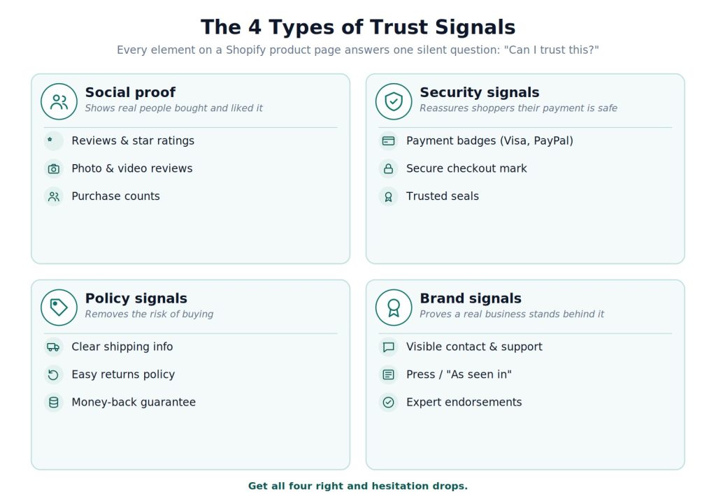
- Social proof like reviews, ratings, and photos
- Security signals like payment badges and secure checkout marks
- Policy signals like shipping, returns, and guarantees
- Brand signals like contact info, press mentions, and endorsements
Get these right and hesitation drops. Pages with all the core trust elements convert far better than pages missing them. Let’s go through all 12.
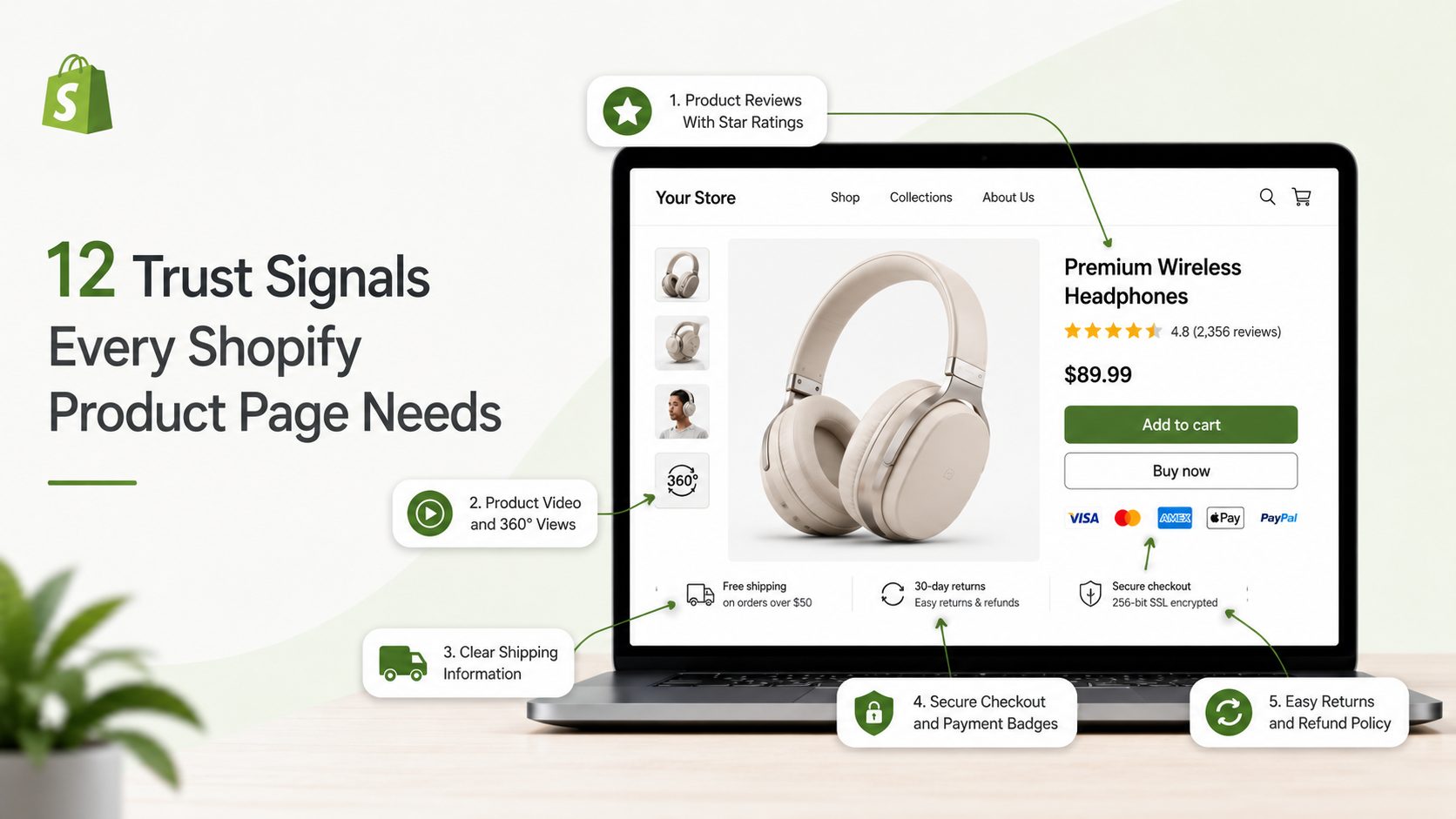
12 Trust Signals Every High-Converting Shopify Product Page in 2026
1. Product Reviews With Star Ratings
Reviews are the number one trust signal on any product page. Full stop.
Shoppers trust other shoppers far more than they trust your product copy. A page with reviews simply outperforms a page without them.
Why it works:
- 93% of shoppers read reviews before buying
- Products with 10+ reviews can convert 52% higher
- Star ratings shown near the title can lift click-through by around 15%
The realistic-rating rule: A product with 50+ reviews at 4.3 stars often beats an identical product with 5 reviews at a perfect 5.0. Buyers trust volume and honesty more than flawless scores. So do not chase a fake 5.0.
Where to put it:
- Show the star rating above the fold next to the title, and make it clickable so it jumps straight to the full reviews
- Surface 3 to 5 highlighted reviews mid-page, and display the review count even if small. “12 reviews” beats nothing
- Never delete bad reviews. A few honest negatives with a professional reply build more trust than a wall of 5 stars
Quick win: Collect reviews with a simple post-purchase email sent 7 to 14 days after delivery. A tool like Yuko can automate that request so it goes out after every order without manual chasing.
2. Photo and Video Reviews
A text review says the product is good. A customer photo proves it. Real photos from real buyers remove doubt in a way studio shots cannot, showing the product in a real home, on a real person, in real light.
- Photo reviews are roughly 6x more influential than text-only reviews, and customer photos often convert better than professional product shots
- They answer the silent question: “Will it actually look like this when it arrives?”
- Pull customer photos into a gallery inside the reviews block, flag reviews that include images, and offer a small discount to nudge buyers to upload a photo
3. Product Video and 360° Views
Video is the closest a shopper gets to holding your product. It shows texture, scale, and how the thing actually works.
- A short 30 to 60-second demo can lift conversion by 10% to 30% on pages where it is added
- It matters most when texture, fit, or assembly is hard to judge from a photo; 360° spin views work well for furniture, shoes, and accessories
- Add a clear play button on the main image, near the top where doubt is highest. Do not auto-play with sound, and show real use, not a glossy ad
4. Secure Checkout and Payment Badges
Shoppers do not know what “SSL” means. But they feel safer when they see a padlock or a brand they recognize, and security fear is a top reason carts get abandoned.
- Baymard found 19% of shoppers abandon over card-security worries; a recognizable seal (Norton, a padlock) raises perceived safety
- Familiar payment logos like Visa, Mastercard, PayPal, and Shop Pay signal “this is a real business”
- Put payment logos in the footer so they show site-wide, and a small “Secure Checkout” mark beside the Add to Cart button
- Keep it clean. Two to four badges beat a cluttered row of ten, and never fake a seal you have not earned. Shoppers and Google both punish it
5. Clear Shipping Information
The number one cause of cart abandonment overall is unexpected shipping cost. So tell people the truth early, right on the product page.
- Stores that show free-shipping thresholds clearly on product pages see 8% to 12% higher conversion than stores that hide shipping until checkout
- Add a short shipping line under the Add to Cart button: “Free shipping over $50”
- State the delivery window so there are no surprises: “Arrives in 3 to 5 days”
6. Easy Returns and Refund Policy
“What if it does not fit?” is the second biggest worry after price. A clear, generous return policy answers it before the shopper even asks.
- 82% of shoppers say free returns matter in their buying decision, per National Retail Federation research
- Specific beats vague. “Free returns within 60 days, no questions asked” builds more trust than “easy returns”
- Add a one-line return note near the price, link to the full policy, and pair it with a guarantee badge if you offer one
7. Money-Back Guarantee
A guarantee flips the risk. Instead of “what if I waste my money,” the shopper thinks “I can always get it back.” That small shift moves a lot of sales.
- A guarantee lowers the barrier to a first purchase and signals the store stands behind its product
- It eases the fear of buying from a brand you do not know yet
- Add a short badge (“30-Day Money-Back Guarantee”) near the Add to Cart button where doubt peaks, and keep the promise simple, with no fine-print traps
8. Honest Social Proof Numbers
Nothing builds confidence like seeing other people buy. A note like “12 people bought this today” tells shoppers they are not the first, and not making a mistake.
- It uses the herd instinct and adds gentle urgency without a fake countdown, but works best paired with real reviews
- Use aggregate numbers where they fit, like “4.8/5 from 2,300+ reviews” or “Trusted by 12,000+ customers.” A big honest number gives instant credibility
- Use honest numbers only. Real stock counts (“Only 4 left”) work when truly low. Avoid fake “5 people are viewing this” popups; savvy shoppers spot them and trust drops fast
9. Trust Badges and Expert Endorsements
A badge from a group your buyer respects is a shortcut to trust, like a dermatologist seal on skincare or a “tested by” mark on supplements.
- They replace paragraphs of explaining with one clear icon and address the exact fear your niche carries
- Place them near the product description, use only real earned certifications, and match the badge to the product. A supplement brand leans on third-party testing; a jewelry store leans on secure packaging
Real example: Skincare brand Tower 28 shows National Eczema Association seals on its product pages. On the Shopify Masters podcast, founder Amy Liu said these endorsements give shoppers a reason to believe the product is safe.
10. High-Quality Product Images
On a product page, images do the selling that a store visit normally would. Blurry or thin photos read as “cheap” or “scam,” even if neither is true. Images are the first thing shoppers judge, often within 3 seconds, and stores with 6+ images see 20% to 30% higher gallery engagement than those with 2 to 3.
- Aim for at least 6 shots: front, back, close-up detail, in-use lifestyle, a scale reference, and packaging
- Mix product-on-white shots with lifestyle shots. The clean shots show detail; the lifestyle ones help shoppers picture the product in their own life, which research from Etsy and BigCommerce links to stronger purchase intent
- Use a hero shot at 1200x1200px or larger on a clean background, with zoom on desktop
- Use your own photos. Shoppers reverse-image-search, and if the same stock photo shows up on ten other stores, trust collapses fast
- Update the main image when a shopper picks a different color or size. Mismatched variant images cause returns
11. Benefit-Focused Description and Specs
A spec sheet describes the product. A good description describes the buyer’s life with the product, then the specs back it up. “Feels like your favorite worn-in shirt from day one” sells more than “100% cotton, 180 GSM,” and a clear specs table cuts support questions and returns.
- Start with a clear, keyword-rich title. “Merino Wool Running Socks, Crew, 3-Pack” beats a cute name like “The Trailblazer.” Plain titles win search and tell the shopper exactly what they are looking at
- Lead with the main benefit, then 5 to 8 benefit-led bullets. Write a real product description of at least 150 words in three parts: what it is, who it is for, and what to expect (sizing, care, ship time)
- Add a simple specs table for size, material, weight, and compatibility, and keep lines short
- Show original vs sale price with the savings spelled out. “Save $12 (25%)” beats a vague “20% off,” and hiding the original price hurts trust
12. Visible Support, Contact, and Q&A
A store that hides is a store to fear. Real businesses make it easy to reach them, and easy to ask before buying.
- Live chat or a clear “Questions? Chat with us” link near the product details says “real humans work here”
- Add a Q&A block below the reviews, seeded with the real questions your team hears most. It answers the next shopper’s doubt in public and adds useful content for SEO
- Keep contact info easy to find in the footer too
Bonus brand signal: If you have press mentions, add a simple “As seen in” logo row. On a Shopify Masters episode, Razvan Romanescu, founder of beauty brand Underlining, said “Featured in” logos help validate a new brand and give shoppers more confidence to buy.
The 12 Trust Signals at a Glance
| # | Trust Signal | What It Fixes | Where It Goes | Impact |
|---|---|---|---|---|
| 1 | Reviews + star ratings | “Is this any good?” | Above fold, near title | 52% higher CVR with 10+ reviews |
| 2 | Photo and video reviews | “Will it look like this?” | Inside reviews block | ~6x more influential than text |
| 3 | Product video / 360° | “How does it work?” | Near top, play button | +10–30% CVR on video pages |
| 4 | Secure checkout + payment badges | “Is my card safe?” | Footer + near cart | Cuts the 19% security drop-off |
| 5 | Clear shipping info | “What will it cost?” | Under Add to Cart | +8–12% CVR vs hidden shipping |
| 6 | Easy returns policy | “What if it’s wrong?” | Near price | 82% say free returns matter |
| 7 | Money-back guarantee | “What if I waste money?” | Near Add to Cart | Lowers first-purchase risk |
| 8 | Honest social proof | “Am I the only one?” | Near title or cart | Adds honest urgency |
| 9 | Badges + endorsements | “Says who?” | Near description | Borrows third-party trust |
| 10 | High-quality images | “What am I getting?” | Top of page | 6+ images, +20–30% engagement |
| 11 | Benefit copy + specs | “Why this one?” | Description block | Cuts returns, beats spec-sheet copy |
| 12 | Support, contact + Q&A | “Are they real?” | Product area + footer | Signals a real business |
Where to Place Trust Signals on a Shopify Product Page (Layout Map)
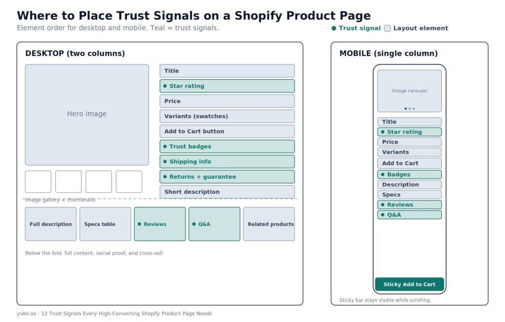
Placement matters as much as presence. A great signal at the bottom of the page is a wasted signal.
Shoppers judge a page’s credibility in the first few seconds, before they read a word. That makes the above-the-fold area, which shows before scrolling, the highest-value space on the page. Your strongest trust signals earn their spot there.
Desktop (two columns):
- Left: image gallery with thumbnail strip
- Right: title → star rating → price → variants → Add to Cart → trust badges + shipping + returns → short description
- Below the fold: full description → specs → reviews → Q&A → related products
A “frequently bought together” or related-products row near the bottom gives a near-miss shopper a second option instead of leaving with nothing, and it lifts average order value.
Mobile (single column):
- Swipeable image carousel → title → rating → price → variants → sticky Add to Cart → badges → description → specs → reviews → Q&A
The rule: Your two or three strongest signals belong above the fold, near the price and cart button. That is where the decision happens.
Most of this layout is set by your theme. On an Online Store 2.0 theme, you can drag and drop these sections without code, and a conversion-focused theme makes the job easier. For example, these premium Shopify themes build Shopify product page templates with these trust elements and flexible sections ready to arrange.
Make the buy button itself clear. The Add to Cart button should be high-contrast, hard to miss, and full-width on mobile. Label it “Add to Cart,” not “Buy,” “Submit,” or anything cute. A clear, obvious button is a trust signal of its own. Guessing what a button does is friction.
Confirm the click. Show a quick loading state while the item adds, then a clear “Added to cart” confirmation with a small cart preview. Silence after a tap makes shoppers click again or doubt the page works. A smooth confirmation reassures them the store is alive and working.
Speed Is a Trust Signal Too
A slow page feels broken, and a broken page feels unsafe. Speed quietly shapes trust before a shopper reads a single word.
- Every 1-second speed gain can lift conversion by about 2% to 7%
- In one agency’s PDP audits, a page loading in 1.2 seconds converted around 40% better than the same page at 4.5 seconds
- Convert images to WebP. They are 25% to 35% smaller than JPEG at the same quality
- Lazy-load below-the-fold images so only the hero loads first
- Audit your apps quarterly. Every extra script slows the page
- Target a Largest Contentful Paint under 2.5 seconds
How to Choose Which Signals to Add First
You do not need all 12 on day one. Start with the trust signals that match your store’s stage, and build out your Shopify product page from there.
- If you are just starting (few or no reviews) → Add secure checkout badges, clear shipping, and a return policy first. These need no customer base and remove the biggest fears.
- If you have steady traffic but few sales → Focus on reviews with star ratings and photo reviews. Social proof is your highest-leverage fix.
- If you sell visual or wearable products → Prioritize photo reviews, video, and strong images. People buy with their eyes here.
- If your budget is zero → Start with benefit-focused copy, a clear return line, and visible contact info. All free, all high-impact.
- If you sell health, beauty, or food → Add endorsement badges and Q&A. Trust and safety questions matter most in these niches.
Rule of thumb: Two to four well-placed signals beat ten cluttered ones. Confidence comes from clarity, not noise.
The Easiest Way to Add the Big Three
Reviews, photo reviews, and Q&A have the biggest payoff and the most setup work by hand.
Yuko is a Shopify retention platform that handles all three in one place, so you are not stitching together separate apps. It automates review requests after every order, shows real customer photos on your product pages, and adds a Q&A block so shoppers get answers without leaving the page. It also pushes star ratings to Google Shopping to win more clicks in search.
Because it bundles loyalty, referrals, and memberships too, the same tool that builds trust on the page also closes the loop, turning first-time buyers into returning customers who convert far higher.
Yuko holds a 5.0 rating on the Shopify App Store. One reviewer, Nutrex Research, said the team was “extremely responsive” and made migration easy. Pricing is simple: a forever-free plan for up to 50 orders a month, paid plans from $12/month, and a 30-day money-back guarantee.
Common Mistakes to Avoid
Even good stores get trust signals wrong. Watch for these:
- Badge overload. Ten icons in a row look desperate, not safe. Pick your two strongest.
- Fake urgency. A countdown that resets on refresh kills trust the moment it is spotted.
- Deleting bad reviews. A perfect 5.0 with zero criticism looks staged.
- Hiding shipping cost. Surprises at checkout are the top reason carts get dumped.
- Burying reviews in a tab. Hiding reviews behind a tab can cut their visibility by 60% to 80%, per one agency’s PDP audits. Keep them on the page where shoppers scroll.
- Generic stock photos. If your photo lives on ten other stores, shoppers notice, and trust drops.
- No mobile sticky cart. The cart button vanishes as mobile shoppers scroll through images.
- Mismatched variant images. Pick red, still see the blue photo, and trust drops.
- Trust signals only at checkout. By then many shoppers are gone. Put them on the product page where the decision happens.
The Trust Signal Most Stores Miss: A Returning Customer
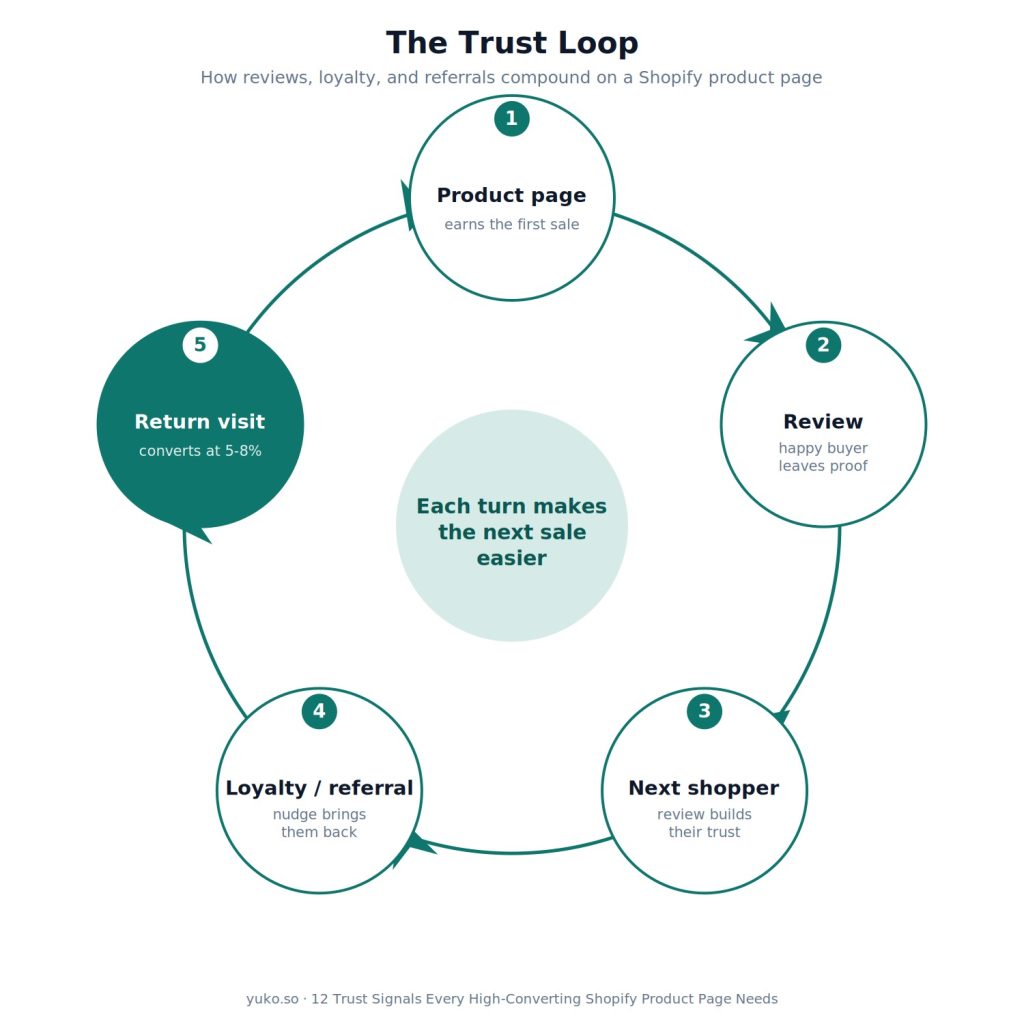
Here is what almost every guide on this topic misses. The strongest trust signal is not a badge. It is a customer who has already bought from you and has come back.
The numbers back this up. First-time visitors rarely convert above 1% to 2%. Return visitors often convert at 5% to 8%, because the trust question is already answered. They know the product is real, the shipping works, and the store is legit.
So trust is not a one-time fix on the page. It is a loop:
- A good Shopify product page earns the first sale
- A great post-purchase experience earns the review
- That review becomes a trust signal that earns the next shopper
- A loyalty or referral nudge brings that buyer back, where they convert far higher
Each turn of the loop makes the next sale easier. The badges and reviews on your page are the start. The real compounding happens when a happy buyer turns into proof for the next one. Stores that treat trust as a cycle, not a checklist, build an edge that competitors copying your badges cannot match. This is exactly what retention platforms like Yuko are built around: turning reviews into loyalty into referrals.
When Trust Signals Will Not Help
Trust signals are powerful, but they are not magic. They will not fix:
- A bad product. No badge saves a product that honestly earns one-star reviews.
- A pricing problem. If your price is far above the market with no reason, trust alone will not close that gap.
- A product-market mismatch. If the wrong people are landing on the page, fix your traffic first.
Fix the product and the basics first. Then trust signals multiply what is already working.
How to Measure the Lift
Add signals, then check if they worked. Track these at the page level in Shopify Analytics or GA4:
- Add-to-cart rate. ATC events divided by product page visits. Average is 8% to 12%. Below 5% points to a product page or trust problem
- Product page conversion rate. Purchases divided by product page visits, segmented by traffic source
- Scroll depth. How far visitors read. Low scroll points to an above-the-fold problem
- Bounce rate. Above 70% on a product page signals a relevance or first-impression issue
- Time on page. 2 to 4 minutes usually means real interest. Under 30 seconds on a high-traffic page points to a relevance or quality problem
- Return-visitor conversion. First-time visitors rarely convert above 1% to 2%. Return visitors often hit 5% to 8%, which is why bringing people back matters so much
Read the numbers together, not alone. The combination tells you where to fix:
- Low add-to-cart but high time on page → a pricing or trust problem, not an interest problem
- High bounce with low scroll depth → an above-the-fold problem
- Good ATC but low final conversion → friction at checkout, not on the product page
Find your weak pages fast. List your top 20 product pages by traffic and rank them by add-to-cart rate. The bottom quarter is where these fixes pay off most. Start there.
Test one change at a time, and pick one main number to judge it by, like add-to-cart rate or conversion. A simple priority order: test your hero image first, then your price display, then trust-badge placement, then review placement. Give each test enough traffic. For a page converting near 2%, you need roughly 2,500 visitors per version to trust the result. If you swap the CTA copy and the badge placement together, you will not know which one moved the result. Clean, single tests give you lessons that stack up over time.
Start Building Trust Today
The fastest path to a higher-converting product page is the big three: reviews, photo reviews, and Q&A. Add those first, then layer in badges, clear policies, and a fast mobile layout.
If you would rather not stitch together separate apps for each one, Yuko handles reviews, photo reviews, and Q&A in a single platform, and starts on a free plan for up to 50 orders a month, so you can have your first reviews live on your product pages within minutes.
Frequently Asked Questions
What is the most important trust signal on a Shopify product page?
Product reviews with star ratings. They are the number one trust signal, since shoppers trust other buyers more than store copy. Products with 10 or more reviews can convert 52% higher. A realistic 4.3-star score with many reviews often beats a perfect 5.0 with only a few.
How many trust badges should I show?
Two to four, placed where they matter, near the price and Add to Cart button. More than that creates visual noise that weakens all of them. The goal is confidence, not clutter.
Do security badges really reduce cart abandonment?
They help, because around 19% of shoppers abandon over card-security worries. But badges alone do not fix abandonment caused by unexpected shipping costs or unclear returns. Pair them with clear pricing and policies.
Where should trust signals go on the page?
The strongest ones go above the fold near the title, price, and Add to Cart button, since that is where the buying decision happens. Payment and security badges also belong in the footer so they show site-wide. On mobile, use a sticky cart bar so the button never disappears.
Do trust signals work on mobile?
Yes, and they matter more there. Over 65% of Shopify traffic is mobile. Use a sticky Add to Cart bar, keep tap targets large, and show badges in the main flow instead of hiding them in tabs.
Can I add reviews and Q&A without a developer?
Yes. A platform like Yuko adds reviews, photo reviews, and Q&A with no code, and starts on a free plan for up to 50 orders a month.