A great beverage product showcase landing page combines compelling storytelling, immersive product visuals, clear flavor highlights, and strong calls to action to convert visitors into customers. The most successful beverage brands use dedicated landing pages to showcase their products, communicate their unique value, and create a seamless path to purchase.
The best beverage product showcase landing pages typically include:
- Eye-catching hero sections that immediately showcase the product
- Lifestyle and product photography that reinforces the brand story
- Flavor, ingredient, and benefit highlights that simplify buying decisions
- Customer reviews and social proof that build trust
- Subscription, bundle, or limited-time offers that increase conversions
- Mobile-first layouts optimized for modern shoppers
For beverage brands, landing pages play a critical role in driving sales. Unlike traditional e-commerce pages that present multiple navigation paths, a dedicated landing page focuses attention on a single product, collection, or campaign. This focused experience helps reduce distractions and encourages visitors to take action.
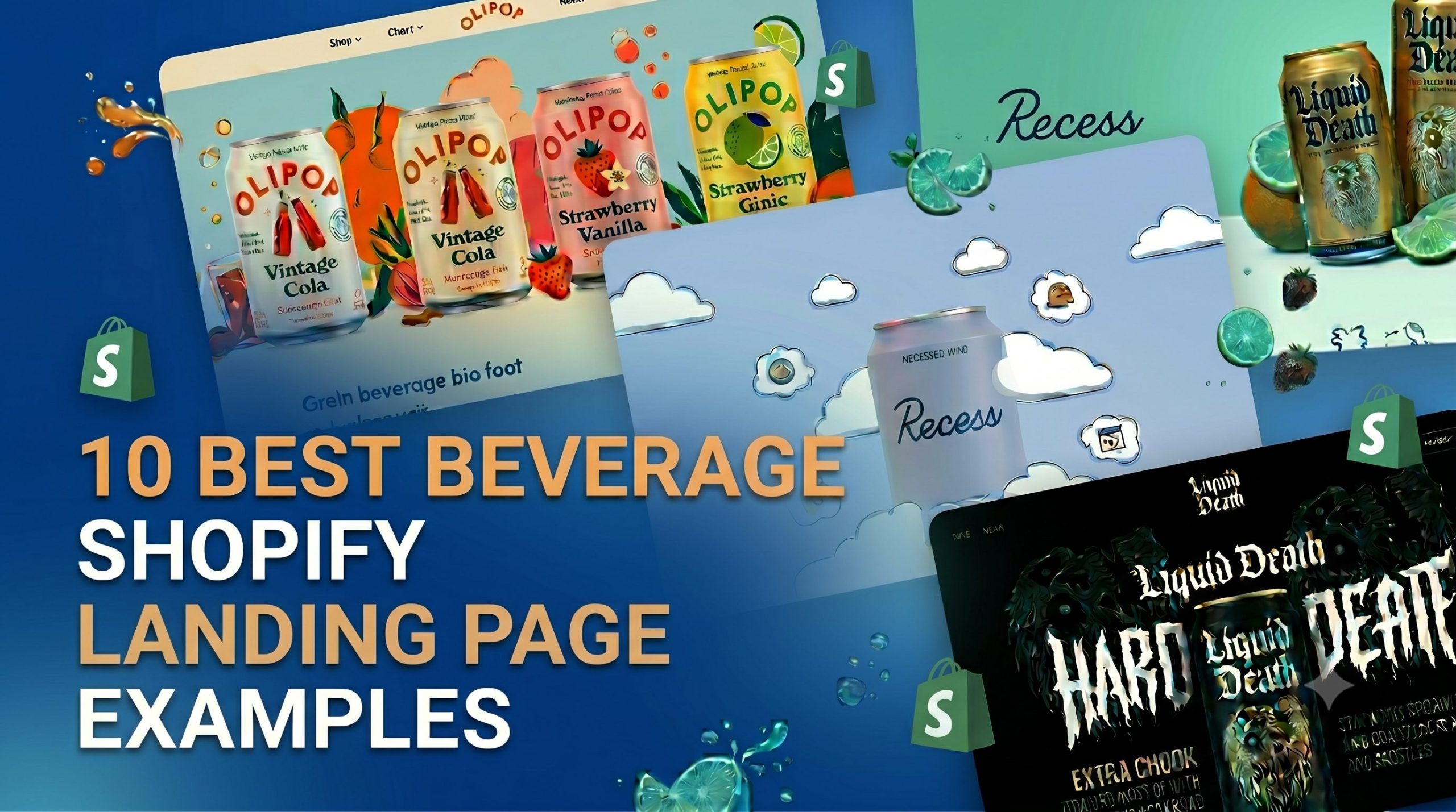
Whether you’re selling coffee, energy drinks, sparkling beverages, wellness drinks, or functional beverages, analyzing successful landing pages can reveal valuable insights into what works. In this guide, we’ll explore 12 of the best beverage product showcase landing page examples for Shopify brands, break down the design elements that make them effective, and share practical ideas you can apply to your own store.
What Makes a Great Beverage Product Showcase Landing Page?
A successful beverage product showcase landing page does more than display a product. It creates an experience that helps visitors understand the product, trust the brand, and feel motivated to make a purchase. While every beverage category has unique requirements, the highest-converting landing pages often share several key elements.
Strong Hero Section
For beverage brands, visuals are often more important than copy. Customers want to see the packaging, flavors, ingredients, and the overall drinking experience before they start reading product details.
A strong beverage hero section typically includes:
- Clear product photography that showcases the bottle, can, pouch, or packaging
- Flavor-focused visuals, such as fruits, coffee beans, herbs, or ingredients
- A headline that highlights the product’s main benefit or unique selling point
- A short description explaining what makes the beverage different
- A prominent CTA button
- Ratings, reviews, awards, or certifications to build trust
The best beverage brands also use the hero section to reinforce their positioning. For example, OLIPOP highlights gut health benefits, Liquid Death emphasizes its bold brand personality, and Recess focuses on wellness and relaxation. Visitors should understand the product’s value within seconds of landing on the page.
Lifestyle Product Photography
People don’t just buy beverages. They buy experiences, routines, and lifestyles. That’s why many successful beverage brands use lifestyle photography throughout their landing pages.
Lifestyle imagery can help visitors visualize:
- How the product fits into daily routines
- The emotions associated with consuming the beverage
- The target audience and brand personality
- The product being enjoyed in real-world situations
Combining product shots with authentic lifestyle imagery often creates a stronger emotional connection than product photos alone.
Clear Flavor and Product Highlights
One of the biggest challenges in beverage ecommerce is helping customers imagine taste and quality through a screen.
Great landing pages solve this by clearly presenting:
- Flavor profiles
- Key ingredients
- Nutritional benefits
- Functional advantages
- Unique production methods
Instead of overwhelming visitors with technical details, leading brands simplify information using icons, illustrations, comparison charts, and visual ingredient breakdowns.
Mobile-First Layout
A significant percentage of beverage shoppers discover products through social media and mobile advertising. As a result, landing pages must be designed with mobile users in mind.
Key mobile-first practices include:
- Fast-loading images
- Thumb-friendly navigation
- Readable typography
- Sticky purchase buttons
- Simplified content hierarchy
A landing page that looks stunning on desktop but performs poorly on mobile will likely lose potential customers before they reach checkout.
Social Proof and Customer Reviews
Trust plays a major role in beverage purchasing decisions, especially for new brands. Social proof helps reduce uncertainty and gives shoppers confidence in their purchase.
Common forms of social proof include:
- Customer reviews and ratings
- User-generated content (UGC)
- Before-and-after results
- Influencer endorsements
- Media features and awards
Displaying authentic customer experiences throughout the page can significantly improve credibility and conversion rates.
Subscription and Bundle Sections
Many beverage brands rely on subscriptions and bundles to increase customer lifetime value. Rather than focusing solely on one-time purchases, effective landing pages highlight options that encourage repeat orders.
Popular approaches include:
- Subscribe-and-save offers
- Flavor variety packs
- Best-selling bundles
- Limited-edition collections
- Membership benefits
These sections not only increase average order value but also make the purchasing decision easier for first-time customers.
Fast and Frictionless Checkout Experience
Even the most visually impressive landing page can fail if the buying process is complicated. High-converting beverage brands prioritize a seamless path from product discovery to checkout.
This often includes:
- Clear and visible CTAs
- Sticky add-to-cart buttons
- Express checkout options
- Transparent shipping information
- Minimal checkout steps
The goal is simple: remove unnecessary friction so visitors can purchase as quickly and confidently as possible.
Together, these elements create the foundation of a beverage product showcase landing page that not only attracts attention but also converts visitors into customers. The following examples demonstrate how leading beverage brands successfully apply these principles in their Shopify stores.
12 Best Beverage Product Showcase Landing Page Examples
OLIPOP – Flavour-First Beverage Product Showcase
Here is the OLIPOP vintage cola product page:
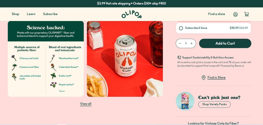
OLIPOP’s Vintage Cola page is a great example of how a beverage brand can transform a standard product page into an engaging showcase experience. Rather than focusing solely on product specifications, the page combines flavor-focused visuals, health-conscious messaging, and educational content to help shoppers understand both the taste and benefits of the drink. The result is a page that feels informative without overwhelming visitors.
Best Design Elements
- Bold Product-Centric Hero Section – Clean product photography and a cohesive pastel background immediately place the focus on the signature Vintage Cola can.
- Instant Benefit Signposting – Crucial health callouts like “9g Fiber” and key functional highlights are placed directly above the product title to immediately address health-conscious shoppers.
- Science-Backed Ingredient Storytelling – The page utilizes clear, illustrative breakdowns of its proprietary OLISMART® fiber and botanicals, building instant credibility and trust.
- Frictionless Subscription & Upsell Flow – A value-driven “Subscribe & Save” option is positioned right alongside an attractive cross-sell section (“Can’t pick just one?”) to maximize average order value.
- Sticky Conversion Bar – As users scroll through ingredients and customer reviews, a persistent bottom CTA bar keeps the purchase action just one click away.
Takeaways for Shopify Stores
- Place your product’s most important nutritional differentiator (e.g., fiber or sugar count) directly above the fold.
- Use simple, friendly visual icons to explain complex or unfamiliar ingredients.
- Implement a sticky dynamic checkout bar to maintain high conversion intent during long-form scrolling.
- Introduce variety packs or alternative flavor cross-sells near the footer to catch users who haven’t committed to a single flavor.
Liquid Death – Disruptive Beverage Branding Showcase
Here is the Liquid Death Mango Chainsaw product page:

Liquid Death’s Mango Chainsaw page demonstrates how a beverage brand can stand out in a crowded market through bold visual identity and unconventional messaging. Instead of following traditional beverage design conventions, the page embraces a rebellious personality with dark aesthetics, aggressive copywriting, and eye-catching packaging. This distinctive approach helps create an instantly recognizable brand experience while keeping the focus on product discovery and purchase.
Best Design Elements
- High-Contrast, Minimalist Visuals – Moving away from traditionally dark backgrounds, the page uses a clean, stark white canvas that makes the premium gold Mango Chainsaw can instantly pop.
- Brutally Honest & Personality-Driven Copy – The headlines and product bullet points reject corporate jargon, opting for aggressive, humorous, and engaging storytelling (“attack your tastebuds so brutally”) that hooks the reader.
- Disruptive Video Integration – A prominent, unconventional short-form video section (“You Won’t Believe It’s Not Soda”) instantly boosts on-page engagement and breaks the monotony of standard e-commerce grid layouts.
- Mission-Led Storytelling Section – A dedicated, high-impact banner tackling environmental issues (“Death to Plastic Bottles”) aligns the purchase with a social cause, deepening brand loyalty.
- Cult-Favorite Merchandise Cross-Sells – The “BUT WAIT THERE’S MORE…” section effortlessly cross-sells high-margin brand merchandise (from sweatshirts to coffin-shaped flasks) rather than just more drinks.
Takeaways for Shopify Stores
- Don’t be afraid to let your brand voice run wild—copywriting that entertains converts better than boring feature lists.
- Use a clean, high-contrast white background if your product packaging is already vibrant and full of detail.
- Embed bold, weird, or highly engaging video content right into the page scroll to increase time-on-site.
- If your brand has a strong mission (like sustainability), give it a dedicated visual section to connect emotionally with modern shoppers.
- Expand your e-commerce horizon by cross-selling lifestyle merchandise that turns customers into walking billboards.
Poppi – Social-Driven Beverage Product Showcase
Here is the Poppi Strawberry Lemon product page:
Poppi’s Strawberry Lemon product page showcases how a modern beverage brand can blend vibrant visuals, lifestyle-focused branding, and ecommerce best practices into a highly engaging shopping experience. The page immediately highlights the product’s colorful packaging while reinforcing Poppi’s positioning as a better-for-you soda designed for a younger, social-media-savvy audience.
Best Design Elements
- High-Energy Neon Visuals – The page uses an unapologetic, high-contrast combination of hot pink and bright yellow that perfectly mirrors the brand’s playful and vibrant personality.
- Social-First TikTok/UGC Integration – Under the section “Taste The Obsession,” a row of embedded short-form vertical videos showcases real taste tests and grocery hauls, translating social media hype directly onto the product page.
- Omnichannel “Favorite Cart” CTAs – Instead of a traditional on-site checkout for this flavor, the hero section smartly routes traffic to trusted retail giants like Amazon and Target to minimize shipping friction.
- Bold Dynamic Flavor Switching – At the top of the benefits section, a dedicated carousel of custom flavor icons allows users to quickly jump between fruit profiles with a single tap.
- Unmissable Sticky Bottom CTA – As users scroll past nutritional facts and customer reviews, a persistent, eye-catching bottom navigation bar keeps the “Add to Cart” prompt always within thumb’s reach.
Takeaways for Shopify Stores
- Leverage high-contrast color blocking to create an energetic, youthful brand aesthetic that stands out in a crowded market.
- Embed TikTok-style short-form videos or user-generated content (UGC) grids to build cultural proof and validation for younger consumers.
- Consider implementing omnichannel checkout options (like linking to Amazon) if your logistics thrive better on major retail networks.
- Utilize a sticky bottom add-to-cart component to ensure high purchase intent is maintained throughout a long-scrolling visual experience.
Recess – Minimal Wellness Drink Landing Page
Here is the Strawberry Rose Mood product page:
The Strawberry Rose product page perfectly reflects Recess’s wellness-first brand identity. From soft visual design to carefully paced content, the experience feels more like browsing a lifestyle brand than shopping for a beverage. The page focuses on creating a sense of calm while highlighting the ingredients and benefits that support the product’s positioning.
Best Design Elements
- Dreamy, Pastel-Driven Hero Section – The product is beautifully framed by clean, minimalist typography and floating 3D clouds, instantly establishing a premium, calming aesthetic above the fold.
- Surrealist 3D Instagram Gallery – Instead of using standard lifestyle photography, the “As Seen on Instagram” section features quirky, surrealist 3D artwork (like water pouring over a moss-covered brain) that perfectly encapsulates the “mental wellness” vibe.
- Bold, Clean Functional Typography – High-priority functional ingredients like Magnesium L-threonate and L-theanine are mapped out with generous spacing and beautiful, clean icons that educate without causing cognitive overload.
- Retro-Modern Social Proof Cards – Customer testimonials are housed in highly scannable, retro-shadowed quote blocks that emphasize emotional benefits like guilt-free relaxation and alcohol replacement.
- Dynamic Sampler Pack Cross-Sell – A dedicated, color-shifting banner for “The original Mood sampler” visually breaks the pink layout to capture users who prefer exploring a variety over a single flavor.
Takeaways for Shopify Stores
- Use white space and soft pastel color blocking to convey a sense of calm and luxury, especially for wellness or relaxation products.
- If traditional lifestyle photography doesn’t fit your brand identity, experiment with surrealist 3D renders or custom digital art to tell your story.
- Simplify clinical or functional ingredient explanations down to one clear, actionable benefit sentence per item.
- Format customer reviews into highly readable visual quote blocks rather than burying them in a massive feedback list at the very bottom.
Magic Mind – High-Converting Functional Beverage Landing Page
Here is the Magic Mind Original Mental Performance Shot product page:
Magic Mind’s product page is a masterclass in outcome-based e-commerce. Within seconds of landing, visitors are presented with clear, performance-driven headlines (“Sharper mind. Sustained energy.”) that shift the conversation from what the drink is to what it achieves. Rather than overwhelming users with dense clinical jargon, the page masterfully layers strict scientific credibility—such as 3D bioavailability models and structured ingredient grids—alongside elite social proof from world-class athletes and authors. Combined with a timeline that sets clear product expectations and an aggressive 100-day risk-free trial, the entire experience is engineered to melt away buyer skepticism and seamlessly guide shoppers into a long-term subscription routine.
Best Design Elements
- High-Urgency, Subscription-First Box Layout – The purchase interface splits choices into clear tier-based subscriptions (15, 30, or 60 bottles) featuring prominent “Save up to 67%” tags, intentionally making one-time purchase options a secondary thought.
- Timeline-Based Benefit Expectations – Under “Your Brain Optimized,” the page maps out a clear timeline journey (Day 1, Day 7, Day 30), visually educating consumers on exactly when and how their mental baseline will elevate.
- Elite Celebrity & Athlete Endorsements – Instead of relying only on anonymous reviews, the page highlights high-profile social proof from elite icons like NFL star Matthew Stafford and NYT Best-Selling authors to build instant cultural authority.
- 3D Bioavailability Illustration – A dedicated scientific section uses a slick 3D visual of a nano-encapsulated formula to easily explain complex absorption technology (“5x more effective absorption” over pills).
- Aggressive “100-Day Risk-Free” Risk Reversal – A high-contrast callout section pairs fresh lifestyle imagery with an ironclad 100-day money-back guarantee, eliminating purchase anxiety right above the product variant selector.
Takeaways for Shopify Stores
- Design your pricing section to guide users toward subscription tiers by clearly displaying the cost savings breakdown per single unit or bottle.
- If your product takes time to show results (like supplements, skincare, or wellness drinks), use a Day 1 to Day 30 timeline graphic to set transparent expectations.
- Leverage authority-based social proof (experts, professional athletes, or certified authors) to establish credibility in the functional supplement space.
- Use clean 3D graphics or macro close-ups to prove any proprietary technical or manufacturing claims you make (e.g., higher absorption, purer filtration).
- Minimize checkout hesitation by introducing a prominent, risk-free trial policy close to alternative collection comparison grids.
Hiyo – Lifestyle Storytelling Beverage Showcase
Here is the Hiyo Variety Pack product page:
What stands out most about Hiyo’s Variety Pack page is the way it connects the product to everyday moments. Rather than relying heavily on ingredient lists or technical product details, the page highlights the experiences customers are looking for, from relaxed gatherings with friends to alcohol-free social occasions. This approach makes the brand feel both aspirational and relatable.
Best Design Elements
- Tiered Bulk Pricing Blocks – The page integrates a clean, structural pack-size selector (12-pack, 24-pack, and 48-pack) with highlighted “Save up to $20” badges, guiding users smoothly toward higher average order values (AOV).
- Warm, Sun-Drenched Lifestyle Grids – Rich, warm photography capturing realistic social moments (pouring drinks from a full fridge, sharing toasts) effectively visualizes the alcohol-free lifestyle without feeling artificial.
- Macro Botanical Presentation – Under the headline “1,700mg of functional ingredients,” the page shifts to gorgeous, hyper-detailed macro close-ups of ingredients like Ashwagandha and Lion’s Mane, mapping an instant connection to their mental wellness benefits.
- Signature Benefit Copywriting – The product copy focuses on emotional states rather than scientific jargon, using custom-tailored phrases like “organic social tonics” and “the float” to build an exclusive brand identity.
- Clean, High-Contrast Sticky Carousel Footer – Near the bottom, a structured “Find your flavor” slider provides clear add-to-cart buttons for alternative product lines like the Tropical Pack, reducing navigation friction.
Takeaways for Shopify Stores
- Group bulk packaging variants into highly visual selection blocks that explicitly state the exact dollar savings to boost average order value.
- Sell the feeling and the alternative lifestyle your beverage enables, using warm, lifestyle-oriented media grids instead of basic product shots.
- Use clean macro photography of raw plants or fruits to elevate the perceived premium value of your ingredients.
- Anchor the bottom of your long-form page with a simplified FAQ accordion to proactively solve remaining checkout doubts (e.g., shipping or ingredients) without sending users away from the cart.
Athletic Brewing – Active Lifestyle Beverage Showcase
Here is the Run Wild IPA product page:
Athletic Brewing’s Run Wild IPA page perfectly demonstrates how a non-alcoholic beverage brand can replace the stigma of “sober drinking” with an aspirational, active lifestyle narrative. Instead of showcasing the product in a dark bar setting, the page integrates sun-drenched outdoor imagery—featuring consumers hiking, camping, and socialising—positioning the brew as a healthy companion for everyday adventures. What makes this page a high-converting masterpiece is its heavy reliance on authority and community trust. By displaying iconic gold-medal badges right on the hero image and leveraging a unique, tier-based “Athletic Club” membership checkout flow, the page effectively elevates a standard e-commerce transaction into a community-driven club experience.
Best Design Elements
- Award-Heavy Visual Trust Anchor – The hero section features multiple prestigious gold-medal stamps (World Beer Awards, US Open Beer Championship) overlaid directly onto the product shot, instantly flashing “20+ Awards” to build immediate quality credibility.
- Three-Tier Conversion Interface (Athletic Club) – Beyond traditional subscription options, the page introduces a custom “Athletic Club” membership switch ($29/yr) that unlocks exclusive prices ($10.99 member price) and perks, creating a highly effective recurring revenue channel.
- Bespoke “Brewer’s Notes” Sensory Mapping – The page translates the taste profile through interactive sliders evaluating Hops, Malt, and Body, signed off by the Head Brewer to deliver an authentic craft beer evaluation experience.
- Grid-Based Lifestyle Validation – A beautifully curated, cross-screen grid photo section displays the product being enjoyed in real-world wellness scenarios (beach days, mountain treks, fitness groups) without looking staged.
- Persistent Omnipresent Welcome Offer – The shopping experience is anchored by a bright mint top bar and a sticky, floating “25% OFF” badge that keeps the welcome incentive top-of-mind as users scroll past nutritional specs.
Takeaways for Shopify Stores
- Flash your product’s industrial awards, certifications, or media badges directly on or right next to the hero image to remove quality doubts instantly.
- Look beyond basic subscription apps—experiment with premium tier-based loyalty memberships or “Clubs” if your brand relies on frequent repeat purchases.
- Use sensory visual indicators (like taste meters, flavor charts, or food pairings) to help digital shoppers imagine the exact taste of your product.
- Keep a consistent, non-intrusive floating offer badge on mobile and desktop scrolls to recover users who are hesitant about the initial retail price.
Ghia – Premium Editorial-Style Beverage Showcase
Here is the Ghia Original Apéritif product page:
Embracing a retro-modern color palette of rich plum and soft cream, Ghia’s Original Apéritif page uses distinctive typography and clean visual structures to create a sense of high-end European sophistication. Rather than separating storytelling from shopping, the page combines a balanced split-screen layout with clearly visible purchase options and curated gift sets. Interactive ingredient showcases and recipe-inspired content further enrich the experience, helping customers explore the product while maintaining a smooth path to purchase.
Best Design Elements
- Balanced Split-Screen Hero Layout – The hero section divides product imagery and purchase options into a clean 50/50 layout, making it easy to browse product details without losing focus on the product itself.
- Gift Set Upsells Near the Purchase Section – Discovery sets and party packs are showcased directly within the buying journey, encouraging customers to explore premium bundle options.
- Ingredient-Focused Visual Storytelling – Ingredients such as Yuzu, Ginger, and Lemon Balm are presented through clean visuals that help communicate flavor profiles at a glance.
- Recipe Inspiration Carousel – A dedicated recipe section showcases serving ideas like the Ghia Spring Spritz, helping customers understand how the product can be enjoyed at home.
- Sticky Add-to-Cart Bar – Purchase actions remain accessible as visitors scroll through reviews, recipes, and FAQs.
Takeaways for Shopify Stores
- Use a clean split-screen layout if you want to pair moody, high-contrast imagery with readable, highly structured purchase forms.
- Don’t hide your premium bundles at the bottom—integrate high-ticket sets or gift packs directly within or right beneath the main product buying portal to skyrocket Average Order Value (AOV).
- If your beverage is a unique concentrate or apéritif, embed a visual recipe carousel section to guide the user exactly on how to consume and enjoy it at home.
- Maintain an elegant, persistent sticky add-to-cart strip to allow high-intent buyers to checkout immediately while scanning long review sections.
Waterdrop – Product Education-Driven Beverage Showcase
Here is the Microdrink Bestseller Set product page:
Waterdrop’s Bestseller Set page is built around a challenge many beverage brands face: introducing shoppers to an unfamiliar product format. Since hydration cubes are very different from traditional bottled drinks, the page focuses on educating visitors through clear benefit messaging, visual product explanations, and guided flavor discovery. Product education is integrated throughout the shopping journey, helping customers understand both the product and its value before making a purchase.
Best Design Elements
- Interactive Flavor Discovery – Lifestyle imagery and product showcases encourage shoppers to explore different flavors and product variations.
- Sticky Purchase Module – Product options and add-to-cart actions remain accessible as visitors continue scrolling.
- Benefit-First Messaging – Key attributes such as zero sugar, low calories, and hydration support are highlighted early in the page.
- Collapsible Educational Sections – FAQs and product information are organized into expandable sections that keep the layout clean and easy to navigate.
- Cross-Sell Product Recommendations – Alternative flavors and related collections are displayed to encourage additional purchases.
Takeaways for Shopify Stores
- Educate customers when introducing a new product category.
- Use visual content to explain how the product works.
- Highlight key benefits before technical details.
- Organize supporting information with accordions or expandable sections.
- Encourage flavor exploration through related products and collections.
Javy Coffee – Conversion-Focused Coffee Product Showcase
Here is the Javvy Coffee Concentrate product page:
Javy’s product landing page focuses on making the product easy to understand and even easier to buy. Since coffee concentrate is still unfamiliar to many consumers, the page quickly explains how it works and highlights its biggest benefit: making café-style coffee in seconds. One of the most effective features is the custom bundle builder, which allows shoppers to mix and match flavors instead of choosing a fixed bundle. Product demos, customer reviews, and short-form video content are placed throughout the page, helping visitors see the product in action while building confidence before purchase.
Best Design Elements
- Progressive Bundle Builder – A visual quantity selector shows how the price per bottle decreases as customers add more products, encouraging larger orders.
- Flexible Flavor Selection – Shoppers can mix and match flavors directly from the product page instead of choosing a fixed bundle.
- 3-Step Product Demo Video – A short instructional video demonstrates how quickly the coffee concentrate can be prepared, helping first-time buyers understand the product.
- UGC Video Gallery – Customer-created videos showcase recipes, product usage, and real experiences, adding authenticity and social proof.
- Attribute-Based Reviews – Reviews are categorized by factors such as convenience, value, and ease of use, making feedback easier to evaluate.
- Cross-Sell Product Recommendations – Related products like creamers and syrups are displayed to encourage larger purchases.
Takeaways for Shopify Stores
- Make bundle pricing easy to understand and compare.
- Give customers the flexibility to build their own flavor assortment.
- Use videos to demonstrate how the product works.
- Incorporate UGC content to strengthen trust.
- Organize reviews around specific buying factors.
- Recommend complementary products to increase average order value.
Beverage Landing Page Trends in 2026
The beverage e-commerce landscape evolves rapidly. To maintain a competitive edge, top Shopify brands are shifting away from static pages and adopting dynamic, immersive experiences. Key trends shaping beverage landing pages this year include:
- Interactive Storytelling & Gamified Flavors: Brands use interactive quizzes and flavor wheels right in the hero section to help customers find their perfect blend.
- Immersive 3D & Animated Showcases: High-fidelity 3D renders of cans opening, pouring, or splashing create a sensory experience that translates the “taste” through a screen.
- AI-Driven Personalization: Landing pages dynamically change their copy, social proof, and product bundles based on whether the visitor clicked from a fitness ad or a wellness influencer’s post.
- Short-Form Video & UGC Integration: TikTok-style unboxing and taste-test videos are embedded directly next to the “Add to Cart” button to capture social-first shoppers.
- Minimalist Premium Layouts: Heavy text is out. Clean typography, generous white space, and bold macro-photography of fresh ingredients are in.
Why Choose a Visual Theme for Beverage Brands
Beverage products are highly visual by nature. Customers often make purchasing decisions based on packaging design, flavor cues, ingredients, and the overall brand experience before they ever read a product description. That’s why successful beverage stores typically rely on visually driven Shopify themes that can showcase products through high-quality imagery, storytelling, and immersive layouts.
A strong beverage theme should help you:
- Highlight product packaging and flavor variations.
- Showcase ingredients and product benefits visually.
- Tell your brand story through lifestyle photography and content sections.
- Promote bundles, subscriptions, and seasonal collections effectively.
- Deliver a seamless shopping experience across desktop and mobile devices.
For beverage brands looking for a purpose-built solution, the Purely drink Shopify theme is designed to combine visual storytelling with ecommerce performance. It includes flexible content sections for showcasing products, ingredients, and brand stories, while maintaining a clean, conversion-focused shopping experience. Whether you sell coffee, wine, craft beer, tea, functional beverages, or specialty drinks, Purely provides the tools needed to create a visually engaging storefront that helps turn visitors into customers.
Final Thoughts,
A great beverage product showcase landing page is the bridge between a customer’s curiosity and a completed purchase. As seen in the 10 examples above, the most successful Shopify brands don’t just sell a drink—they sell a lifestyle, a daily ritual, and a sensory experience.
To convert casual visitors into loyal subscribers, your page must balance bold flavor visuals, clear functional benefits, strong social proof, and a completely frictionless checkout experience.
Ready to transform your online store and build a landing page that converts like the pros? Let’s discover premium, high-converting Shopify themes and launch your beverage brand’s next best-seller with confidence!