Today, mobile isn’t just an option — it’s the primary way people shop online.
With over 70% of eCommerce traffic coming from smartphones, your store’s mobile experience can make or break your sales. A slow load time, confusing layout, or tiny tap targets can quickly drive potential customers away.
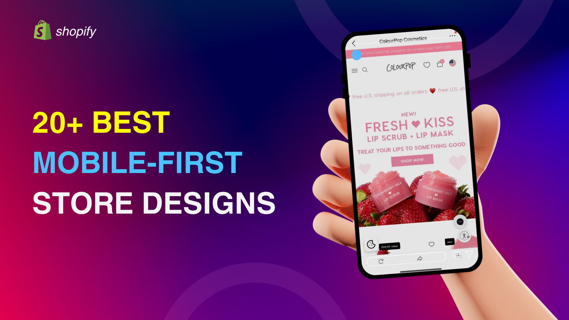
The good news? Many Shopify stores are leading the way with stunning, high-performing mobile websites, and we’ve gathered 20 of the best examples to inspire you.
From sleek product pages to smooth mobile navigation, these stores show exactly what great mobile design looks like in action. If you’re looking to enhance your website’s mobile experience, these examples will help you create a store that’s mobile-optimized to convert.
Let’s dive in.
Table of Contents
What Makes a Shopify Store Mobile-Friendly?
A mobile-friendly Shopify store is more than just a responsive version of your desktop site — it’s designed specifically with mobile users in mind. That means faster loading, easier navigation, and a smoother shopping experience on smaller screens.
Here are the key elements that make a Shopify store truly mobile-friendly:
- Responsive Design: The layout automatically adapts to different screen sizes, ensuring your store looks great on smartphones, tablets, and desktops without awkward zooming or side-scrolling.
- Fast Loading Speed: Mobile users are impatient. A mobile-friendly store is optimized for speed with compressed images, minimal code, and fast server response times. You may be interested in exploring the fastest Shopify themes.
- Thumb-Friendly Navigation: Menus, buttons, and product filters are easy to tap and scroll with one hand. Clear spacing prevents mis-clicks and frustration.
- Simplified Checkout Process: A smooth, mobile-optimized checkout helps reduce cart abandonment. This includes autofill options, guest checkout, and minimal required fields.
- Mobile-Friendly Shopify Fonts: Choose clean, legible fonts with proper sizing (14–18px) and minimal styles to ensure readability and performance.
- Clear CTAs and Legible Text: Call-to-action buttons (like “Add to Cart”) are bold, centered, and easy to spot on smaller screens. Text is large enough to read without zooming.
- Mobile-Optimized Product Pages: High-quality images, swipeable galleries, and compact descriptions help shoppers get all the info they need — fast.
Why Mobile Website Design Matters for Shopify Stores
According to Croppink, 75% of online retail sales are predicted to come from mobile devices, making mobile optimization essential. Here’s why mobile website design is critical for Shopify success:
- Boosts SEO and Visibility: Google prioritizes mobile-friendly websites in search rankings. A responsive, fast-loading mobile site helps improve your organic reach.
- Increases Conversion Rates: Mobile-optimized stores reduce friction for users, making it easier to browse, add to cart, and complete purchases.
- Enhances User Engagement: Clean layouts and intuitive mobile navigation keep visitors on your site longer and increase the likelihood of return visits.
- Aligns with Google’s Mobile-First Indexing: Since Google uses the mobile version of your site for indexing, poor mobile design can negatively impact your overall search performance.
20 Best Shopify Mobile-First Website Design Examples (2025)
These Shopify stores stand out for their mobile performance, user-friendly layouts, and visually appealing design, all optimized to convert mobile traffic into real customers.
1. Allbirds
- Visit Website
- Industry: Footwear / Apparel
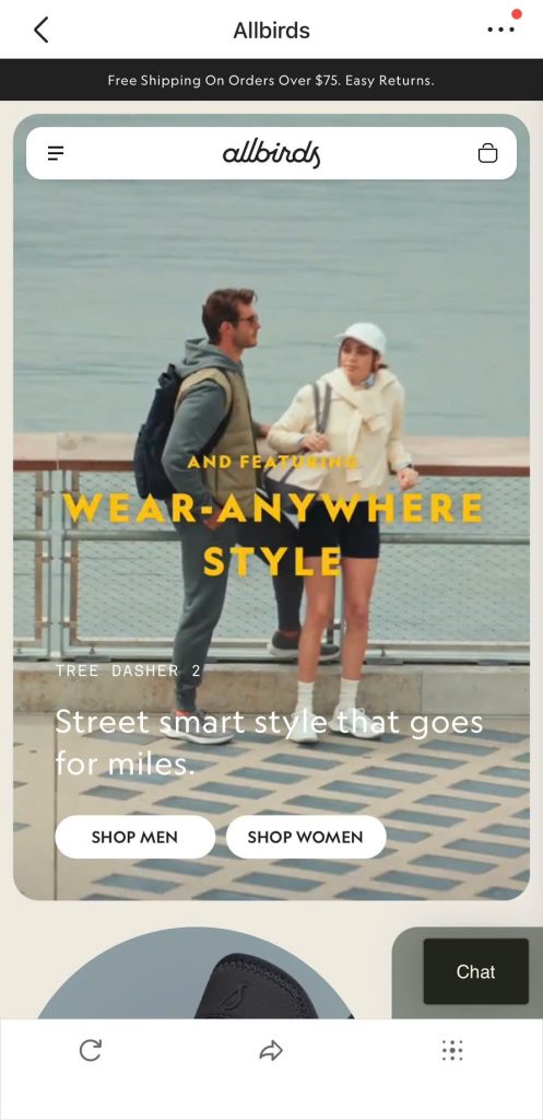
- Mobile Design Highlights: Allbirds delivers a clean, uncluttered mobile experience with a sticky header, smooth product scrolling, and quick access to key sections like “Men” and “Women.” The site loads quickly and uses breathable white space to create a calm, shoppable interface — perfect for mobile users on the go.
2. Gymshark
- Visit Website
- Industry: Activewear
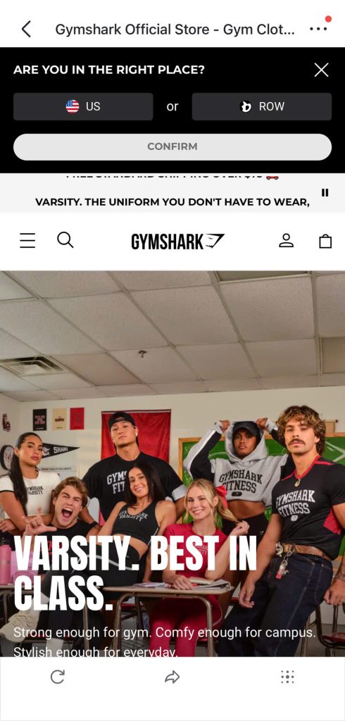
- Mobile Design Highlights: Gymshark uses a persistent sticky menu and large, tap-friendly product filters that make browsing easy on small screens. Their product grid loads fast, and the checkout flow is sleek, ensuring minimal friction from product discovery to purchase.
3. ColourPop
- Visit Website
- Industry: Beauty / Cosmetics
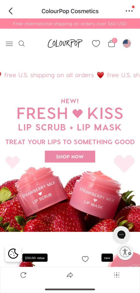
- Mobile Design Highlights: ColourPop’s mobile site grabs attention with vibrant visuals and well-organized product cards. Navigation is intuitive with a dropdown menu that works flawlessly on mobile, and the product pages include swipeable image galleries and clearly labeled CTAs — perfect for beauty shoppers browsing on their phones.
4. Inkbox
- Visit Website
- Industry: Temporary Tattoos / Body Art

- Mobile Design Highlights: Inkbox offers a highly engaging mobile experience with bold imagery, fast load times, and smooth category navigation. The product pages are swipeable, with large visuals and easy-to-tap “Add to Cart” buttons. Their use of mobile-friendly filters and visual search makes browsing feel effortless, especially for younger, design-savvy users.
5. Hiut Denim
- Visit Website
- Industry: Fashion / Denim
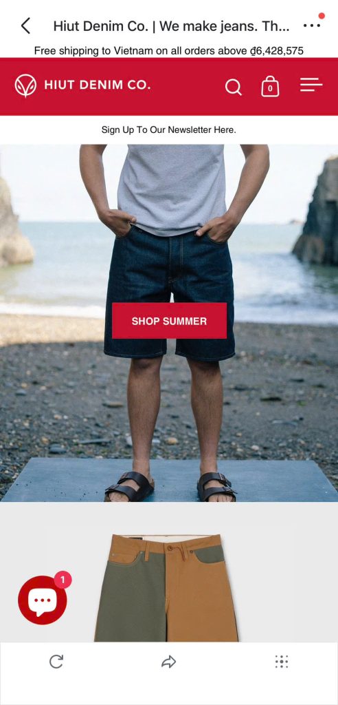
- Mobile Design Highlights: Hiut Denim keeps it minimal with a focus on storytelling. Their mobile site uses full-width imagery, short paragraphs, and thoughtful typography to convey brand values. It’s a great example of how mobile design can support both shopping and brand engagement.
6. Haus
- Visit Website
- Industry: Beverages / DTC
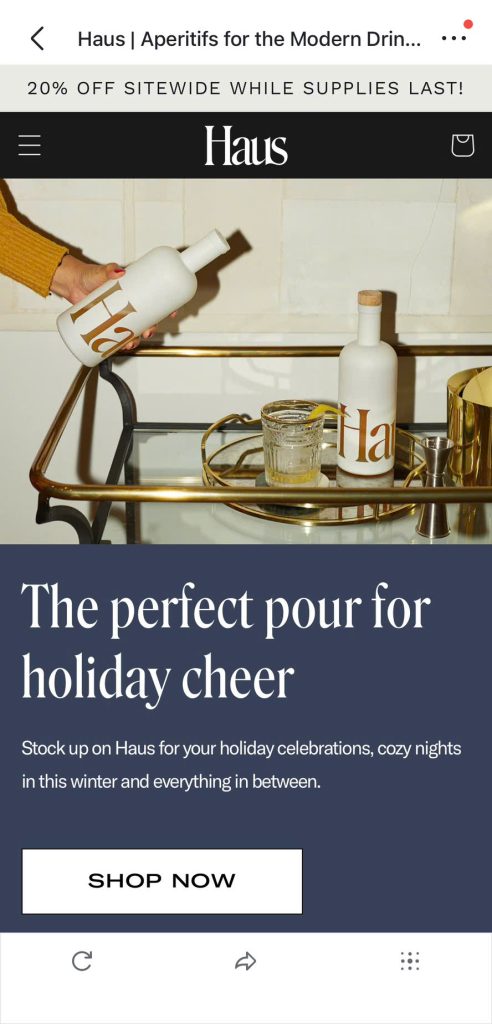
- Mobile Design Highlights: Haus impresses with large, high-quality product photography that fills the mobile screen without slowing down performance. The mobile navigation is streamlined, making it easy to explore their collections. The one-page checkout is fast and intuitive, reducing friction for mobile users and encouraging quick conversions.
7. Chubbies Shorts
- Visit Website
- Industry: Men’s Apparel
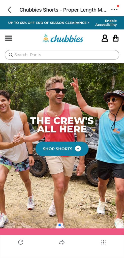
- Mobile Design Highlights: Chubbies brings its playful brand personality to life on mobile with bold colors, strong typography, and witty product descriptions. The homepage loads quickly, and product browsing is snappy with smooth transitions and clear call-to-action buttons. Their mobile filter menu is user-friendly and makes shopping fun.
8. Tropicfeel
- Visit Website
- Industry: Travel / Outdoor Gear
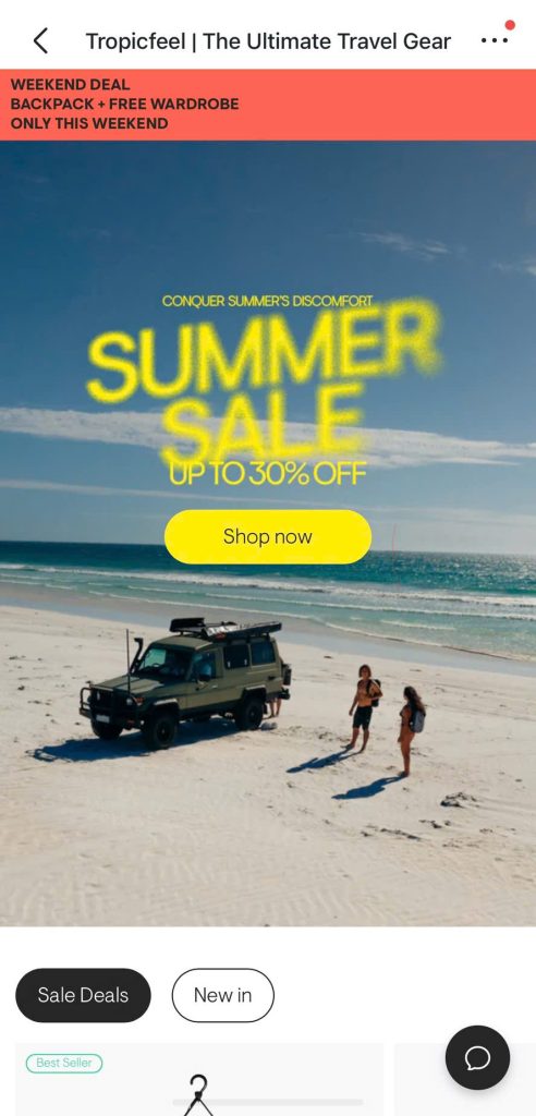
- Mobile Design Highlights: Tropicfeel’s mobile layout uses scroll-based storytelling to guide users through its sustainable travel gear. The product highlights are well-organized, and CTAs are clearly visible without interrupting the flow. The mobile shopping journey is clean, focused, and conversion-optimized, especially for eco-conscious customers on the go.
9. Meowingtons
- Visit Website
- Industry: Pet / Lifestyle
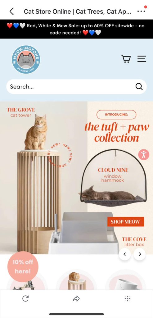
- Mobile Design Highlights: Meowingtons nails mobile engagement with cute, cat-themed branding, bold visuals, and bundled offers that display perfectly on smaller screens. Their homepage is concise and scroll-friendly, with featured collections, product bundles, and promotions that are easy to tap and explore.
10. Jeffree Star Cosmetics
- Visit Website
- Industry: Beauty / Cosmetics
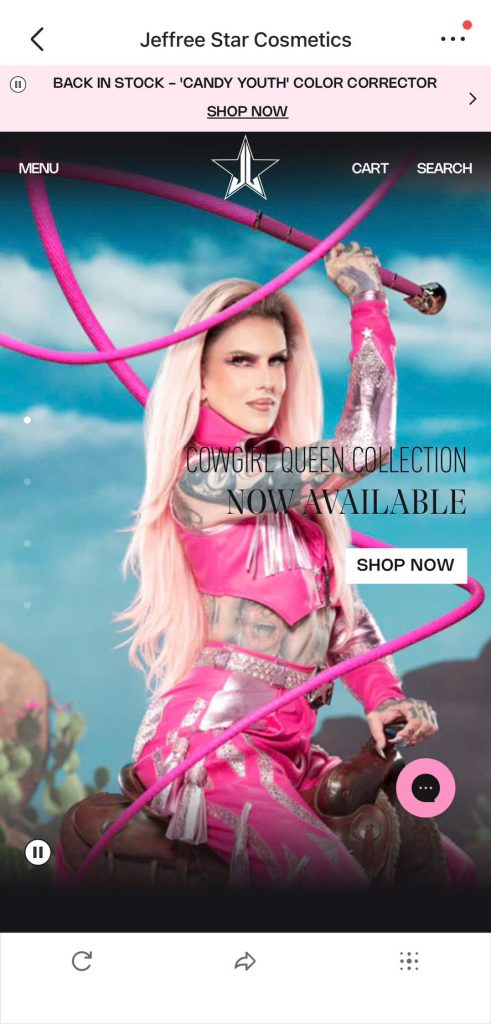
- Mobile Design Highlights: Jeffree Star Cosmetics delivers a high-impact visual experience tailored for mobile. The product grid is responsive and visually stunning, and the navigation is simple but effective. Product pages are media-rich but well-optimized, giving mobile shoppers everything they need without overwhelming them.
11. Beardbrand
- Visit Website
- Industry: Grooming / Men’s Products

- Mobile Design Highlights: Beardbrand delivers a sleek and fast-loading mobile experience. The menu is clearly structured and easy to navigate with just a thumb, while the content is spaced out for effortless scrolling. Product pages are minimal yet effective, letting the products and lifestyle imagery do the selling.
12. Rothy’s
- Visit Website
- Industry: Footwear / Sustainable Fashion
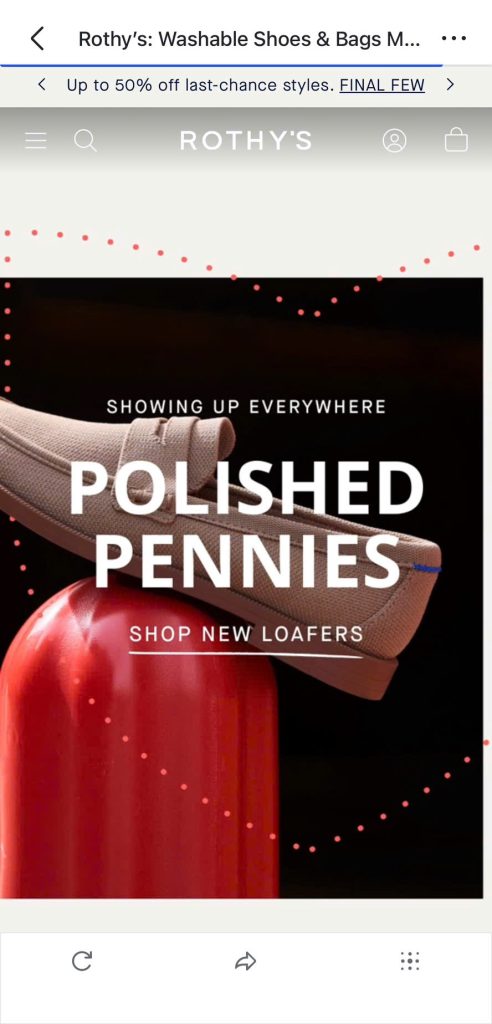
- Mobile Design Highlights: Rothy’s features a clean, modern mobile layout with an ultra-smooth browsing experience. Shoppers can quickly sort or filter collections with a few taps, and the search functionality is fast and precise. Their image-first design helps customers quickly visualize styles and colors on small screens.
13. Nomad Goods
- Visit Website
- Industry: Tech Accessories
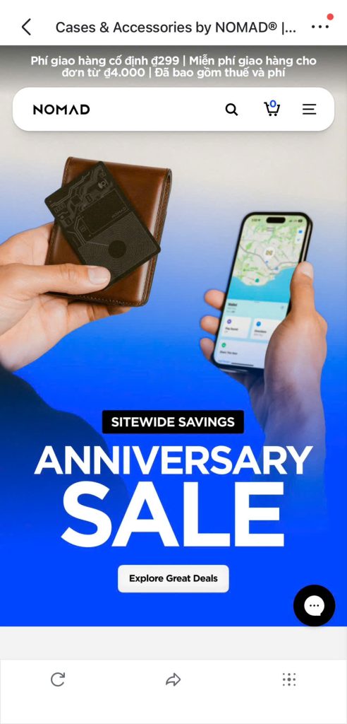
- Mobile Design Highlights: Nomad Goods uses swipeable product carousels and interactive image displays that are perfectly tuned for mobile touchscreens. The site loads quickly and makes excellent use of white space, helping mobile shoppers focus on premium product visuals without distraction.
14. PopSockets
- Visit Website
- Industry: Phone Accessories
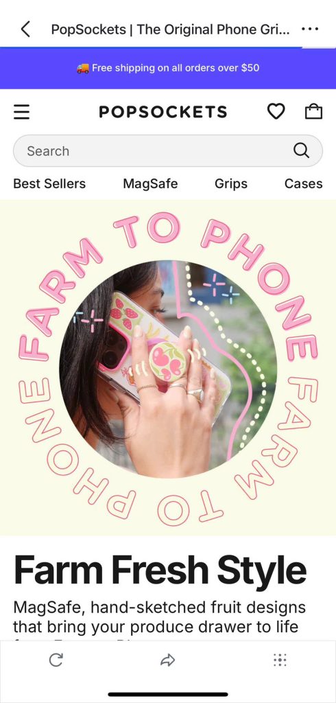
- Mobile Design Highlights: PopSockets offers an engaging mobile UI filled with colorful visuals and clever micro-interactions. From product builders to playful animations, the site invites exploration. Despite its fun design, it remains fast and easy to navigate, striking a perfect balance between style and usability.
Explore Top 20+ Products with Huge Profit Margins.
15. Velasca
- Visit Website
- Industry: Footwear / Fashion
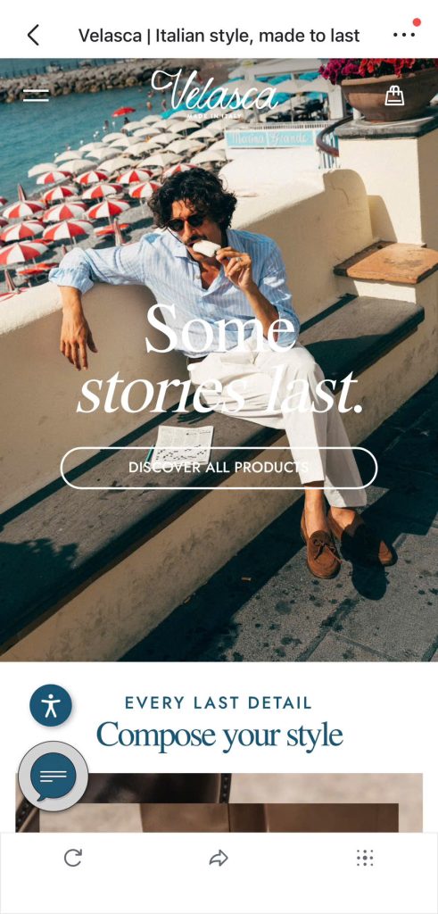
- Mobile Design Highlights: Velasca combines elegance and performance in its mobile layout. The site features large, high-quality images and refined typography that reflect its premium brand. Smooth scrolling, logical content flow, and subtle transitions make for a polished mobile shopping experience.
7+ High Ticket Dropshipping Niches For Big Profits in 2025
16. Daniel Wellington
- Visit Website
- Industry: Watches / Lifestyle
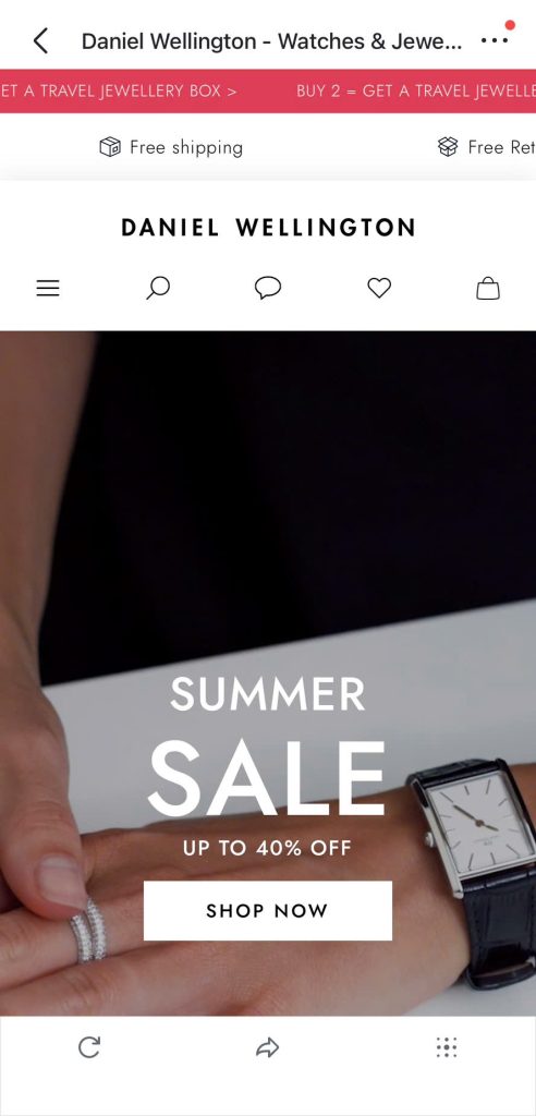
- Mobile Design Highlights: Daniel Wellington brings a premium feel to mobile with high-resolution visuals, generous spacing, and refined typography. The mobile site mirrors the elegance of its watches — everything from browsing to checkout feels sleek and intentional. Navigation is minimal and intuitive, keeping the shopping journey smooth and clutter-free.
17. Tentree
- Visit Website
- Industry: Eco Fashion / Apparel

- Mobile Design Highlights: Tentree effectively weaves its sustainability story into the mobile experience with immersive visuals, environmental impact stats, and easy-to-navigate collections. The site loads fast, and mobile elements like CTAs and product tiles are cleanly designed, guiding users through a brand-driven and eco-conscious journey.
18. Alo Yoga
- Visit Website
- Industry: Activewear / Wellness
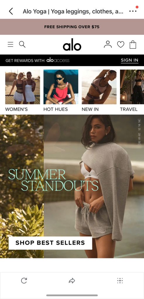
- Mobile Design Highlights: Alo Yoga’s mobile experience is a masterclass in visual storytelling. Bold, aspirational photography draws users in, while fast-loading pages and intuitive navigation make it easy to shop their collections. Sticky menus, size filters, and swipeable galleries enhance usability across all mobile devices.
19. Blueland
- Visit Website
- Industry: Eco-Friendly Home Products
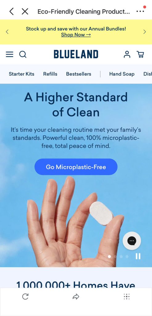
- Mobile Design Highlights: Blueland uses bold visuals and clear product messaging to create a mobile layout that’s both educational and conversion-focused. The homepage features compact, scroll-friendly sections that highlight environmental benefits and key products. CTAs are large and noticeable, making the mobile path to purchase seamless.
20. Wild
- Visit Website
- Industry: Personal Care / DTC
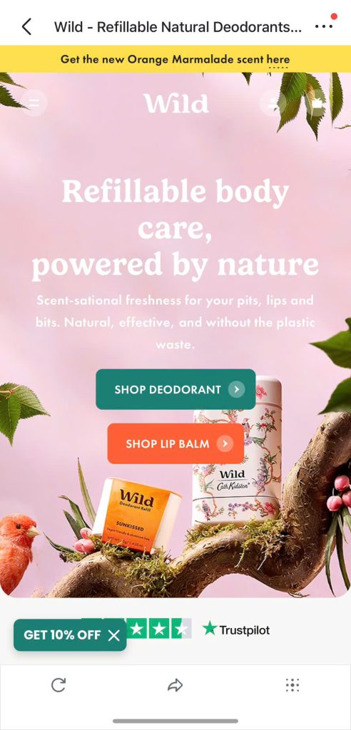
- Mobile Design Highlights: Wild delivers an energetic mobile shopping experience with bright colors, playful animations, and bold call-to-action buttons. Product pages are well-optimized with tap-friendly options and visuals that load quickly. Their brand personality shines through every scroll, making the experience memorable and highly shoppable.
Looking to Build a Mobile-Optimized Shopify Store?
All the examples above prove one thing: mobile-first design is no longer optional — it’s essential for driving sales in 2025. With over 70% of eCommerce traffic coming from smartphones, using a mobile-first Shopify theme is one of the smartest decisions you can make.
These free premium Shopify themes are built to perform seamlessly on small screens, with features like fast-loading layouts, sticky CTAs, swipeable galleries, and thumb-friendly navigation. They help you create a store that not only looks great on mobile but is also optimized to convert.
Explore Mobile-First Shopify Themes by BoostifyThemes
Ready to take your store’s mobile experience to the next level? At BoostifyThemes, our Shopify themes are crafted to deliver lightning-fast performance, stunning visuals, and smooth navigation — all optimized to turn mobile visitors into loyal customers.
Why settle for good when you can have the best? Our themes offer:
- Lightning-fast mobile performance for seamless browsing
- Fully responsive sections and product pages that look perfect on any device
- Mobile-friendly mega menu and filter options for effortless shopping
- Sticky navigation and clear call-to-actions that drive conversions
- Swipeable product galleries designed for touch-friendly interaction
- Easy customization via Shopify Editor, no coding required
- Seamless mobile checkout to speed up purchases
- Perfectly tailored for fashion, beauty, home, and more niches
- Built for speed, SEO, and maximum conversion potential
Don’t let your competitors steal your mobile traffic. Explore mobile-first Shopify themes to grow your business with confidence.
Conclusion
In today’s mobile-driven world, having a Shopify store that looks great and performs flawlessly on smartphones is no longer optional — it’s essential. The 20 examples showcased above demonstrate how smart mobile-first design can boost user engagement, streamline shopping, and ultimately increase sales.
Choosing a mobile-first Shopify theme is a powerful way to ensure your store delivers a seamless, fast, and intuitive experience on any device. Shopify themes come packed with features like responsive layouts, mobile-friendly navigation, and optimized checkout flows designed to maximize conversions. By selecting the right theme, you can save time, reduce development costs, and focus on growing your business with confidence.