
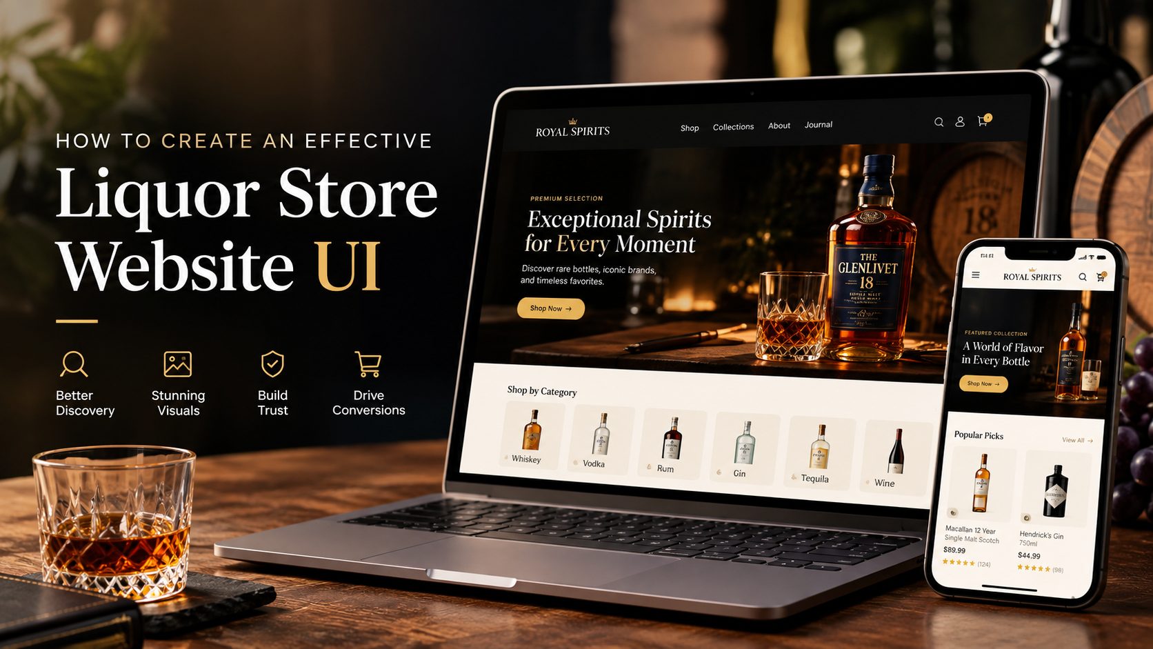
Some customers are looking for a specific vintage wine for their anniversary dinner, or a pack of craft beer for a weekend backyard gathering. They aren’t just buying a liquid in a bottle—they are searching for a sensory experience, a specific mood, or even an upscale gift.
Now, imagine they land on your liquor website, which feels like a generic shoe store or a household goods shop. Where is it going next? That sense of excitement quickly fades, and they leave before they even get a chance to explore your products.
Designing a liquor store website UI comes with a distinct set of challenges. Complex product catalogs can quickly overwhelm shoppers with details such as vintage, region, ABV, and tasting notes. At the same time, strong visual presentation is essential for showcasing everything from intricate bottle labels to the color and character of the product. The UI must also balance legal compliance and trust, including age verification and regional shipping restrictions, while supporting fast, frictionless shopping for customers who may need a product delivered the same day.
Are you struggling with high traffic but a low “Add to Cart” rate on your beverage website? Or are you planning to launch a brand-new site and want it to look luxurious while driving conversions from day one?
Either way, improving your website UI should be a priority. A clear, intuitive interface can make it easier for shoppers to discover products and complete their purchase.
So, what does an effective Liquor Store Website UI look like? Let’s dive in.
Table of Contents
What Should a Liquor Store Website UI Look Like?
When a customer walks into a high-end wine boutique or a well-curated craft spirits shop, the environment does half the selling. The lighting is deliberate, the bottles are organized with breathing room, and finding what you want feels intuitive rather than overwhelming.
Translating that physical experience into a digital interface is what strategic UI design is all about. A liquor store website UI cannot just be a generic grid of products; it must act as a digital sommelier. Here is what a high-performing liquor store UI should look and feel like across its core pillars:
Build a Clear and Product-Focused Visual Hierarchy
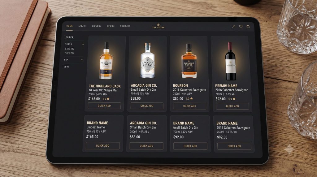
In the beverage industry, the bottle is the hero. Your layout should treat every product shot like a piece of art while keeping the commercial logic sharp.
- Make products the main visual focus: Use clean, structured layout grids that let high-resolution photography pop against neutral backgrounds.
- Prioritize critical data: Ensure the product name, price, volume (e.g., 750ml), and primary Add-to-Cart or Quick-Add CTA are instantly recognizable without requiring users to squint or click through.
- Embrace generous whitespace: Clutter kills conversion. Give bottles room to “breathe” to evoke that upscale boutique feeling, preventing visual fatigue as shoppers scroll through dense catalogs.
- Optimize for scannability: Highlight key attributes like ABV %, region, or vintage right on the card so connoisseurs can filter information at a glance.
Balance Premium Branding With Easy Shopping
Liquor branding leans heavily on emotion—whether it is old-world luxury, rugged craft heritage, or sleek, modern minimalism. However, aesthetics should never come at the cost of utility.
- Align with positioning: Tailor your typography, color palette, and imagery to your exact market niche (e.g., deep burgundies and sophisticated serifs for luxury wine; bold, vibrant typography and gritty textures for craft beer and RTDs).
- Speed over heavy animations: Avoid lag-heavy intro animations or overly complex video backgrounds. A lightning-fast page load trumps flashy visual effects every time, especially for mobile impulse buyers.
Make Product Discovery the Core of the Interface
With thousands of SKUs spanning different categories, vintages, and flavor profiles, users should never feel lost in a labyrinth of inventory.
- Guide users effortlessly: Use visual entry points that match how people actually shop for alcohol—by product type (Wine, Spirits, Beer), region (Bordeaux, Islay, Napa), or occasion (Dinner Party, Gifting, Summer BBQ).
- Keep search prominent: Position a smart, highly visible search bar across all viewports so users hunting for a specific label can find it in milliseconds.
- Minimize click depth: Reduce the distance between the homepage and the final product page. A user should be able to land, discover, and inspect a bottle in two clicks or less.
Design for Trust, Transparency, and Compliance
Buying alcohol online involves unique legalities and financial security considerations. Your UI must proactively eliminate friction and skepticism.
- Total price transparency: Clearly display taxes, bottle deposits, and shipping or local pickup availability upfront. No one likes a surprise surcharge at the final checkout step.
- Build immediate social proof: Integrate star ratings, customer reviews, and secure checkout trust badges directly onto category and product pages.
- Frictionless Age Verification: Implement a clean, non-intrusive age verification modal upon entry. Make sure it remembers user sessions via cookies so loyal returning customers aren’t constantly forced to re-enter their birthdate.
Create a Consistent Experience Across Devices
Liquor shopping happens everywhere—from a desktop computer during a corporate lunch break to a smartphone while browsing a local menu at a restaurant bar. To capture these varied buyer journeys, you must maintain a consistent and fluid experience across all devices. Ensuring that your visual hierarchy, navigation pathways, and brand identity remain seamless and intuitive whether the user is on a massive desktop monitor, an iPad, or a mobile phone screen guarantees that customers can transition effortlessly between platforms without losing their shopping momentum or facing broken layouts.
What Essential UI Elements Does a Liquor Store Website Need?
An effective liquor store website is built on a robust toolkit of interface elements. While standard e-commerce platforms share basic foundations, an alcohol storefront requires specialized modules to handle age compliance, rich product attributes, and complex inventory catalogs.
Here is the exact checklist of essential UI elements your liquor store website needs to drive seamless discovery and high conversions:
Header and Navigation
Your header is the command center of your store. It must give users instant orientation the second they land on the page.
- Logo & brand identity: Cleanly positioned on the left or center, setting an immediate tone of trust and style.
- Main navigation menu: Clear top-level anchors for Wine, Spirits, Beer, and Gift sections.
- Visual mega menus: Dropdowns that showcase rich category images, featured brands, or regional maps rather than just walls of text.
- Instant search bar: Prominently placed so keyboard-driven shoppers can immediately hunt down specific labels or vintages.
- Account access, Wishlist, and Cart drawer icon: Quick-action icons tucked neatly on the right for effortless profile management and quick checkout peeks.
Homepage Sections
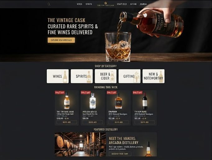
The homepage must capture attention in seconds, guiding both impulse buyers and connoisseurs deeper into the catalog.
- Hero banner: A striking, high-impact visual showcasing seasonal releases, exclusive bundles, or promotional campaigns with a single, clear call-to-action.
- Featured categories: Visual entry blocks for Wine, Spirits, Beer, and RTDs (Ready-to-Drink cocktails) using appetizing photography.
- Best sellers & curated collections: Social proof modules highlighting trending bottles or staff picks.
- Brand logos & gift guides: Logos of elite partner distilleries/wineries alongside dedicated gift-giving pathways.
- Local pickup/delivery badges: Trust indicators right near the top showing local fulfillment options and zip-code validation cues.
Product Category & Collection Interface
When users click into a category, the interface must handle massive inventory arrays without inducing cognitive overload.
- Category hierarchy: Clear breadcrumbs and sub-category toggles (e.g., Red Wine > Pinot Noir > Oregon).
- Responsive product grids: Clean, multi-column layouts optimized for both desktop scanning and mobile swiping.
- Standardized product cards: Consistent sizing and structured data layout for every bottle.
- Side/top multi-filters & sorting options: Essential filtering by price range, region, ABV %, vintage, and flavor profile.
- Pagination or lazy-loading infinite scroll: Smooth loading mechanics that keep shoppers browsing without tedious page reloads.
Predictive Search Interface
Because many liquor shoppers know exactly what bottle they want, search is your highest-converting feature.
- Autocomplete with thumbnail previews: Instant dropdown suggestions featuring bottle images, names, and prices as the user types.
- Suggested categories: Smart shortcuts pointing to matching wine regions or spirit types.
- Recent/popular searches: Quick links reflecting trending items or the user’s search history.
- Helpful zero-result fallback states: Graceful error handling that suggests popular alternatives or top categories instead of a dead end.
Rich Product Detail Page (PDP)
The PDP is where purchasing decisions are finalized. It needs to replicate the in-person sommelier experience digitally.
- High-res bottle photography & label close-ups: Crisp images showcasing the front label, back label, and bottle shape from multiple angles.
- Product core specs: Clear display of name, brand, volume/size (e.g., 750ml), price, and real-time stock status.
- Visual Tasting Notes: Interactive flavor charts or sliders illustrating sweetness, body, acidity, and tannins.
- Food Pairing & Serving Suggestions: Cross-selling blocks suggesting cheeses, meats, or cocktail recipes that complement the bottle.
- Social proof & compliance details: Verified customer reviews, ratings, shipping restriction notices, and a prominent, unmissable Add to Cart CTA.
Refer to these beverage product showcase landing pages.
Cart, Checkout & Gifting Interface
Friction in the cart or checkout stage is the #1 killer of beverage sales. The interface here must be streamlined and rewarding.
- Slide-out Mini Cart / Cart Drawer: A non-disruptive drawer featuring a live free-shipping progress bar to incentivize higher order values.
- Gifting & Bundle Options: Simple checkboxes for premium gift wrapping, custom greeting message cards, or wooden gift boxes.
- Order summary & picker: Clear breakdowns of taxes, bottle deposits, shipping versus local pickup pickers, promo code fields, and a streamlined multi-payment express checkout.
Trust, Compliance & Utility Elements
These utility features safeguard your business legally while reassuring customers of a secure transaction.
- Age verification gate: A seamless modal capturing birthdates or confirmation prompts upon entry.
- Store locator & delivery area checker: Built-in tools letting users verify if local delivery or curbside pickup is available in their zip code.
- Support widget & secure payment badges: Live chat integration and recognized payment trust icons (Apple Pay, Google Pay, Visa/Mastercard) embedded near checkout zones.
How Should You Design Each Part of a Liquor Store Website?
Translating a strategy into reality requires a step-by-step UI blueprint. Let’s break down how to design each foundational section of a high-performing liquor store website, starting from the moment a user lands on your homepage.
Designing the Homepage
Your homepage is your digital storefront window. It has mere seconds to capture attention, establish trust, and guide shoppers where they want to go.
Start With a Focused Hero Section
The hero section sets the entire mood for your brand. Avoid overwhelming users with text or shifting carousels that dilute your message.
- Clear headline: Speak directly to the shopper’s desire (e.g., “Curated Wines & Rare Spirits Delivered to Your Door”).
- Strong high-res product visual: Feature an iconic, aesthetically striking bottle shot or an atmospheric lifestyle image of a cocktail pour.
- Single primary CTA button: Direct users instantly to where the action is (e.g., “Shop the Collection” or “Explore Spirits”).
- Clean, uncluttered copy: Keep supporting text brief, punchy, and legible against the background imagery.
Guide Users Into Product Categories
Liquor buyers usually know their preferred lane, so make it effortless for them to navigate straight to their category of choice without hunting through menus. Feature prominent, visually distinct quick-access blocks right below the fold for core departments like Wine, Spirits, Craft Beer, RTDs/Cocktails, and Seasonal Gift Collections, turning what could be an overwhelming catalog into an inviting visual menu.
Use Product-Focused Content Blocks
Keep momentum going as the user scrolls down by showcasing inventory that drives immediate engagement and impulse buying.
- Dynamic grids: Feature Best Sellers, New Arrivals, and Curated Bundles (like “Weekend BBQ Packs” or “Whiskey Tasting Flights”).
- Brand storytelling: Highlight featured distilleries or historic wineries to elevate perceived value and build immediate brand trust.
Designing Product Category & Collection Pages
Build a Logical Product Grid
Your product grid is the backbone of the collection page. Every visual element should be meticulously standardized to help users scan and compare bottles rapidly:
- Consistent dimensions: Keep card dimensions and image aspect ratios uniform, whether displaying tall slender wine bottles or squat bourbon decanters.
- Visible attributes: Surface vital data—such as ABV percentage, volume, and region—directly on the card.
- Instant actions: Include a subtle, friction-free “Quick Add” button to encourage fast purchasing.
Make Filters Intuitive
Liquor shoppers are notoriously specific. Design a robust, multi-faceted filtering system positioned in a sticky sidebar or an easily accessible top drawer so users can narrow down choices by:
- Category and Brand
- Price range
- Region or Country
- ABV percentage
- Vintage year
- Specific flavor profiles (e.g., peaty, smoky, crisp, fruit-forward)
Provide Clear Sorting
Once filters narrow down the catalog, sorting options help shoppers establish immediate priority. Provide a clean, lightning-fast dropdown menu featuring:
- Popularity & Newest Arrivals
- Price (Low to High / High to Low)
- Curated “Editor’s Pick” selections to guide undecided buyers toward high-margin or staff favorites.
Designing High-Converting Product Cards
Your product card is the micro-moment where a shopper decides whether to click or scroll past. In the liquor industry, where bottle aesthetics, vintage years, and alcohol proofs carry immense decision-making weight, every detail on that card must speak directly to wine and spirits buyers.
Prioritize Shopper Needs
Connoisseurs and casual buyers look for very specific attributes before clicking into a bottle. Make sure your card immediately displays the core details they rely on:
- High-Impact Bottle Shot: A crystal-clear image of the bottle against a neutral background, showcasing the actual silhouette and label art.
- Brand, Name & Vintage: Clear typography highlighting the estate/brand name, the specific expression, and crucially, the vintage year (e.g., 2018 Bordeaux or 12-Year Single Malt).
- Bottle Volume & ABV: Essential specs like 750ml, 1L, or magnum sizes, alongside the Alcohol By Volume percentage (e.g., 40% ABV or 14.5% Vol).
- Price & Star Rating: Transparent pricing paired with trusted customer ratings to build instant confidence.
- Fulfillment Indicators: Real-time stock availability, low-stock warnings, or local pickup/delivery status badges.
Make Actions Obvious
Never force a user to hunt for how to buy a bottle. Equip your product cards with smooth, friction-free touch targets:
- Quick Add / Add to Cart: Allow shoppers to drop a bottle directly into their cart without being redirected away from the collection page.
- View Details: A clean secondary click zone for users who want to inspect tasting notes or food pairings.
- Wishlist Heart Icon: A subtle, tap-friendly bookmark option for shoppers building custom wine cellars or wishlists for future events.
Designing the Product Detail Page (PDP)
The Product Detail Page is where the final purchasing decision is made. For fine wines and craft spirits, this page must replicate the expertise of an in-person sommelier.
Lead With High-Impact Visuals
- Multi-Angle & Scale Photography: Showcase crisp, high-resolution shots of the front label, back label (to display regional details, sulfites, and importer notes), and the bottle shape to give a tangible sense of scale and craftsmanship.
- Label Zoom: Implement smooth hover-to-zoom functionality so wine enthusiasts can inspect every detail of the estate name, region, and official classifications.
Organize Complex Details
Liquor pages come packed with rich, sensory information. Avoid chaotic walls of text by grouping technical data into clean, digestible UI blocks:
- Collapsible Tabs: Neatly tuck away detailed product stories, distillery history, aging processes, and regional shipping restrictions.
- Interactive Tasting Charts: Replace boring text descriptions with visual sliders, radar charts, or flavor scales illustrating key wine and spirit characteristics (e.g., sweetness, body, acidity, tannins for wine; or peat, smoke, oak, and fruit notes for spirits).
- Food Pairing Recommendations: Feature cross-selling blocks or icon-based pairing suggestions (such as pairs best with grilled ribeye, aged cheddar, or dark chocolate) to inspire complete purchases.
Optimize Purchase Actions
- Clear Quantity & Case Selectors: Make it easy to toggle between purchasing a single bottle, a 3-pack, or a full case of 12.
- Subscription & Club Tiers: If you run a wine club or recurring delivery service, integrate clear radio buttons showing tiered savings (e.g., Join the Reserve Club and save 15% on every shipment).
- Prominent Add to Cart Button: Keep a sticky “Add to Cart” or “Buy Now” CTA pinned within thumb reach on mobile and visible above the fold on desktop.
Designing Cart, Gifting & Checkout
Cart abandonment in alcohol e-commerce often spikes due to unexpected shipping surcharges, strict regional rules, or a lack of gifting features. Your post-selection and checkout interface must eliminate these roadblocks while maximizing average order value.
Keep the Cart Drawer Editable
When a shopper adds a rare bourbon or a case of champagne to their cart, the transition should be seamless and friction-free:
- Slide-Out Mini Cart: Trigger a non-disruptive drawer whenever a bottle is added, keeping users immersed in their browsing session.
- Live Free-Shipping Progress Bar: Feature a dynamic threshold bar (e.g., “Add $25 more to unlock Free Local Delivery!”) to subtly encourage higher cart values.
- Inline Bottle Adjustments: Let shoppers tweak quantities (such as adjusting from 1 bottle to a 6-pack case), remove items, or swap package sizes instantly without forcing page reloads.
Highlight Gifting Options
Because wine and spirits are among the most frequently gifted items for holidays, weddings, and corporate events, your UI should make customization effortless:
- One-Click Gifting Checkboxes: Provide prominent checkboxes right inside the cart drawer for premium gift wrapping, custom wooden presentation boxes, or personalized greeting message card
- Gift Receipt Toggles: Include a simple toggle to hide physical price receipts on the packing slip when sending bottles directly to a recipient.
Minimize Checkout Friction
- Transparent Breakdowns: Upfront visibility of state/local taxes, bottle deposits, and localized delivery slot pickers or pickup availability before the user reaches the final payment screen.
- Express Checkout Integration: Instant, one-click payment options like Apple Pay, Google Pay, and Shop Pay to fast-track checkout for mobile and desktop shoppers alike.
Designing for Mobile-First Experience
A massive share of alcohol e-commerce traffic—especially spontaneous purchases, weekend party restocks, and mobile gifting—happens on smartphones. Prioritizing a seamless mobile website design is essential because if your layout is cramped, cluttered, or awkward on smaller screens, shoppers will abandon your cart in seconds.
Simplify Navigation
Mobile screen real estate is precious. Keep core pathways instantly accessible without forcing users to dig through hidden hamburger menus:
- Sticky Bottom Navigation Bar: Anchor a persistent, thumb-friendly navigation bar at the bottom of the screen for high-intent actions—such as instant Search, Categories, Cart drawer, and Account login.
- Collapsible Filter Drawers: Use clean, slide-up bottom sheets for multi-faceted filters (like region, vintage, or ABV) so users can refine wine and spirit selections without cluttering their small screen.
Optimize Touch Targets
Designing for mobile means respecting human ergonomics and the natural “thumb zone” of smartphone users:
- Comfortable Button Spacing: Ensure “Add to Cart” buttons, quantity selectors, and quick-add toggles have generous padding to prevent accidental mis-taps on heavy bottles.
- Streamlined Mobile Grids: Shift seamlessly from multi-column desktop layouts to a clean 1- or 2-column mobile product grid that highlights high-resolution bottle silhouettes and vital specs (like vintage and price) at a comfortable reading scale.
Best Liquor Store Website UI Examples
To see how top brands solve complex catalog navigation, legal compliance, and high-stakes conversions in the real world, let’s look at 4 standout examples of successful alcohol e-commerce websites:
1. The Whisky Exchange — The Gold Standard for Catalog Depth & Predictive Search
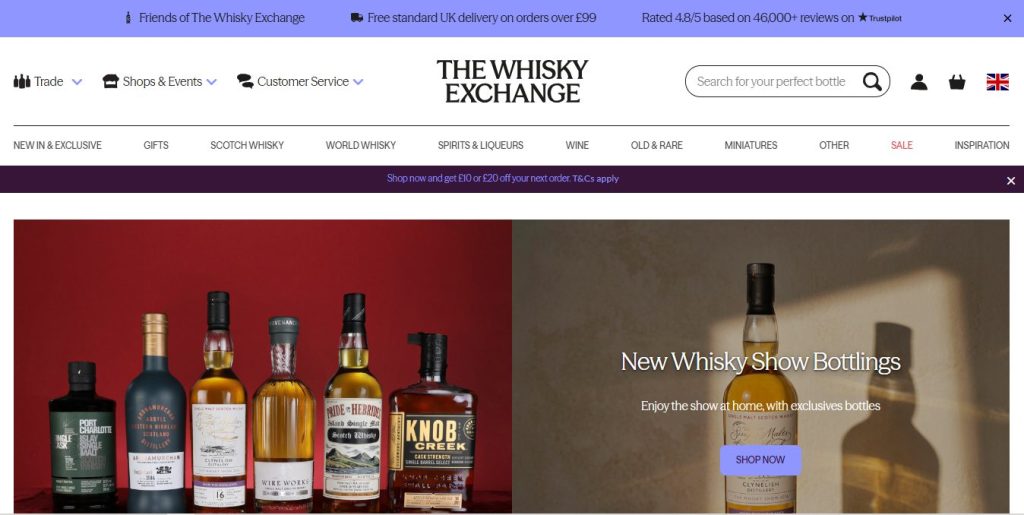
Niche & Positioning: A global retail authority specializing in rare whiskies and high-end spirits with a massive, complex inventory.
UI/UX Highlights:
- Masterclass in Predictive Search: Their search bar acts as an immediate digital sommelier, serving up autocomplete thumbnail previews filtered by brand, distillation year, region (e.g., Islay vs. Speyside), or flavor profile.
- Structured PDP Data: Despite housing thousands of technical data points—such as expert scores, cask types, and elaborate tasting notes—the product detail page remains uncluttered thanks to clean, collapsible tabs.
2. Cask NYC — Local Fulfillment & Urban On-Demand UX
Niche & Positioning: A prominent New York-based retailer blending sleek modern design with rapid local delivery and curbside pickup services.
UI/UX Highlights:
- Upfront Zip Code Verification: Features an immediate location/delivery checker right near the top of the session, eliminating user drop-offs by confirming delivery eligibility before a shopper even starts browsing.
- Frictionless Mobile-First Flow: Built with urban impulse buyers in mind, utilizing a sticky bottom navigation bar and lightning-fast express checkout options for quick party restocks.
3. East London Liquor Company — Balancing Brand Storytelling with E-Commerce
Niche & Positioning: An independent craft distillery brand featuring a modern, industrial, and edgy aesthetic.
UI/UX Highlights:
- Bold Visual Hierarchy: Uses striking typography, dark textured accents, and generous whitespace to let unique, craft-distilled bottle art take center stage.
- Seamless Gifting & Bundling Integration: Features beautifully structured cocktail kits and tasting sets directly on the homepage with quick-add functionality, effortlessly driving higher Average Order Values (AOV).
4. Market View Liquor — Advanced Filtering for High-Density Inventories
Niche & Positioning: A large-scale e-commerce storefront offering a vast, diverse inventory of wines and spirits ranging from everyday values to rare collectors’ items.
UI/UX Highlights:
- Robust Multi-Faceted Filters: Allows users to slice through thousands of SKUs using precise filters like grape variety, vintage year, country of origin, and critic ratings without lagging page performance.
- Conversion-Driven Cart Drawer: Utilizes a slide-out cart equipped with a live free-shipping threshold progress bar, subtly nudging shoppers to add one more bottle to hit the free delivery goal.
What Liquor Store Website Template Should You Choose?
When building or upgrading an online alcohol store, choosing the right e-commerce template saves months of custom coding and high development costs. Look for templates engineered specifically for high-density beverage catalogs, age verification, and rapid mobile checkout.
Here are 3 standout template options tailored for wine, spirits, and craft beverage merchants:
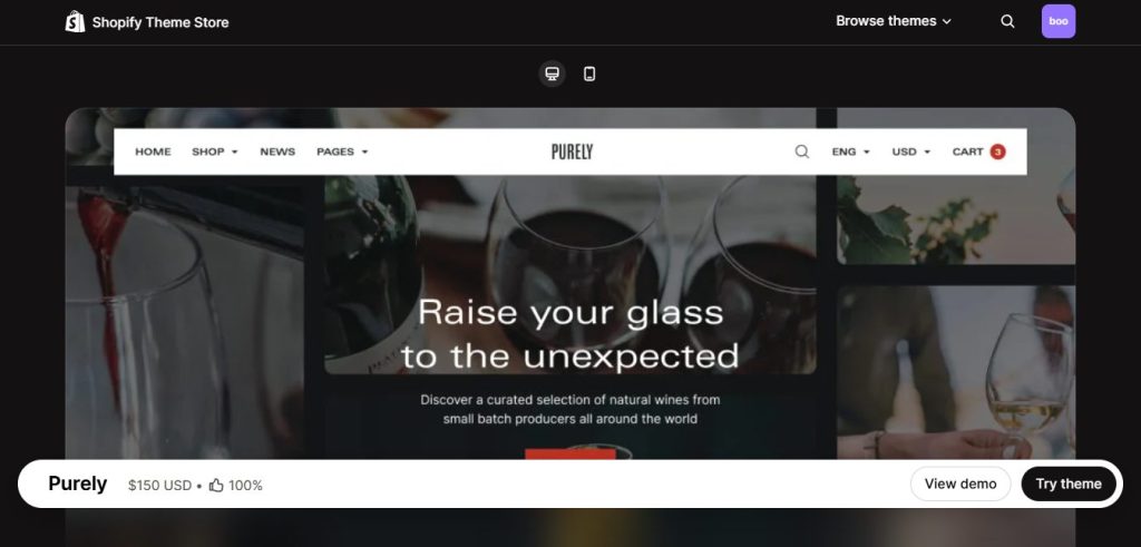
1. Purely drink theme – Best for High-Converting Beverage & Wine Stores
Specifically crafted for food, drink, wine, and specialty retail stores, Purely by BoostifyThemes is a premier, conversion-focused theme blending elite aesthetic presentation with robust built-in sales features. It comes equipped with high-performance slide-out cart drawers, quick-buy triggers, and in-store pickup selectors out of the box. Engineered with lightweight code and optimized image rendering, it ensures heavy bottle catalogs load instantly on mobile devices while providing generous whitespace to make wine and spirit labels look like high-end art.
2. Venue theme – Best for Age-Regulated & High-End Catalogs
A robust Shopify theme tailored specifically for businesses offering age-regulated products such as rare whiskies, craft beers, and artisanal wines. Venue by SafeAsMilk offers strong compliance features like native age-verification modals, integrated store locators for local curbside pickup, and flexible grid layouts that handle complex, multi-attribute inventories without sacrificing visual elegance or page speed.
3. Story theme – Best for Brand Storytelling & Large Inventories
An exceptional choice for premium wine brands and expansive liquor merchants who rely heavily on narrative. Story, developed by Pixel Union, combines sophisticated, large-format imagery, high-resolution galleries, and customizable content blocks with powerful filtering tools. It effortlessly bridges the gap between editorial storytelling (sharing vineyard heritage or distillery origins) and high-converting transactional flows.
In Conclusion,
Creating a successful liquor store website requires a careful balance between visual elegance, legal compliance, fast product discovery, and smooth conversion flows.
By prioritizing a clean visual hierarchy, lightning-fast predictive search, rich tasting and pairing details on your PDPs, and a frictionless mobile checkout, you can turn casual beverage browsers into loyal, repeat connoisseurs. Whether you choose a custom build or fast-track your launch using conversion-optimized solutions, delivering an exceptional digital sommelier experience is the ultimate key to scaling your alcohol e-commerce business.