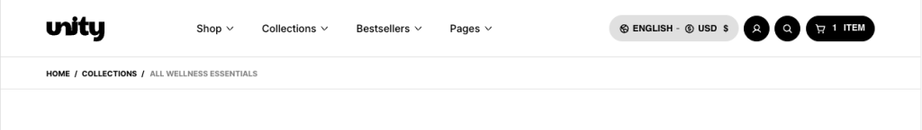
The Breadcrumbs section enhances site navigation by showing customers a clear path of where they are within your store. Displayed as a simple trail of links (e.g., Home → Collection → Product), breadcrumbs help visitors understand the structure of your website and easily backtrack to previous pages. This feature improves the shopping experience by reducing confusion, speeding up navigation, and keeping customers oriented—especially in stores with many collections and product categories.
Configure your Breadcrumb section
Normally, you can show the breadcrumb with one row.
With a page that needs to be eye-catching, it can be customized for a background image, the heading page, and a unique description
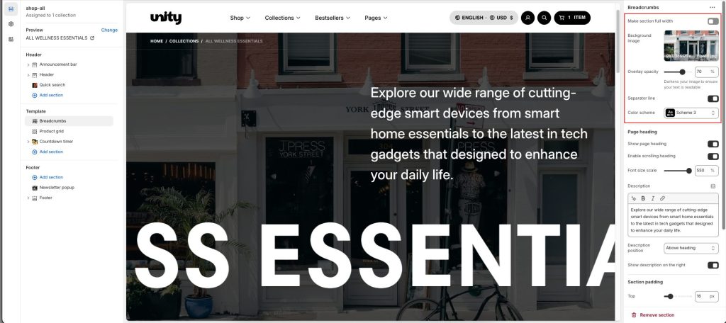
Add a background image to highlight the section
Change Overlay opacity: Darkens your image to ensure your text is readable
Use Separator line to separate the links and the Page heading.
Change Color scheme to make your text clear.
Page heading
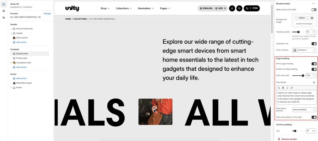
Enable scrolling heading to make the scroll page heading text.
Use Font size scale to change the text font size from 50% to 550%
In the Description box, enter text to display inside the section. Format the text and add links, using the Text editor pane.
2 Description positions: About heading and Below heading
Active Show description on the right, and the description will show a half-width of the page on the right side.