
The Product information section is the main part of every product page. On the left it shows the product gallery, and on the right a summary made of blocks: title, price, variant picker, buy buttons and more. You choose which blocks to show and in which order.
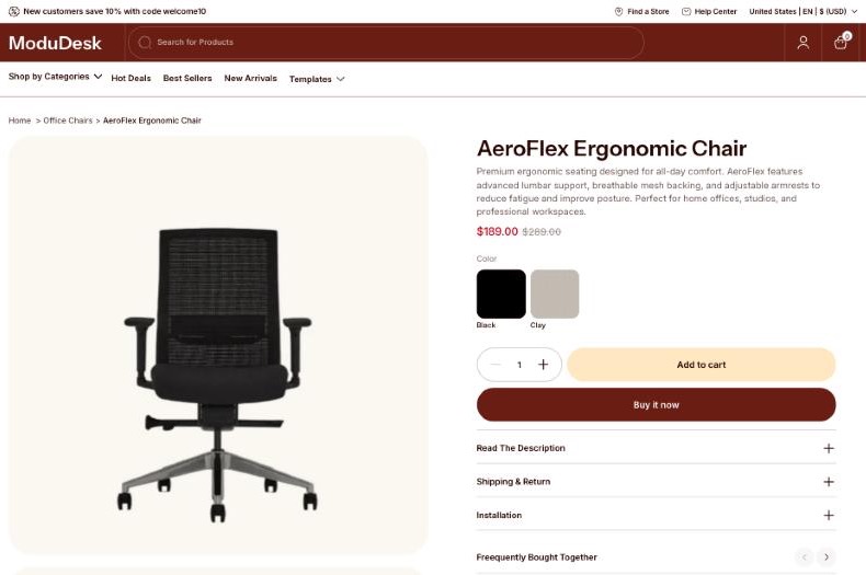
Open the product page settings
- From your Shopify admin, go to Online Store > Themes.
- Next to the Modudesk theme, click Customize.
- In the page selector at the top of the editor, choose Products > Default product.
- In the left sidebar, click Product information.
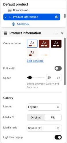
Changes made to the Default product template apply to every product that uses it. To give some products a different look, create a new product template and assign it to those products in the product’s Theme template setting.
Choose a gallery layout
- Open the Product information settings.
- Under Gallery, choose a Layout:
- Layout 1: images stacked in one column.
- Layout 2: images in a two-column grid.
- Layout 3: a repeating pattern of two small images and one full-width image.
- Choose the Media ratio and Media fit, then click Save.
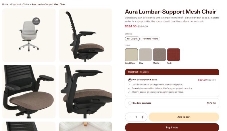
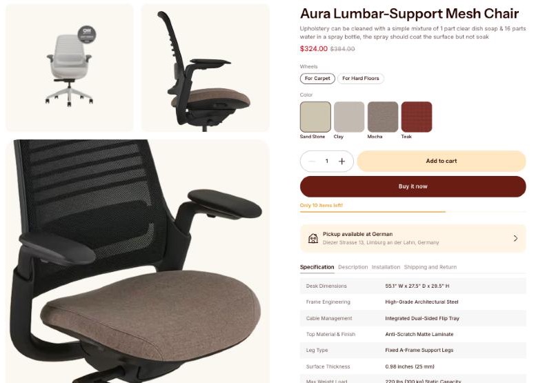
The layouts apply to screens 992px and wider. On smaller screens, the gallery is a slider with one image at a time.
Build the product summary with blocks
- In the sidebar, expand Product information and click Add block.
- Choose a block, for example Variant picker or Collapsible row.
- Click the block to edit its settings.
- Drag the ⋮⋮ handle to change the order, or click the eye icon to hide a block.
- Click Save.
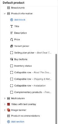
A new Product information section comes with Title, Price, Inventory status, Buy buttons, Description, Share and Information blocks. To put two blocks on one row, for example the title and the price, add a Group block and add the blocks inside it.
Section settings
| Setting | Description |
|---|---|
| Color scheme | Colors of the section. Default: Scheme 1 |
| Full width | Stretch the section to the edges of the screen. Default: Off |
| Space | Space between the gallery and the summary (0–200px). Default: 20px |
Gallery
| Setting | Description |
|---|---|
| Layout | Layout 1, Layout 2 or Layout 3 (see Choose a gallery layout). Default: Layout 2 |
| Media fit | Fill crops the media to fill the frame. Original shows the whole image inside the frame. Default: Fill |
| Media ratio | Shape of the media frame: Adapt to image, Landscape (4:3), Square (1:1), Portrait (5:6) or Tall (2:3). Default: Square (1:1) |
| Lightbox popup | Open the media in a full-screen popup when it is clicked. Default: On |
| Enable video looping | Replay product videos when they end. Default: Off |
Summary
| Setting | Description |
|---|---|
| Enable sticky content | Keep the summary in view while the visitor scrolls past the gallery. Default: On |
| Alignment | Text alignment of the summary: left, center or right. Default: Left |
Section padding
| Setting | Description |
|---|---|
| Top / Bottom | Space above and below the section on desktop (0–100px). Default: 20px / 20px |
| Mobile devices – Top / Bottom | Space above and below the section on mobile (0–100px). Default: 20px / 20px |
Block settings
Every block also has a Padding bottom setting (0–100px) for the space below it.
Title, Price and Description
| Block | Description |
|---|---|
| Title | The product title. Font size: H1–H6 or Body. Default: H3 |
| Price | The price and compare-at price of the selected variant. Font size: H1–H6 or Body. Default: H5 |
| Description | The product description from the product’s admin page. No other settings. |
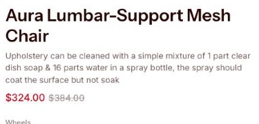
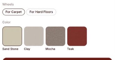
Variant picker
| Setting | Description |
|---|---|
| Style | Dropdown or Pills. Default: Pills |
| Swatch | Shape of the swatches: Circle, Square or None. Pills style only. Default: Square |
| Swatch priority | Image first shows the variant image in the swatch. Color first shows the swatch color. Default: Image first |
| Swatch size | Size of the swatches (24–100px). Default: 80px |
Buy buttons
| Setting | Description |
|---|---|
| Layout | Quantity + Add to cart / Buy now full-width; Quantity full-width / Add to cart + Buy now; or Inline. Default: Quantity + Add to cart / Buy now full-width |
| Text transform | None, Uppercase or Capitalize. Default: None |
| Show quantity selector | Show the quantity field. Default: On |
| Show dynamic checkout buttons | Show the Buy it now button. Customers see their preferred payment method from the ones in your store, such as PayPal or Apple Pay. Default: On |
| Show recipient information form for gift cards | Let buyers send a gift card to someone else, on a scheduled date and with a personal message. Default: On |
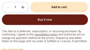
Inventory status
| Setting | Description |
|---|---|
| Show inventory count | Show the number of items left, e.g. “12 in stock”. Default: On |
| Show progressbar | Show a bar for the stock level. Default: On |
| Low inventory threshold | Show the low stock message when the stock is at or below this number (0–100). Set 0 to turn it off. Default: 10 |
The status only shows for variants whose inventory is tracked by Shopify.

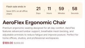
Countdown timer
| Setting | Description |
|---|---|
| Heading / Description | Text above the timer. Default: Countdown heading / Promotion description |
| Time | End date and time, in the format DD/MM/YYYY HH:MM, e.g. 31/12/2026 23:59. |
The time is read in each visitor’s own time zone. When the time has passed, the whole block is hidden. If Time is empty, each visitor sees a timer of about 21 days that starts again when fewer than 3 days are left.
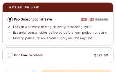
Selling plan picker
Shows the subscription options of the product. It needs a subscription app, such as Shopify Subscriptions, and hides itself when the product has no selling plans.
| Setting | Description |
|---|---|
| Heading | Title above the plans. Default: Best Deal This Week |
| Benefits | One benefit per line. Shown under the first plan when the plan has no description. |
| Button outline | Use the outlined button style. Default: Off |
Volume discount
| Setting | Description |
|---|---|
| Products | The products that show this offer. The block is hidden on all other products. |
| Label | Text of the offer. Default: Buy 2, save 10% |
| Quantity | Minimum quantity for the discount. Default: 2 |
| Discount value | Amount of the discount. Default: 10 |
| Discount type | Percentage or Fixed amount. Default: Percentage |
When the customer clicks the offer, the quantity field is set to the offer quantity. The block only shows the discounted price: to charge it at checkout, create a matching automatic discount in Discounts in your Shopify admin.

Product detail tabs
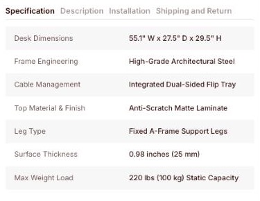
Shows tabs from the product’s Product tabs metafield (custom.product_tabs). The block has no settings other than Padding bottom, and shows nothing when the metafield is empty.
- Open the product in your Shopify admin and scroll to Metafields.
- In Product tabs, add one entry per tab. Each entry has a title, a content field for rich text, and an optional specifications list. Each specification has a label and a value, shown as a row of a table.
- Drag the entries to change the order of the tabs, then click Save.
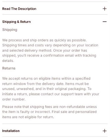
Collapsible row
A row that opens to show more content. Use it for shipping and return policies, size guides or care instructions.
| Setting | Description |
|---|---|
| Heading | Title of the row. If empty, the page title is used. Default: Collapsible row |
| Tab content | Text shown when the row is open. |
| Content from page | Show the content of a page. It is shown after the tab content. |
Pop-up
A button that opens the content of a page in a popup.
| Setting | Description |
|---|---|
| Link label | Text of the button. If empty, the page title is used. Default: Pop-up link text |
| Page | The page shown in the popup. |
| Button outline | Use the outlined button style. Default: On |

Complementary products
Shows products that go well with this one, in a slider. Pick them with the Search & Discovery app, under Product recommendations.
| Setting | Description |
|---|---|
| Heading | Title above the products. Default: Buy it with |
| Font size | H1–H6 or Body. Default: H6 |
| Layout | Large or Compact product cards. Default: Large |
| Maximum products to show | 1–10. Default: 10 |
| Infiniti loop | Go back to the first slide after the last one. Default: Off |
| Auto-rotate slides / Change slides every | Move to the next slide automatically, every 3–20 seconds. Default: Off / 5s |
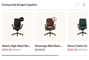
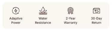
Trust badges
| Setting | Description |
|---|---|
| Color scheme | Colors of the badges. Default: Scheme 2 |
| Number of items | 1–4 badges. Default: 4 |
| Icon / Label | An icon image and a short text for each badge, e.g. “Free shipping”. Default: Feature one, Feature two, Feature three, Feature four |
Information
| Setting | Description |
|---|---|
| Show vendor | Show the vendor, linked to its products. Default: On |
| Show collections | Show the collections the product belongs to. Default: On |
| Show tags | Show the product tags. Default: On |
| Show type | Show the product type. Default: On |
| Show sku | Show the SKU of the selected variant. Default: On |
| Show barcode | Show the barcode of the selected variant. Default: On |

Share
| Setting | Description |
|---|---|
| Text | Text of the share button. Default: Share |
| Type | According to the operating system shows a share button with a copy-link field. According to the social media shows social media icons. Default: According to the operating system |
| Button outline | Use the outlined button style. Operating system type only. Default: On |

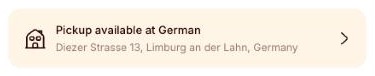
Local pickup availability
Shows where the selected variant can be picked up. Turn on local pickup for a location in Settings > Shipping and delivery. No other settings.
Divider
| Setting | Description |
|---|---|
| Background color | Color of the line. |
| Height | Thickness of the line (0–100px). Default: 1px |
Image with link
| Setting | Description |
|---|---|
| Image | An image, such as a banner or a size chart. |
| Link | Page the image links to. |
| Image width (px) | Width of the image. Default: 370 |
Custom Liquid
Add app snippets or other Liquid code in the Custom liquid setting.

Group, Heading, Text and Button
Use Heading, Text and Button to add your own content to the summary. Use Group to place blocks next to each other or stacked. A Group can hold Heading, Text, Button, Title and Price blocks.
| Setting | Description |
|---|---|
| Direction | Horizontal or Vertical. Default: Horizontal |
| Horizontal alignment | Left, Center, Right or Space between. Default: Space between |
| Vertical alignment | Top, Middle or Bottom. Default: Middle |
| Gap | Space between the blocks in the group (0–60px). Default: 12px |

You can also add app blocks from installed apps that support them.
Tips
- Use images of the same shape for all your products and match Media ratio to them, so the gallery looks even.
- To show a different image for each color, assign an image to each variant in the product’s admin page. The gallery jumps to that image when the variant is selected.
- Keep the Buy buttons block near the top of the summary so customers see it without scrolling.