
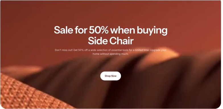
The Image banner section shows a large, eye-catching banner with a heading, text and a call-to-action button on top of an image, a video or a solid color. Use it at the top of your homepage or to promote a campaign.
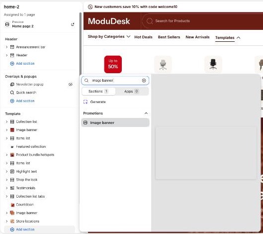
Add the Image banner section
- From your Shopify admin, go to Online Store > Themes.
- Next to the Modudesk theme, click Customize.
- In the left sidebar, click Add section in the area where you want the banner.
- Search for Image banner (under Promotions) and click it.
- Click Save.
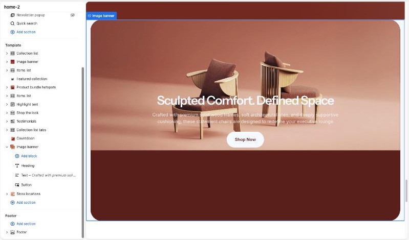
The new section comes with a Heading, a Text and a Button block.
Set the banner background
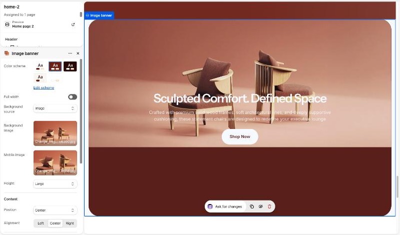
- Click the Image banner section in the sidebar to open its settings.
- In Background source, choose Color, Image or Video.
- For Image: click Select under Background image and pick an image. Optionally add a Mobile image.
- For Video: choose a Video source, then paste a YouTube or Vimeo URL, or upload a Shopify hosted video.
- For Color: the background uses the selected Color scheme.
Edit the banner content
- Expand the Image banner section in the sidebar to see its blocks.
- Click a block (Heading, Text or Button) to edit it.
- To add another block, click Add block under the section.
- Drag the ⋮⋮ handle to reorder blocks, or click the eye icon to hide one.
Section settings
| Setting | Description |
|---|---|
| Color scheme | Text and background colors of the banner. Default: Scheme 1 |
| Full width | Stretch the banner to the edges of the screen. Turn off to show a boxed banner with rounded corners. Default: On |
| Background source | Color, Image or Video. Default: Image |
| Background image | Image shown on desktop. |
| Mobile image | Image shown on screens narrower than 992px. If empty, the background image is used. |
| Video source | Vimeo or Youtube, or Shopify hosted. Default: Vimeo or Youtube |
| Vimeo or Youtube video URL | Link to the video. Default: Sample YouTube video |
| Shopify hosted video | Upload your video. |
| Height | Minimum height of the banner: Small (500px), Medium (560px), Large (710px). Auto keeps the 500px minimum and grows with the content. Default: Medium |
| Position | Vertical position of the content: Top, Center or Bottom. Default: Center |
| Alignment | Horizontal alignment of the content: Left, Center or Right. Default: Center |
| Section padding – Top / Bottom | Space above and below the content on desktop (0–100px). Default: 50px / 50px |
| Mobile devices – Top / Bottom | Space above and below the content on mobile (0–100px). Default: 20px / 20px |
Block settings
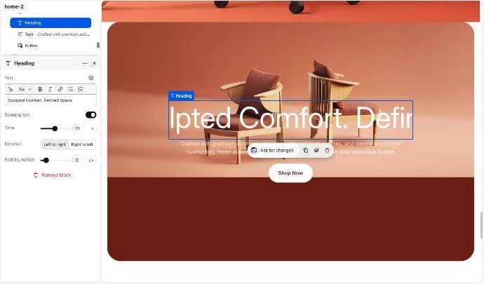
Heading
| Setting | Description |
|---|---|
| Text | The heading text. Default: Image banner |
| Font size | Heading size from H1 to H6. Hidden when Scrolling text is on. Default: H1 |
| Scrolling text | Make the heading scroll continuously across the banner. Default: Off |
| Time | Duration of one scroll loop (1–50 seconds). A higher value scrolls slower. Default: 25s |
| Direction | Left to right, or Right to left. Default: Right to left |
| Padding bottom | Space below the block (0–100px). Default: 20px |
Text
| Setting | Description |
|---|---|
| Text | The description text. Default: Placeholder text |
| Font size | Small, Medium or Large. Default: Medium |
| Padding bottom | Space below the block (0–100px). Default: 20px |
Button
| Setting | Description |
|---|---|
| Button label | Text on the button. Leave blank to hide the button. Default: Button label |
| Button link | Page the button links to. |
| Button style | Primary or Secondary. Default: Primary |
| Padding top / Padding bottom | Space above and below the button (0–100px). Default: 0px / 20px |
You can also add app blocks from installed apps that support them.
Tips
- Use a landscape image of at least 2400px wide for the desktop background, and a portrait image for Mobile image.
- Block padding on mobile is scaled down automatically to about half of the desktop value (minimum 10px).
- Line breaks in the heading and text are removed on mobile so the text wraps naturally.
- Image banner can’t be added to the header or footer.