
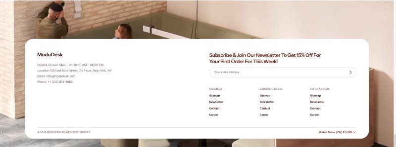
The Footer section shows your logo, contact information, footer menus, social icons and a scrolling announcement at the bottom of every page. A bottom bar shows the copyright, payment icons and the country/language selector.
Open the Footer settings
- From your Shopify admin, go to Online Store > Themes.
- Next to the Modudesk theme, click Customize.
- In the left sidebar, under Footer, click Footer.
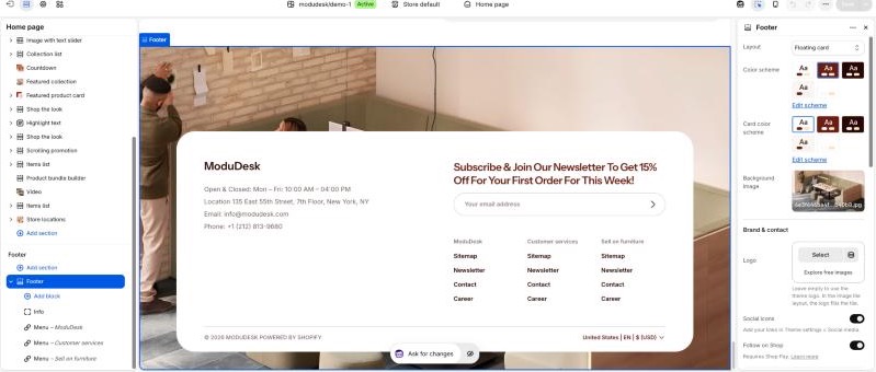
The Footer sits in the footer group, so the same footer appears on every page. A new Footer comes with one Info block and one Menu block.
Choose a layout
- Open the Footer settings.
- In Layout, choose one of the three layouts:
- Image tile: a large logo tile with your contact information and social icons, and the menus on the right.
- Centered logo: logo and contact information in the middle, with the menus split to the left and right.
- Floating card: a card over a background image, with a newsletter sign-up form and the menus.
- Click Save.
Add contact information and menus
- Create your footer menus first in Online Store > Navigation. Only top-level items are shown.
- In the sidebar, expand Footer and click Add block.
- Choose Info to add contact details, or Menu to add a menu column.
- Click the new block and fill in its settings.
- Drag the blocks to change their order, then click Save.
You can add up to 2 Info blocks and 4 Menu blocks. In the Centered logo layout, the first half of the menu blocks goes to the left of the logo and the rest to the right.
Section settings
| Setting | Description |
|---|---|
| Layout | Image tile, Centered logo or Floating card. Default: Image tile |
| Color scheme | Colors of the footer. Default: Scheme 2 |
| Card color scheme | Colors of the card. Floating card layout only. Default: Scheme 1 |
| Background image | Image behind the card. Floating card layout only. |
Brand & contact
| Setting | Description |
|---|---|
| Logo | Leave empty to use the theme logo, or your store name if there is no logo. In the Image tile layout, the logo fills the tile. |
| Social icons | Show your social media icons. Add your links in Theme settings > Social media. Not shown in the Centered logo layout. Default: On |
| Follow on Shop | Show the Follow on Shop button. Requires Shop Pay. Default: On |
Scrolling text
| Setting | Description |
|---|---|
| Text | A short announcement that scrolls across the footer. Leave empty to hide it. Default: Share a short announcement |
| Direction | Left to right, or Right to left. Default: Right to left |
| Speed | Duration of one scroll loop (1–50 seconds). A higher value scrolls slower. Default: 20s |
| Pause on hover | Stop scrolling while the pointer is over the text. Default: On |
| Text color | Color of the scrolling text. Floating card layout only. |
| Space below text | Space between the text and the card (0–200px). Floating card layout only. Default: 60px |
Newsletter
| Setting | Description |
|---|---|
| Heading | Title above the email sign-up form. Floating card layout only. Default: Subscribe to our emails |
Customers who sign up are added to Customers in your Shopify admin with the newsletter tag.
Bottom bar
| Setting | Description |
|---|---|
| Copyright | Show “© year, store name” and the Powered by Shopify link. Default: On |
| Localization selectors | Country/language/currency selector style: Use theme setting, Disabled, or one of three display styles. If the selectors are disabled in Theme settings > Localization, they are hidden here too. Default: Language and currency |
| Payment icons | Show the icons of the payment methods enabled in your store. Default: On |
Section padding
| Setting | Description |
|---|---|
| Top / Bottom | Space above and below the footer content on desktop (0–200px). Default: 72px / 20px |
| Mobile devices – Top / Bottom | Space above and below the footer content on mobile (0–200px). Default: 32px / 20px |
Block settings
Info
| Setting | Description |
|---|---|
| Heading | Title above the contact details. Image tile layout only. Default: Contact information |
| Content | Your opening hours, address, email and phone number. Default: Sample contact lines |
Menu
| Setting | Description |
|---|---|
| Heading | Title of the menu column. |
| Menu | The menu to show. Top-level items only. Default: Footer menu |
You can also add app blocks from installed apps that support them.
Tips
- If a Menu block has no menu selected, it shows five placeholder links. Pick a menu or remove the block.
- Payment icons appear only after you set up a payment provider in Settings > Payments.
- Use a wide, low-contrast image as the Floating card background so the card stays easy to read.