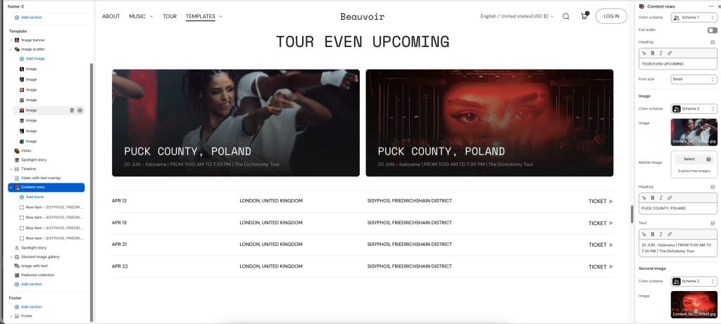
Display structured rows of content combined with featured imagery and supporting information in a clean editorial layout. Use this section to showcase schedules, events, collections, announcements, or organized storytelling content with clarity and visual balance. Flexible row items, images, and typography settings allow the layout to adapt to many creative and informational use cases. Create an engaging browsing experience that blends detailed content with strong visual presentation.
Color scheme: Select a color palette for the section background and content.
Full width: Expand the section to fill the full width of the screen.
Heading: Display the main title or featured message for the section.
Font size: Adjust the heading text size.
Image and Second image
Color scheme: Select a color palette applied to the image content area.
Image: Upload the primary featured image.
Mobile image: Add an alternate image optimized for mobile devices.
Heading: Add a title displayed over the featured image.
Text: Enter supporting text or additional information to display with the image.
Row item
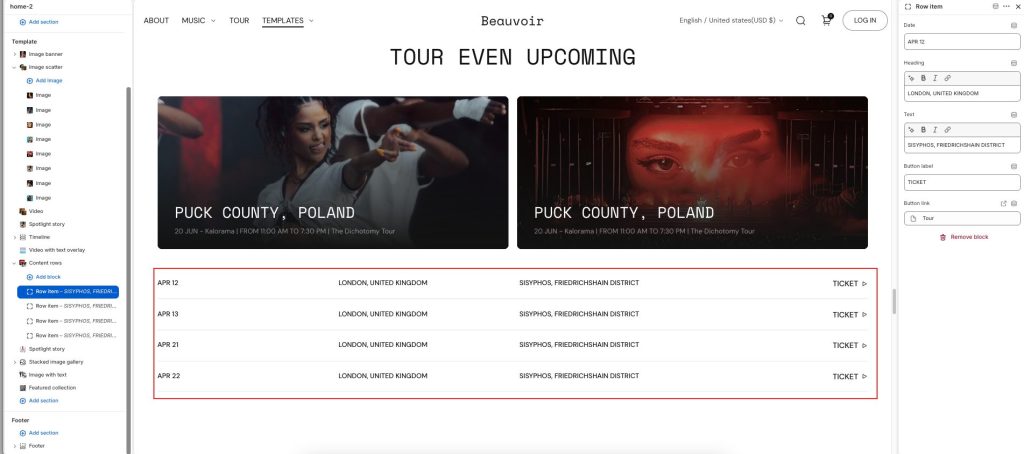
Date: Add the event date or timeline label displayed in the row item.
Heading: Display the main title or primary location for the row item.
Text: Enter supporting details or additional information for the row item.
Button label: Add text for the action button.
Button link: Choose a destination link for the button.