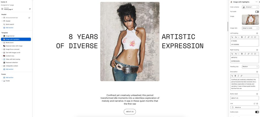
Combine featured imagery with bold, highlighted typography to create a striking editorial-style composition. Layer expressive text, supporting content, and visuals to emphasize key messages, milestones, or brand storytelling moments. Flexible typography and layout controls allow the section to adapt to artistic showcases, campaigns, or immersive content presentations. Create a balanced visual experience that blends strong imagery with impactful highlighted text.
Color scheme: Select a color palette for the section background and content.
Full width: Expand the section to fill the full width of the screen.
Image: Upload the primary featured image displayed in the section.
Image ratio: Adjust how the image is cropped and displayed within the layout.
Left heading: Add highlighted heading text displayed on the left side of the image.
Right heading: Add highlighted heading text displayed on the right side of the image.
Heading size: Adjust the size of the highlighted heading text.
Description: Enter descriptive or supporting content displayed below the image.
Button label: Add text for the call-to-action button.
Link: Choose a destination link for the button.
Outline style: Display the button with an outlined visual style.